

Shady Areas and No-Worry Lines—171
Shady Areas and No-Worry Lines
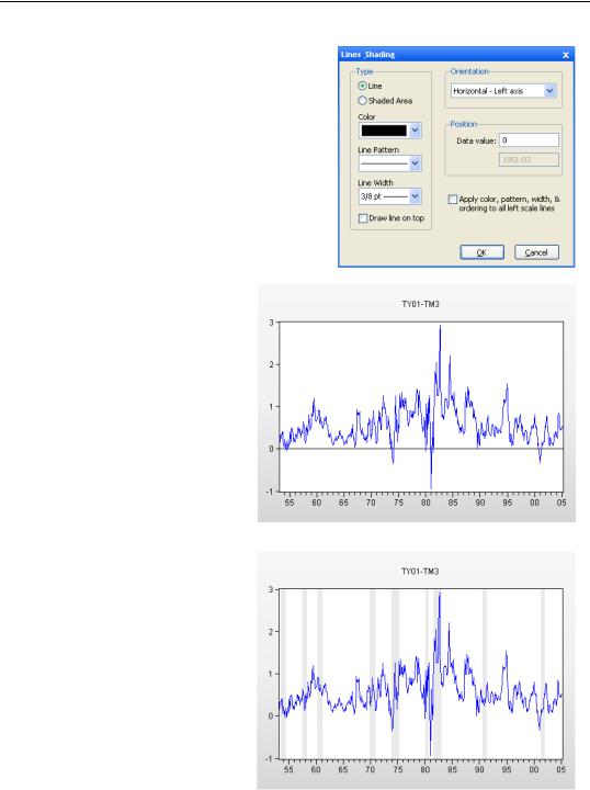
Adding shaded areas or vertical or horizontal lines to graphs is a very effective way of focusing your audience’s attention on specific aspects of a plot. The  button brings up the Lines & Shading dialog, which is used to place both lines and shades.
Shades
Beginning in 1942 and ending with the March 4, 1951 TreasuryFederal Reserve Accord, the Federal Reserve kept interest rates low in support of the American war effort. We can use shading to highlight interest rates during this period. Define a shaded area by entering Left and Right observations in the Position field of the Lines & Shading dialog.
Hint: To put in multiple shaded areas, use  repeatedly.
Hint: The Apply color to all vertical shaded areas checkbox lets you change the color of all the vertical shades on a graph with one command. This checkbox morphs according to the type of line or shade selected. For example, if you’ve set the combo for Orientation to Horizontal - left axis, the checkbox reads Apply color, pattern, & width to all left scale lines.
172—Chapter 6. Intimacy With Graphic Objects
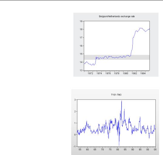
Shading can also be applied horizontally. After the Bretton Woods agreement on exchange rates broke down, a number of European countries agreed to keep their exchange rates from rising or falling more than 2.25 percent. Sometimes this worked and sometimes it didn’t. Shading visually highlights a band of the appropriate width for the Belgian/Dutch exchange rate in the figure to the right.
Lines
Adding a vertical or horizontal line, or lines, to a graph draws the viewer’s eyes to distinguishing features. For example, long term interest rates are usually higher than short term interest rates. (This goes by the term called “normal backwardation,” in case you were wondering.) The reverse relation is sometimes thought to signal that a recession is likely. Here’s a graph that shows the difference between the one year and three month interest rates.
Templates for Success—173
Use  to add a horizontal line at zero, as shown.
In the revised figure it’s much easier to see how rare it is for the longer term rate to dip below the short rate.
Templates for Success
What’s really useful is to see how the difference between long and short term interest rates compares to (shaded) periods of recession. Periods in which the long rate dips below the short rate are associated with recessions. On the other hand, there have been a number of recessions in which this didn’t happen.
In fact, adding shading for recessions has become something of a
174—Chapter 6. Intimacy With Graphic Objects
standard in the display of U.S. macro time series data. Including shades for the NBER recession dates is so easy that you may want to make it a regular practice. Just use the  button for each of the 32 recessions identified by the NBER.
You don’t really want to re-enter the same 32 sets of shade dates every time you draw a graph, do you? Templates to the rescue!
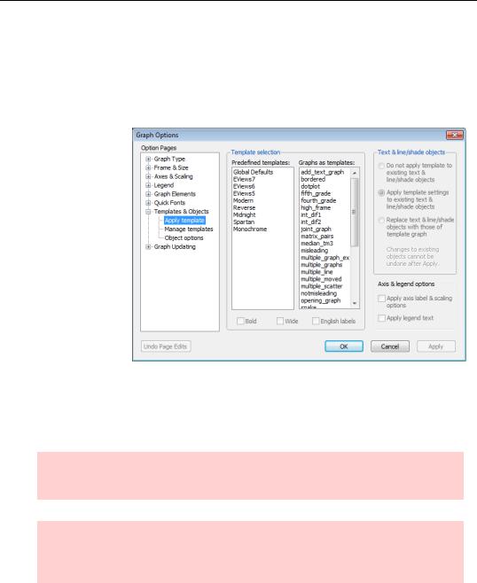
A template is nothing more than a graphic object from which you can copy option settings into another graph. Open the graph sans shades and click  . (You may need to widen the graph window to see this button on the far right.) The Graph Options dialog
opens to the Templates & Objects section. I once made a graph with the NBER recessions marked as shades, and saved that graph in the workfile with the name RECESSIONS. Choosing RECESSIONS, in the Graphs as templates: scroll area, makes available all the graphic options—including shade bands—for copying into the current graph.
Hint: When you select a template, an alert pops open to remind you that all the options in all the various Graph Options sections will be changed.
Hint: The list in Graphs as templates: shows graphs in the current workfile. If the template graph is in another workfile, it’s easy enough to copy it and then paste it into the current workfile.
Once you hit the  button all the basic graphic elements are copied into the current graph, with the exception of text objects, line and shade objects, some axis options, and legend text.

Templates for Success—175
Hint: Applying a template can make a lot of changes, and there’s no undo once you exit the dialog. It can pay to use Object/Copy Object… to duplicate the graph before making changes. Then try out the template on the fresh copy.
Text, lines, and shades in templates
Radio buttons offer three options for how text, line, and shade objects are copied.
Do not apply means don’t copy these objects from the template. Use this setting to change everything except text, line, and shades to the styles in the template. Any text, line, or shade objects you add subsequent to the choice of template will use the template settings.
Apply template settings to existing uses the template styles for both existing and future text, line, and shades.
Replace text & line/shade wipes out existing text, line, and shade objects and then copies these objects in from the template. In the
previous figure, we manually re-entered the zero line after the recession shading was applied from the template. This was necessary because the template didn’t have a zero line, and all lines get replaced.
Hint: If you regularly shade graphs to show periods of recession—something commonly done in macroeconomics—make a template with recession periods shaded and then use Replace text & line/shade to copy the shaded areas onto new graphs.
Hint: Nope, there’s no way to copy text, line or shade objects from the template without replacing the existing ones.
Axis and legends in templates
Two checkboxes handle how axis and legend settings are copied.
Check the first box to apply axis settings from the template related to the label and scale. The second checkbox will replace the current legend text with that of the template.
If neither is checked, these items will not be copied.
176—Chapter 6. Intimacy With Graphic Objects
Bold, wide, and English labels in templates
You will also be given the choice of applying the Bold, Wide, or English labels modifiers. Bold modifies the template settings so that lines and symbols are bolder (thicker, and larger) and adjusts other characteristics of the graph, such as the frame, to match, Wide changes the aspect ratio of the graph so that the horizontal to vertical ratio is increased, and English labels modifier changes the settings for auto labeling the date axis so that labels that use month formatting will default to English month names (“Jan”, “Feb”, “Mar” instead of “M1”, “M2”, “M3”).
Predefined Templates
EViews comes with a set of predefined templates that provide attractive looking graphic styles. These appear on the left in the Template selection field.
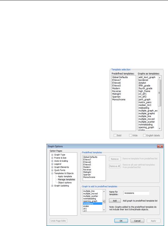
You can add any graph you like to the predefined list so that it will be globally available by going to the Manage templates page of the Templates & Objects section. Then