

Let’s Look At This From Another Angle—155
If you want to use color but still get acceptable monochrome renderings, change the colors in the
Fill Areas section in the Graph Elements group of the Graph Options dialog to ones with different “darkness levels.” Here we’ve used blue, pink, and white. You can also select different Grey shade levels, which operate independently of the color choice when EViews renders in black and white.
Hint: The same issue arises in any graph with adjacent filled areas. You can use the same trick in any graph.
Let’s Look At This From Another Angle
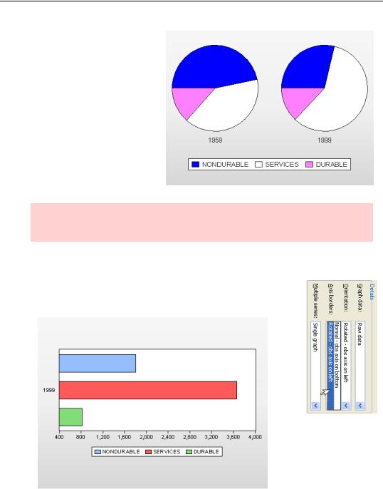
To twist a graph on it’s side, choose Rotated - obs axis on left in the Orientation combo of the Graph Type dialog. Below is a rotated version of the bar graph we saw on page 139.
156—Chapter 5. Picture This!
Hint: Rotated only works for some graph types. For types where it doesn’t, the Rotated option won’t appear.
Hint: Frozen graphs with updating off don’t rotate.
Continuing hint: But if you wish, you can accomplish the same thing by going to the Axes & Scaling section and reassigning the series manually.
To Summarize
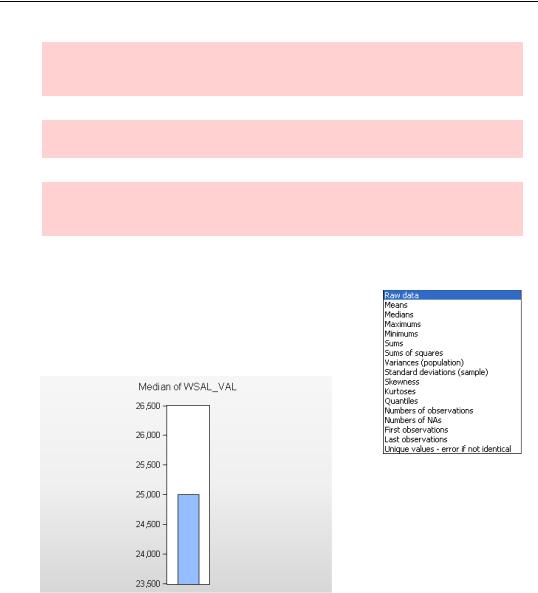
To visually summarize your data, change the Graph data: dropdown in the Details: field to a summary statistic of your choice. For example, here’s a bar graph showing the median level of wages and salaries for U.S. workers in 2004 (“cpsmar2004extract.wf1”).
Pretty boring, eh? Even if you’re fascinated by wage distributions, that’s a pretty boring graph. All the choices other than Raw data produce a single summary statistic for each group of data. If all you have is one series, there’s only one number to plot. Plotting summary statistics gets interesting when you compare statistics for different groups of data. We saw this in the comparison of the means of three different interest rate series in the plot of the average yield curve on page 130. We’ll see examples where the groups of data represent different categories in the next section.
Categorical Graphs—157
Hint: As a general rule, different groups of data summarized in a single plot need to be commensurable, meaning they should all have the same units of measurement. Our three interest series are all measured in percent per annum. In contrast, even though GDP and unemployment are both indicators of economic activity, it makes no sense to compare a mean measured in billions of dollars per year with a mean measured in percentage points.
Hint: Details only works for some graph types. For types where it doesn’t, the Details option won’t appear.
Categorical Graphs
So far, all our graphs have produced one plot per series. EViews can
also display plots of series broken down by one or more categories. This is a great tool for getting an idea of how one variable affects
another. Categorical graphs work for both raw data and summary statistics and pretty much all the graph types available under Basic graph are also available under Categorical graph.
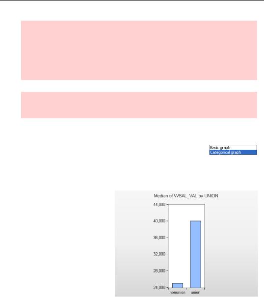
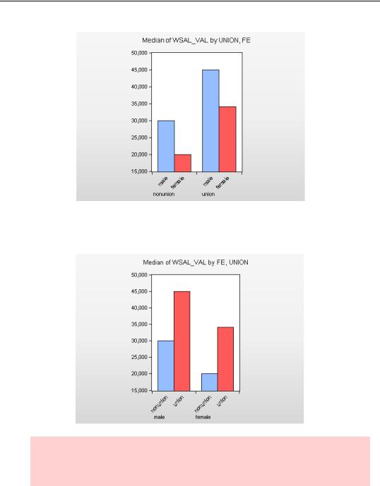
For example, a bar graph of median wages isn’t nearly so interesting as is a graph comparing wages for union and nonunion workers. Union workers get paid more. (But you knew that.)
158—Chapter 5. Picture This!
Junk graphics alert: The graph appears to show that union workers are paid enormously more than are non-union workers. In generating a visually appealing graph, EViews selected a lower limit of 24,000 for the vertical axis. Union wages are about 60 percent higher than non-union wages. But the union bar is about 10 times as large. The visual impression is very misleading. We’ll fix this in Chapter 6, page 185.
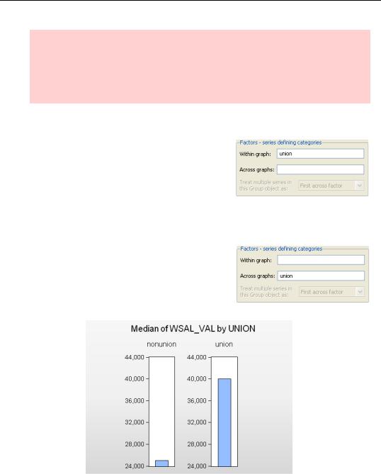
Factoring out the categories
EViews allows multiple categorical variables, each with multiple categories. This can mean lots and lots of individual plots. EViews uses the Factors - series defining categories field to sort out which variables place plots within a graph and which place plots across graphs. For the graph above, we put UNION in the Within graph: box. This told
EViews to place the bars for all the categories of UNION (“nonunion” and “union”) within the same graph.
In contrast, if we’d entered UNION in the Across graphs: box EViews would have spread the bars across plots, so that each UNION category appears separately—as below.
Splitting up wages by gender as well as union membership, we have four plots with numerous arrangement possibilities. If we make “UNION FE” the within factors (FE codes gender), we get the plot shown below.
Categorical Graphs—159
Note that the first categorical variable listed becomes the major grouping control. Switch the within order to “FE UNION” and EViews switches the ordering in the graph as shown below.
Hint: The graphs give identical information, but the first graph gives visual emphasis to the fact that men are paid more than women whether they’re union or non-union. The second graph emphasized the union wage premium for both genders.
160—Chapter 5. Picture This!
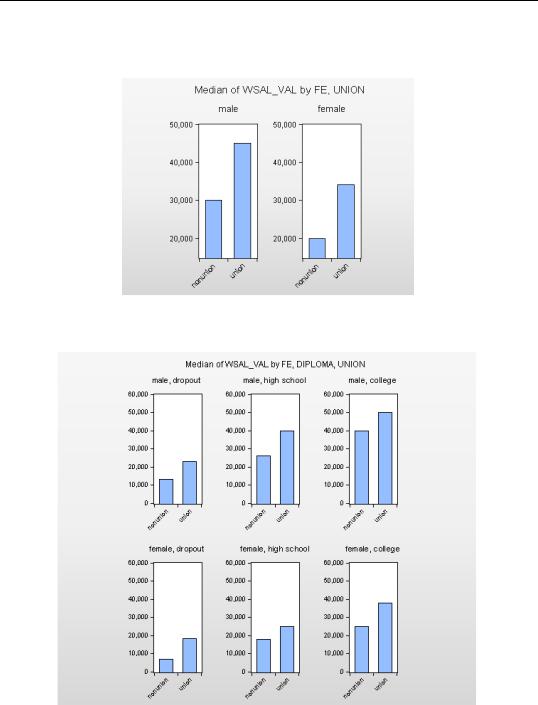
If we move the variable FE to the Across field, EViews splits the graph across separate plots for each gender.
You can use as many within and across factors as you wish. We’ve added “highest degree received” to the across factor in this graph.
Categorical Graphs—161
Hint: EViews will produce graphs with as complex a factor structure as you’d like. That doesn’t make complex structures a good idea. Anything much more complicated than the graph above starts to get too complicated to convey a clear visual message.
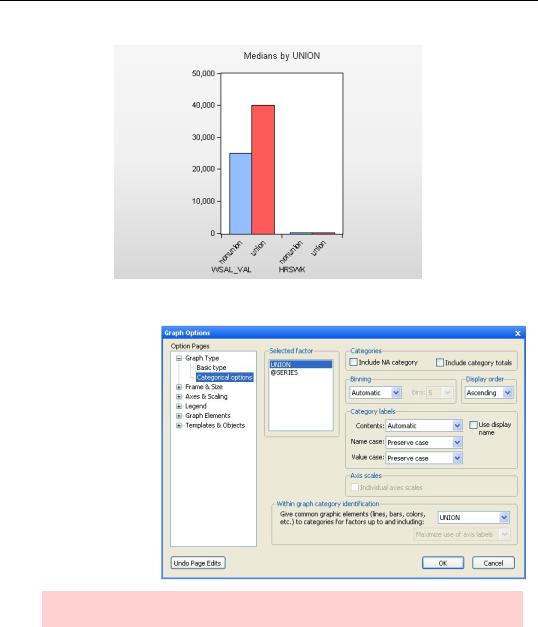
Multiple Series as Factors
Having multiple series in a graph is sort of like having multiple categories for a single series, in that there’s more than one group of data to graph. EViews recognizes this. Use the Treat multiple series in this Group object as: menu to treat the series (the series in this group were WSAL_VAL and HRSWK) as a factor.
If we’d set Treat multiple series in this Group object as: First within factor both WSAL_VAL and HRSWK would appear in the same plot, as shown below. Because of the difference in scales for the two series, First within factor wouldn’t be a sensible choice for this application.
162—Chapter 5. Picture This!
Polishing Factor Layouts
For categorical graphs, the Graph Type group on the left-hand side of the dialog includes a Categorical options section with a number of fine-tuning options. We discuss the most used options here, leaving the rest to your experimentation (and to the User’s
Guide).
Hint: Categorical options aren’t available on frozen graphs if updating is disabled.
Distinguishing Factors
In the graph depicted earlier, all the bars are a single color and pattern. Contrast the graph to the graph shown below, where “union” bars are shown in solid red and “nonunion bars” come in cross-hatched blue. Turning on Within graph category identification instructs EViews to add visual distinction to the within graph elements. We’ve done this to change
Categorical Graphs—163
the color in the graph to the right by changing Within graph category identification from none to UNION.
EViews interprets “add visual distinction” for this graph as assigning a unique color for each within category. This choice is ideal when the graph is presented in color, but we wanted clear visual distinction for a monochrome version as well. So we added the cross-hatching manually. To see how, see Fill Areas in the next chapter.
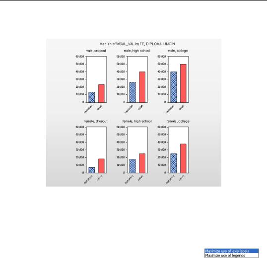
More Polish
Two more items are worthy of quick mention. The first item is that
you can direct EViews to maximize the use of either axis labels or legends. Axis labels are generally better than using a legend, but
sometimes they just take up too much room. The graph above maximized label use. Here’s the same graph maximizing legend use. In this example neither graph is hard to understand nor terribly crowded, so which one is better mostly depends on your taste.