

Group Graphics—137
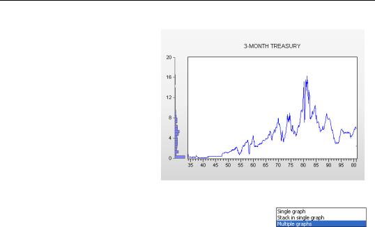
The graph to the right has a histogram added to the line graph for the 3-month Treasury bill rate. The histogram provides a reminder that interest rates were close to zero for much of our sample. The line graph reveals that these extremely low rates were a phenomenon of the Great Depression and World War II.
Group Graphics
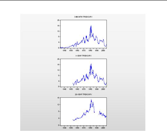
Any graph type applicable to a single series can also be used to graph all the series in a Group. EViews’ default setting is to plot the series in a single graph, as in our interest rate example. As
you saw earlier you can switch the Multiple series: field in Graph Options to Multiple graphs to get one series per graph.
138—Chapter 5. Picture This!
Each of the graphs in the window is a separate graphic sub-object. You can set options for the graphs individually or all together. You can also grab the graphs with the mouse and drag them around to re-arrange their locations in the window.
Group Graphics—139
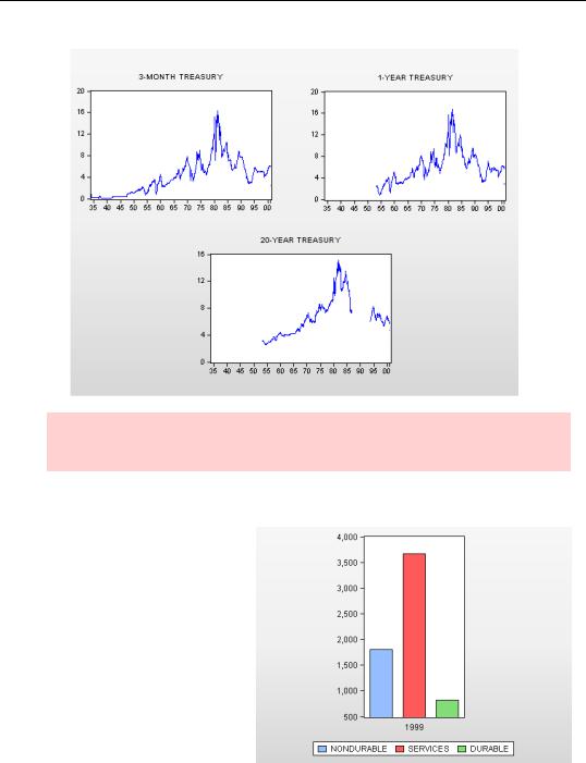
Hint: If you prefer, EViews can auto-arrange the individual graphs into neat rows and
columns. Right-click on the graph window and choose Position and align graphs...
Stack ´Em High
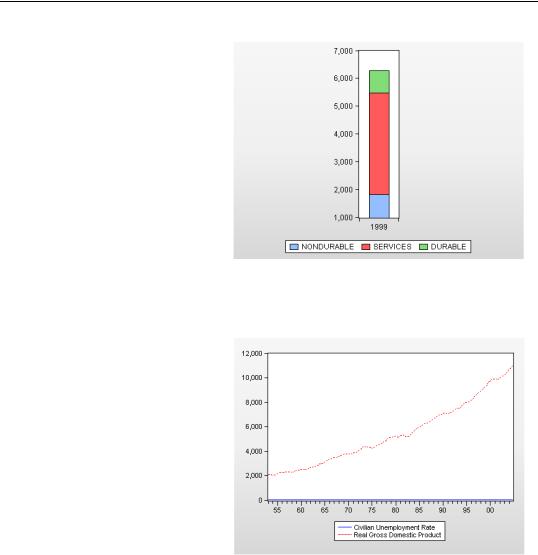
Several graph types let you “stack” multiple series, which is sort of like adding the data values in the series vertically. The first series is plotted in the usual way. The second is plotted as the sum of the first and the second series. The third as the sum of the first three series. And so forth. Here’s an ordinary bar graph (from the workfile “consumption sectors.wf1”) showing the various pieces of U.S. consumption in 1999.
140—Chapter 5. Picture This!
Using the Multiple series: field to tell EViews to Stack in single graph gives a better sense of how much total consumption was, as well as packing in the information while using less space. Several graph types provide this kind of stacking option.
Other than deciding on window arrangements, Line, Area, Bar, and Spike graphs are the same for a group as for a series, except that you get one line (set of bars, etc.) for each series in the group. So we won’t discuss these further.
Left and Right Axes in Group Line Graphs
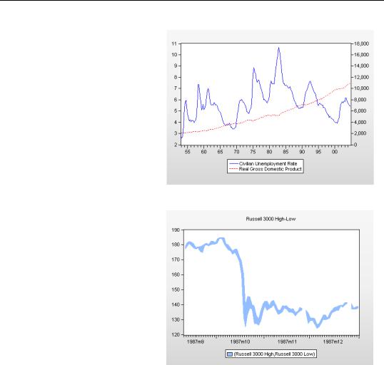
Well, truth-be-told, there’s one element of group line graphs that is worth discussing. The line graph to the right (from “Output_and_Unemployment.wf 1”) shows real GDP and the civilian unemployment rate. The first thing you’ll notice about this graph is that it’s completely useless. GDP and unemployment have different units of measurement, GDP being measured in billions of 2000 dollars and unemployment in percentage points. The former scale is so
much larger than the latter scale, that unemployment is all but invisible.
Group Graphics—141
Since the two series have different units of measurement, we need two vertical axes so that each series can be associated with meaningful units. Click the  button and switch to the Axes & Scaling group. Select series 2 (Real GDP) in the Series axis assignment field and click on the Right radio button.
Now we have a meaningful graph. We can see that GDP is strongly trended while unemployment isn’t. We can also see something of an inverse relation between bumps in GDP and unemployment.
One more option is immediately relevant. Return to the
Axes/Scales tab and click Overlap (lines cross) in the Vertical axes labels field.
142—Chapter 5. Picture This!
The Overlap option—this will not come as a great surprise— allows the lines to overlap. Since the lines “share” the vertical space, they’re each a little easier to read. The downside is that the viewer’s attention may be drawn to the line crossings, which for these series aren’t meaningful.
Now let’s take a look at some graph types that apply only when there’s more than one series.
Area Band
Area Band plots a band using pairs of series by filling in the area between the two sets of values. Band graphs are most often used to display forecast bands or error bands around forecasts.
EViews will construct bands from successive pairs of series in the group. If there is an odd number of series in the group, the final series will, by default, be plotted as a line.
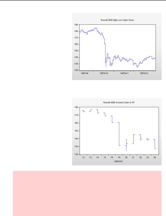
The example here shows high
and low prices for the Russell 3000 (a very broad index of U.S. stocks) in the later part of 1987.
Group Graphics—143
Mixed With Lines
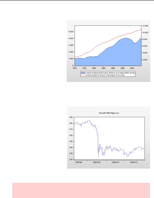
Mixed with Lines plots the first series in a group as an Area, Bar, or Spike graph (your choice) and the remaining series as lines. We’ve used this feature to put the U.S. national debt and GDP together in one picture. Note that we’ve used both left and right axes for labels. Note too how nicely mixing an Area and a Line graph illustrates that debt dropped dramatically in the second Clinton administration and rebounded in the first Bush administration, even while GDP growth was relatively steady.
High-Low — High-Low-Open-Close Graphs
High-Low graphs take observations from pairs of series and draw vertical lines connecting each pair, placing the value from the first series at the top and the value from the second series at the bottom. The most common use of the High-Low graph is to show opening and closing prices for a stock or other traded good, but these graphs are nifty any time you want to display a range of values at each date. The example here shows high and low prices for the Russell 3000 in
the later part of 1987 (“Russell3000.wf1”). October 19th really stands out, doesn’t it!
Hint: The legend isn’t displayed on High-Low graphs, so be sure to include your own label using the  button as we have here.
144—Chapter 5. Picture This!
High-Low graphs’ display of pairs extends to display of triples or quadruples. The first two series in the group mark the top and bottom of the vertical bar, respectively. If there are three series (perhaps the third series represents closing prices), values from the third series are shown with a right facing horizontal bar. If there’s a fourth series, then it’s shown with a right-fac- ing horizontal bar (perhaps representing closing prices) and the third series gets the left-facing bar.
These graphs carry a lot of information. They’re probably most effective when limited to a small number of data points. The version shown to the right covers two weeks, whereas the previous graph had four months of data. This shorter graph does a better job of showing market behavior in the period right around the 1987 stock market crash.
Orderly hint: The order in which the series appear in the group matters for the HighLow graph. EViews puts series in the same order as you select them in the workfile window, but the order is easily re-arranged by choosing the Group Members view and manually editing the list. This is true for any group, but it’s especially important for graphs such as the High-Low graph, where the order of the series affects their interpretation.
Be sure to click the  button when you’re done re-arranging.
Group Graphics—145
Error Bar Graphs
Error bar graphs are similar to High-Low graphs in that pairs of observations from the first two series are used to mark the high and low values of vertical lines. They’re slightly different in that error bar graphs have small horizontal caps drawn at the top and bottom of each line. When there’s a third series, its value is marked by placing a symbol on the vertical line. Such triplet error bar graphs are commonly used for showing point estimates together with confidence bands, for example, after forecasting a series.
Hint: Use an error bar graph whenever you want to draw primary attention to a central point (the third series) and secondary attention to a range.
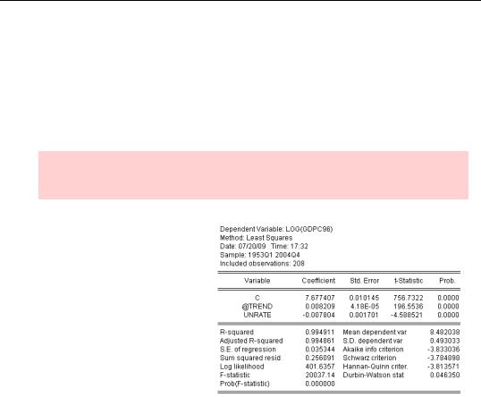
As an example, we estimated log(GDP) as a function of unemployment and a time trend, and then used EViews’ forecasting feature to put the forecast values of GDP in the series GDPC96F and the forecast standard errors in GDPC96SE.
The command
show gdpc96f+1.96*gdpc96se gdpc96f-1.96*gdpc96se gdpc96f
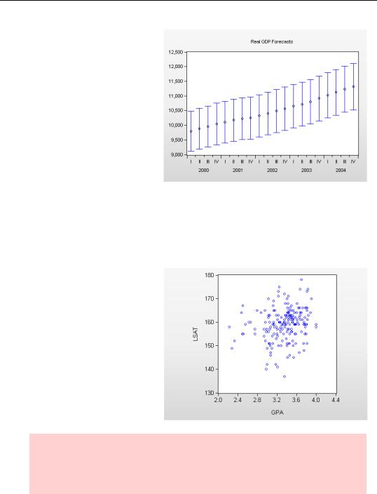
146—Chapter 5. Picture This!
opened a group window which we then switched to an Error Bar graph. (We added the title manually.)
Of course, EViews can also produce forecast graphs with confidence intervals automatically.
See Chapter 8, “Forecasting.”
Scatter Plots
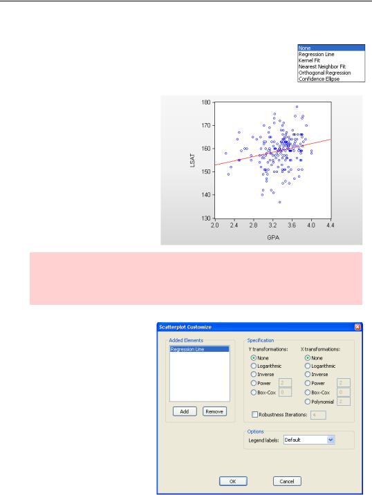
Scatter plots are used for looking at the relation between two—or more—variables. We’ll use data on undergraduate grades and LSAT scores for applicants to the University of Washington law school to illustrate scatter plots (“Law 98.wf1”).
Simple Scatter
At the default settings, Scatter creates a scatter plot using the first series in the group for X-axis values and the second series for the Y-axis. While there’s a tendency for higher undergraduate grades to be associated with higher LSAT scores, as shown on the graph to the right, the relationship certainly isn’t a very strong one. (If there were a really strong relationship, law schools wouldn’t need to look at both grades and test scores.)
Hint: Scatter plots don’t give good visuals when there are too many observations. The plots tend to get too “busy” to discern patterns. Additionally, scatter plots with very large numbers of observations can take a very, very long time to render when the graphs are copied outside of EViews.
Group Graphics—147
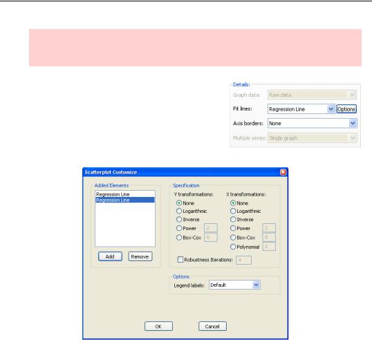
Scatter with Regression
EViews offers several options for fitting a line or curve to the data in a scatter plot in the Fit Lines menu. Regression Line is the one most commonly used. (To learn about the other options see the User’s Guide.)
As you might expect, Regression Line adds a least squares regression line to the scatter plot we’ve just seen.
Hint: The equation for the line shown is, of course, the equation estimated by the command
ls lsat c gpa
If you want to fit the line to transformed data, using logs for example, choose  to bring up the Scatterplot Customize dialog to choose from a variety of transformations.
148—Chapter 5. Picture This!
Hint: Changing the axis scales to logarithmic is different than drawing the fitted line using logs in the Scatterplot Customize dialog. The former changes the display of the scattered points while the latter changes how the line is drawn. Changing the axis scales is covered in Chapter 6, “Intimacy With Graphic Objects.”
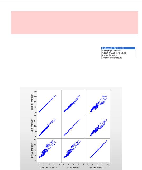
Multiple Scatters
If the group has more than two series, EViews presents a number of choices in the Multiple series: field of the Graph Options dialog. The default is to add more scatterings to the plot using the third series versus the first, the fourth series versus the first, and so on. Alternatively, choosing Multiple
graphs - First vs. All puts each scatter in its own plot. You can also see all the possible pairs of series in the group in individual scatter plots by choosing Scatterplot matrix. It’s clear that the 3-month rate is more closely related to the 1-year rate than it is to the 20-year rate. Not surprising, of course.
Group Graphics—149
Where Scatterplot matrix gives each series a turn on both horizontal and vertical axes, Lower triangular matrix shows a single orientation for each pair.
If you have four or more series in a group, Scatter adds the choice
Multiple Graphs - XY Pairs which plots a scatter of the second series (on the vertical axis) versus the first series (on the horizontal axis), the fourth series versus the third series, and so forth. Contrast with
Multiple graphs - First vs. All, which uses the first series for the
horizontal axis and places all the remaining series on the vertical axis.
Togetherness of the First Sort
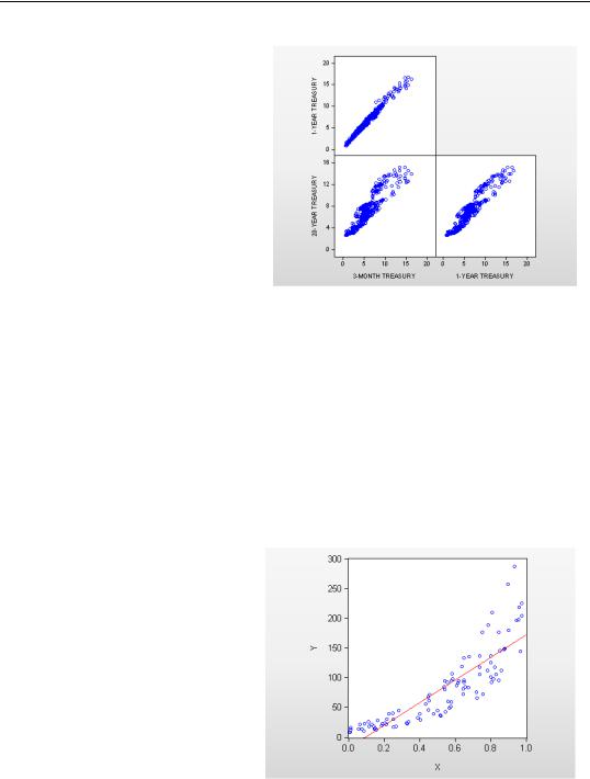
Scatter plots (XY Line plots too) have a special feature by which you can include multiple fitted lines on one scatter plot. We’ll use this feature to illustrate what happens when you misspecify the functional form in a regression.
First, we’ll generate some artificial data:
workfile u 100
series x = rnd
series log(y) = 2+3*x+rnd
Now we’ll make a scatter plot and have EViews put in the standard (misspecified) linear regression line. Notice the predominance of positive errors for both low and high values of X.
150—Chapter 5. Picture This!
Clever observation: Did you notice that EViews cleverly solved for Y even though we specified log(Y) on the left of the series command?
To add a second fitted line, click the  button in the Details: field to bring up the Scatterplot Customize dialog. Click
  for a new regression line, this one using a log transformation on the Y variable.
Using the right specification sure fits the data a lot better!
Group Graphics—151
Scatter Plots and Distributions
Scatter plots help us understand the joint distribution of two variables, answering questions such as: “If variable one is high, is variable two likely to be high as well?” We can add information about the marginal distributions of each variable by turning on Axis borders. We can also add confidence ellipses through the Fit lines: menu and the  button. Here we’ve added histograms to the axes in our law school admission example, as well as two confidence
ellipses. The confidence ellipses enclose areas that would contain 90 percent and 95 percent, respectively, of the sample if the sample was drawn from a normal distribution. Of course, as you can see from the histograms, the data are not drawn from a normal distribution.
152—Chapter 5. Picture This!
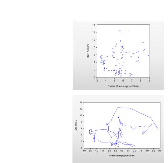
XY Line and XY Area Graphs
XY Line graphs are really just scatter plots where the consecutive points are connected, and XY Area graphs are XY Line graphs with the area below the line filled in. Contrast a scatter diagram (shown right) of inflation versus unemployment (“Output_and_Unemployment.w f1”) from 1959 through 1979 with the same data shown with connecting lines (shown next).
The connecting lines give a much clearer hint that we’re seeing a series of negatively sloped, relatively flat lines that are moving up over time.
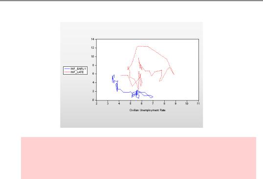
Let’s try a little trick for displaying pre-1970 and 1970’s inflation separately on the same graph.
By making separate series for inflation in different periods, we can exploit the ability of XY Line graphs to show multiple pairs. We create our series with the commands:
smpl 59 69
series inf_early = inflation
smpl 70 79
series inf_late = inflation
smpl 59 79
The series INF_EARLY has inflation from 1959 through 1969 and NAs elsewhere. Similarly, INF_LATE is NA except for 1970 through 1979. Now we open a group with the unemployment rate as the first series and INF_EARLY and INF_LATE as the second and third series. We can exploit the fact that EViews doesn’t plot observations with NA values to get a very nice looking XY Line graph.
Group Graphics—153
Obscure graph type hint: The graph type XY Bar (X-X-Y triplets) lets you draw bar graphs semi-manually. Vertical bars are drawn with the left edge specified by the first series, the right edge specified by the second series, and the height given by the third series.
Pie Graphs
Pie graphs don’t fit neatly into the EViews model of treating a series as the relevant object. The Pie Graph command produces one pie for each observation. The observation value for each series is converted into one slice of the pie, with the size of the slice representing the observation value of one series relative to the same period’s observation for the other series. For example, if there are three series with values p, p, and 2p , the first two slices will each take up one quarter of the pie and the third slice will occupy the remaining half.
154—Chapter 5. Picture This!
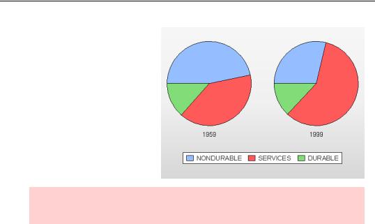
Here’s a simple pie chart (“consumption sectors.wf1”) showing the relative sizes of the consumption of durables, nondurables, and services in the United States in 1959 and 1999. (We’ve turned on Label Pies in the Bar- Area-Pie section of the Graph Elements group in the Graph Options dialog.) It’s easy to see here the dramatic increase in the size of the service sector.
Hint: In case you were wondering, there’s no way to automatically label individual slices.
Most EViews graphs render pretty nicely in monochrome, even if you’ve created the graphs in color. Pie graphs don’t make out quite so nicely, so you’ll want to do a little more customization for black and white images. The aesthetic problem is that pie graphs have large filled in areas right next to each other. Colors distinguish; in monochrome, adjacent filled areas don’t look so good. (If you have access to both the black and white printed version of this book and the electronic, color version, compare the appearance of the pie chart above. Color looks a lot better.)
The solution is further complicated because there are two ways to get a monochrome graph out of EViews. You can tell EViews to render it without color by unchecking Use Color in the appropriate Save or Copy dialogs, or by sending it directly to a monochrome printer. When EViews knows that it’s rendering in black and white, it does a decent job of picking grey scales. Alternatively, you can copy the image in color into another program and then let the other program render it the best it can.