
- •Table of Contents
- •Foreword
- •Chapter 1. A Quick Walk Through
- •Workfile: The Basic EViews Document
- •Viewing an individual series
- •Looking at different samples
- •Generating a new series
- •Looking at a pair of series together
- •Estimating your first regression in EViews
- •Saving your work
- •Forecasting
- •What’s Ahead
- •Chapter 2. EViews—Meet Data
- •The Structure of Data and the Structure of a Workfile
- •Creating a New Workfile
- •Deconstructing the Workfile
- •Time to Type
- •Identity Noncrisis
- •Dated Series
- •The Import Business
- •Adding Data To An Existing Workfile—Or, Being Rectangular Doesn’t Mean Being Inflexible
- •Among the Missing
- •Quick Review
- •Appendix: Having A Good Time With Your Date
- •Chapter 3. Getting the Most from Least Squares
- •A First Regression
- •The Really Important Regression Results
- •The Pretty Important (But Not So Important As the Last Section’s) Regression Results
- •A Multiple Regression Is Simple Too
- •Hypothesis Testing
- •Representing
- •What’s Left After You’ve Gotten the Most Out of Least Squares
- •Quick Review
- •Chapter 4. Data—The Transformational Experience
- •Your Basic Elementary Algebra
- •Simple Sample Says
- •Data Types Plain and Fancy
- •Numbers and Letters
- •Can We Have A Date?
- •What Are Your Values?
- •Relative Exotica
- •Quick Review
- •Chapter 5. Picture This!
- •A Simple Soup-To-Nuts Graphing Example
- •A Graphic Description of the Creative Process
- •Picture One Series
- •Group Graphics
- •Let’s Look At This From Another Angle
- •To Summarize
- •Categorical Graphs
- •Togetherness of the Second Sort
- •Quick Review and Look Ahead
- •Chapter 6. Intimacy With Graphic Objects
- •To Freeze Or Not To Freeze Redux
- •A Touch of Text
- •Shady Areas and No-Worry Lines
- •Templates for Success
- •Point Me The Way
- •Your Data Another Sorta Way
- •Give A Graph A Fair Break
- •Options, Options, Options
- •Quick Review?
- •Chapter 7. Look At Your Data
- •Sorting Things Out
- •Describing Series—Just The Facts Please
- •Describing Series—Picturing the Distribution
- •Tests On Series
- •Describing Groups—Just the Facts—Putting It Together
- •Chapter 8. Forecasting
- •Just Push the Forecast Button
- •Theory of Forecasting
- •Dynamic Versus Static Forecasting
- •Sample Forecast Samples
- •Facing the Unknown
- •Forecast Evaluation
- •Forecasting Beneath the Surface
- •Quick Review—Forecasting
- •Chapter 9. Page After Page After Page
- •Pages Are Easy To Reach
- •Creating New Pages
- •Renaming, Deleting, and Saving Pages
- •Multi-Page Workfiles—The Most Basic Motivation
- •Multiple Frequencies—Multiple Pages
- •Links—The Live Connection
- •Unlinking
- •Have A Match?
- •Matching When The Identifiers Are Really Different
- •Contracted Data
- •Expanded Data
- •Having Contractions
- •Two Hints and A GotchYa
- •Quick Review
- •Chapter 10. Prelude to Panel and Pool
- •Pooled or Paneled Population
- •Nuances
- •So What Are the Benefits of Using Pools and Panels?
- •Quick (P)review
- •Chapter 11. Panel—What’s My Line?
- •What’s So Nifty About Panel Data?
- •Setting Up Panel Data
- •Panel Estimation
- •Pretty Panel Pictures
- •More Panel Estimation Techniques
- •One Dimensional Two-Dimensional Panels
- •Fixed Effects With and Without the Social Contrivance of Panel Structure
- •Quick Review—Panel
- •Chapter 12. Everyone Into the Pool
- •Getting Your Feet Wet
- •Playing in the Pool—Data
- •Getting Out of the Pool
- •More Pool Estimation
- •Getting Data In and Out of the Pool
- •Quick Review—Pools
- •Chapter 13. Serial Correlation—Friend or Foe?
- •Visual Checks
- •Testing for Serial Correlation
- •More General Patterns of Serial Correlation
- •Correcting for Serial Correlation
- •Forecasting
- •ARMA and ARIMA Models
- •Quick Review
- •Chapter 14. A Taste of Advanced Estimation
- •Weighted Least Squares
- •Heteroskedasticity
- •Nonlinear Least Squares
- •Generalized Method of Moments
- •Limited Dependent Variables
- •ARCH, etc.
- •Maximum Likelihood—Rolling Your Own
- •System Estimation
- •Vector Autoregressions—VAR
- •Quick Review?
- •Chapter 15. Super Models
- •Your First Homework—Bam, Taken Up A Notch!
- •Looking At Model Solutions
- •More Model Information
- •Your Second Homework
- •Simulating VARs
- •Rich Super Models
- •Quick Review
- •Chapter 16. Get With the Program
- •I Want To Do It Over and Over Again
- •You Want To Have An Argument
- •Program Variables
- •Loopy
- •Other Program Controls
- •A Rolling Example
- •Quick Review
- •Appendix: Sample Programs
- •Chapter 17. Odds and Ends
- •How Much Data Can EViews Handle?
- •How Long Does It Take To Compute An Estimate?
- •Freeze!
- •A Comment On Tables
- •Saving Tables and Almost Tables
- •Saving Graphs and Almost Graphs
- •Unsubtle Redirection
- •Objects and Commands
- •Workfile Backups
- •Updates—A Small Thing
- •Updates—A Big Thing
- •Ready To Take A Break?
- •Help!
- •Odd Ending
- •Chapter 18. Optional Ending
- •Required Options
- •Option-al Recommendations
- •More Detailed Options
- •Window Behavior
- •Font Options
- •Frequency Conversion
- •Alpha Truncation
- •Spreadsheet Defaults
- •Workfile Storage Defaults
- •Estimation Defaults
- •File Locations
- •Graphics Defaults
- •Quick Review
- •Index
- •Symbols

Picture One Series—131
Picture One Series
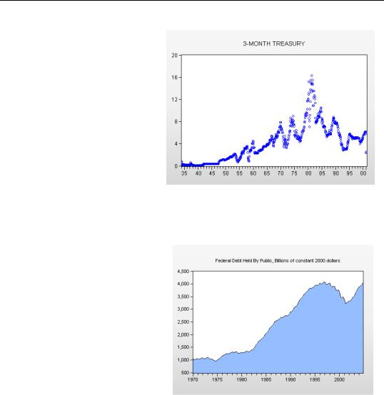
Our soup-to-nuts example graphed three interest rates together. Now we step back and for the sake of simplicity look at the various graphic views available for a single series, all of which are available by opening a series window and choosing View/Graph…. All these graph types are available for Groups as well, as are additional types discussed in Group Graphics below.
Line Graph (…and Dot Plots)
A series line graph is just like the group line graph we saw above, except it only shows a single series. The line graph plots the value of the series on the vertical axis against the date on the horizontal axis.

132—Chapter 5. Picture This!
An EViews Dot Plot is a line graph with the lines replaced with little circles. Series in a dot plot are indented a little to improve their visual appearance.
Area Graph
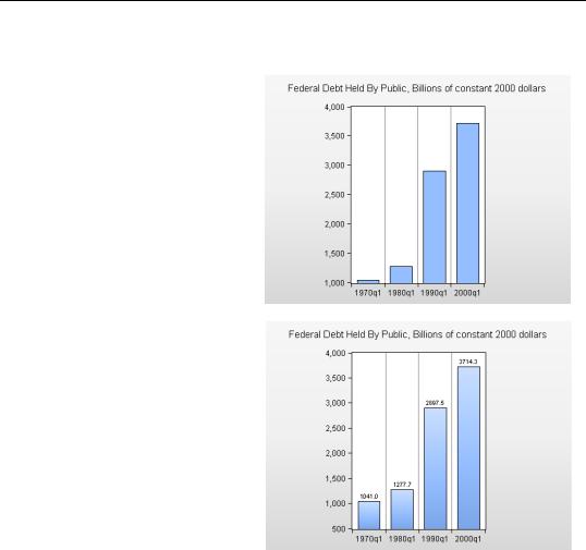
An area graph is a line graph with the area underneath the line filled in. The same information is displayed in line and area graphs, but area graphs give a sense that higher values are “bigger.” Interest rates are probably better depicted as line graphs. In contrast, an area graph of the federal debt held by the public emphasizes that the U.S. national debt is one whole heck of a lot more than it used to be.

Picture One Series—133
Bar Graph
A bar graph represents the height of each point with a vertical bar. This is a great format for displaying a small number of observations; and a crummy format for displaying large numbers of observations. The figure to the right shows federal debt for the first observation in each decade. Note that EViews has drawn vertical lines to indicate breaks in the sample.
Bar labels can be added with the click of a radio button in the Fill Areas tab of the Graph Options dialog. An example is shown to the right. Note that we have also used the options page to add a neat fade effect to the bars.

134—Chapter 5. Picture This!
Spike Graph
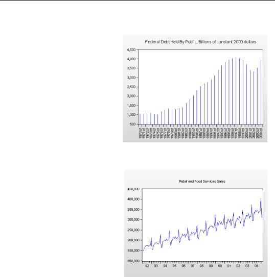
A spike graph is just like a bar graph—only with really skinny bars. It’s especially useful when you have too many categories to display neatly with a bar graph. Here’s a version of our debt graph, using spikes to show the first quarter of each year with padding for excluded obs.
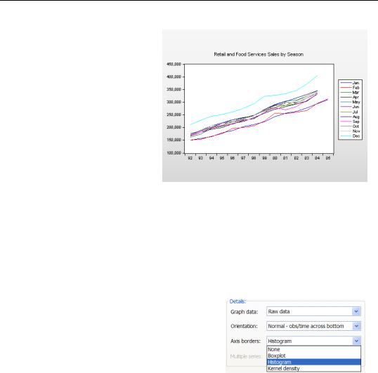
Seasonal Graphs
The standard line graph to the right shows U.S. retail and food service sales over a dozen years. Notice the regular spikes. How fast can you say “Christmas?”

Picture One Series—135
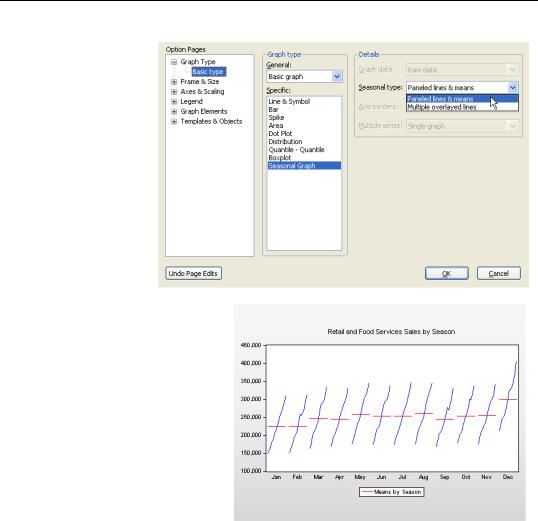
Change the Graph type to Seasonal and the right-hand side of the Graph Option dialog changes to give you choices of two kinds of seasonal graphs.
Paneled lines &
means draws one line graph for each season, and also puts in a horizontal line to mark the seasonal mean. Since our retail sales data (“Retail Sales.wf1”) is in a monthly workfile, that means twelve lines.
Using a Paneled lines & means graph it’s easy to see that December sales are relatively high and that sales in January and February are typically low.

136—Chapter 5. Picture This!
Multiple overlayed lines graphs also provide one line for each season, but use a common date axis. For our retail sales data, the Multiple overlayed lines graph does a particularly good job of showing how December (higher) and January and February (lower) compare to the remaining months.
Distribution, Quantile-Quantile, and Boxplots
Distribution graphs, quantile-quantile plots, and boxplots provide pictures of the statistical distribution of the data, rather than plotting the observations directly. (A histogram is probably the most familiar example.) These graphs are discussed in Chapter 7, “Look At Your Data”, on page 195.
Axis Borders
Even though discussion of distribution graphs awaits Chapter 7, we’ll sneak in one marginal comment. EViews lets you decorate the axes of most graphs with small histograms or other distribution graphs by using the Axis borders: menu. This is a great technique for looking at raw data and distribution information together.