

126—Chapter 5. Picture This!
Hint: It’s best to do as much graph editing as possible inside EViews—before export- ing—so that EViews has a chance to “touch-up” the final picture. See Graphic AutoTweaks above.
Graph Save To Disk
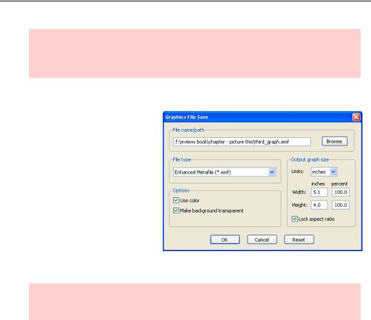
The alternative to copy-and-paste is to save a graph as a disk file. Choose Save to disk… either from the  button or the rightclick menu to bring up the
Graphics File Save dialog. From here you can choose a file format (including EMF, EPS, GIF, JPEG, PNG, PDF, and BMP), whether or not to use color, and whether or not to make the background of the graph transparent. You can also adjust the picture size and, of course, pick a location on the disk to save the file.
Hint: There isn’t any way to read a graphic file into EViews, nor can you paste a picture from the clipboard into an EViews object.
A Graphic Description of the Creative Process
Graph creation involves four basic choices:
•What specific graph type should be used to display information? Line graph? Scatter plot? Something more esoteric perhaps?
•Do you want to graph your raw data, or are you looking to graph summary statistics such as mean or standard deviation?
•Do want a “basic” or a “categorical” graph, the latter graph type displaying your data with observations split up into categories specified by one or more control variables? For example, you might compare wage and salary data for unionized and non-union- ized workers.
•If more than one group of data is being graphed, i.e. multiple series or multiple categories, how would you like them visually arrayed? Multiple graphs? All in one graph?
A Graphic Description of the Creative Process—127
While it’s helpful to think of these as four independent choices, there is some interaction among them. For example, the number of series in the window determines the choices of graph types that are available. (A scatter diagram requires (at least!) two series, right?) The Graph Options dialog adjusts itself to display options sensible for the data at hand.
Stressing out: Making a graph is starting to sound awfully complicated.
Hakuna matata: Probably half the graphs ever produced in EViews are line graphs. As you’ve already seen this requires you to:
1.Open a window with desired data.
2.Choose Graph… from the View menu.
3.Click  .
.
Thinking about the four basic choices in graph creation is a useful organizing principle, but the truth is most graphs are made with a couple of mouse clicks and where to click is usu-
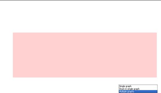
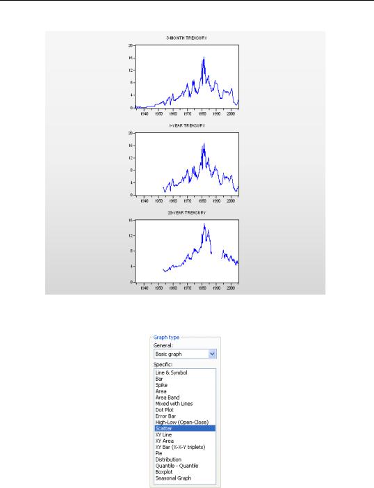
ally pretty obvious. We’ve been showing our interest rate data in a single graph as a useful way to show that interest rates of different maturities largely move together. To show each series separately, set the Multiple series: dropdown menu to Multiple graphs. Presto!
128—Chapter 5. Picture This!
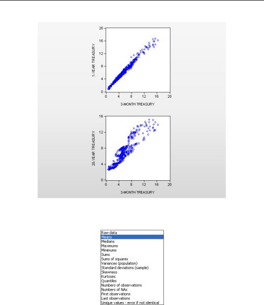
Or suppose we wanted a scatter plot of long rates against the short (3-month) rate? Just choose the Scatter and accept the defaults settings.
to display the scatterplots:
A Graphic Description of the Creative Process—129
But here’s my favorite one-click wonder: Change the Graph type back to Line & Symbol and then with a single click, change Graph data: to Means:
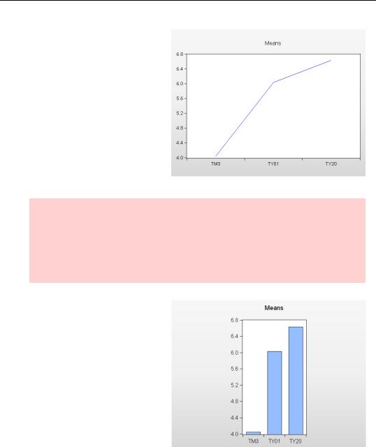
130—Chapter 5. Picture This!
The graph now flicks from raw data to a particularly interesting summary. Instead of a line graph for each series, EViews plots the mean for each series and connects the means with a line. This view of interest rates, called an average yield curve, shows at a glance that long term interest rates are typically higher than short-term rates, with 20-year bonds paying on average about 2.5 percentage points more than 3-month bonds.
Financial econometrics visualization alert: This average yield curve worked out neatly because the series in the group “just happened to be” ordered from short maturity to long maturity. If we’d chosen a different order for the series, the line connecting the means wouldn’t have been meaningful. As is, the scaling on the horizontal axis is a little misleading. We probably think of the one-year rate as being close to the 3-month rate, not halfway between the 3-month and 20-year rates.
My favorite two-click wonder takes the previous graph and adds a click on Bar to give us this version of the same summary information.