

Chapter 5. Picture This!
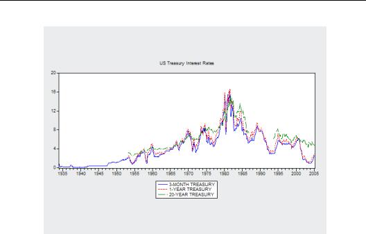
Interest rates over a wide spectrum of maturities—three months to 20 years—mostly move up and down together. Long term interest rates are usually, although not always, higher than short term interest rates. Long term interest rates also bounce around less than short term interest rates. One picture illustrates all this at a glance.
This chapter introduces EViews graphics. EViews can produce a wide variety of graphs, and making a good looking graph is trivial. EViews also offers a sophisticated set of customization options, so making a great looking graph isn’t too hard either. In this chapter we focus on the kinds of graphs you can make, leaving most of the discussion of custom settings to Chapter 6, “Intimacy With Graphic Objects.”
We start with a simple soup-to-nuts example, showing how we created the interest rate illustration above. This is followed by simpler examples illustrating, first, graph types for single series and, next, graph types for groups of series.
A Simple Soup-To-Nuts Graphing Example
The workfile “Treasury_Interest_Rates.wf1” contains monthly observations on interest rates with maturities from three months to 20 years. Multiple series are plotted together in the same way that EViews always analyzes multiple series together: as a group. To get started,
118—Chapter 5. Picture This!
create a group by selecting the three-month, one-year, and 20-year interest rate series, TM3, TY01, and TY20, with the mouse, opening them as a group, and then naming the group RATES_TO_GRAPH. (As a reminder, you select multiple series by holding down the Ctrl key.) Equivalently, type the command:
group rates_to_graph tm3 ty01 ty20
and then doubleclick
 to
to
open the group. The menu
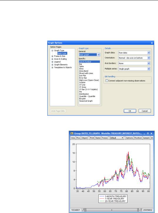
View/Graph… brings up the
Graph Options dialog. This master dialog can be used to create a wide variety of graph types, and also provides entry for tuning a graph’s appearance after it’s created.
For now, hit  to produce a simple line graph. This graph looks pretty good. You can print it out or copy it into a word processor and be on your merry way.
A Simple Soup-To-Nuts Graphing Example—119
Hint: Where did those nice, long descriptive names in the legend come from? EViews automatically uses the DisplayName for each series in the legend, if the series has one. (See “Label View” on page 30 in Chapter 2, “EViews—Meet Data.”) If there is no DisplayName, the name of the series is used instead.
Hint: If you hover your cursor over a data point on a line in the graph EViews will show you the observation label and value. If you hover over any other point inside the graph frame, EViews will display the values in the statusline located in the lower lefthand corner of your EViews window.
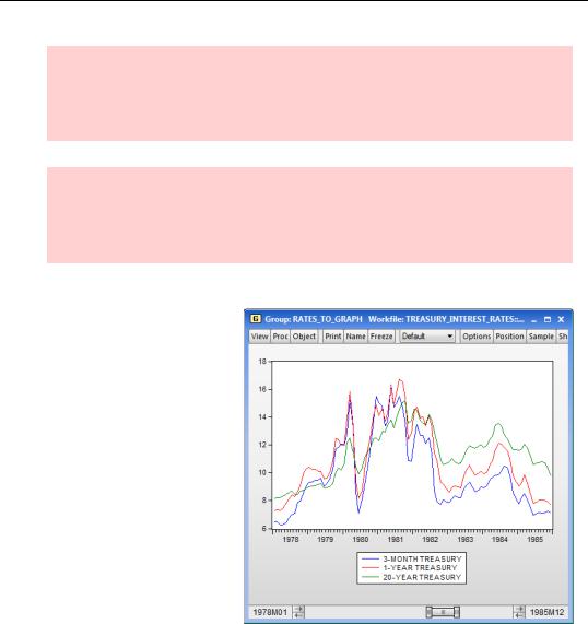
Get A Closer Look
Notice the slider bar at the bottom of the graph? If we want to look more closely at a specific part of the data, we can resize it and move it to blow up a part of the graph. To see the action during the peak, we drag and resize the slider bar to show data between 1978 and 1985.
You should be aware that when you close the window, the visible range will be reset. If you’d like to capture what you see, you might want to consider freezing the graph.
To Freeze Or Not To Freeze
Before adding any customizations, we have a choice to make about whether to freeze the graph. The group we’re looking at right now is fundamentally a list of data series, which we happen to be looking at in a graphics view. If we change any of the underlying data, the change will be reflected in the picture. Same thing if we change the sample. For that matter, we can switch to a different graphics view or even a spreadsheet or statistical view. But a group view does have one shortcoming:
120—Chapter 5. Picture This!
•When you close a group window or shift to another view, many customizations you’ve made on the graph disappear.
Freezing a graph view creates a new object—a graph object—which is independent from the original series or group you were looking at.
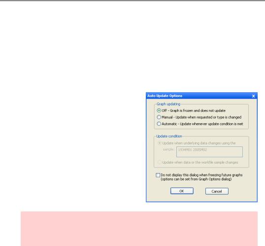
A graph object is fundamentally a picture that happens to have started life as a graphic view. You make a graph object by looking at a graphic view, as we are at the moment, and hitting the  button.
A dialog opens, allowing you to choose how you want your new graph object to be tied to the underlying data. Selecting Manual or Automatic update will keep the graph object tied to the data in the series or group that it came from. When the data changes, the graph object will reflect the new values. To update the graph with any applicable changes, select Automatic. To control when the graph update occurs, select Manual. If you’d rather freeze the graph as a snapshot of its current state, select Off. Click  to create the graph object.
Hint: If you select Off and then decide you’d like to relate the graph object to its underlying data again, you can always change your selection later in the master Graph Options dialog, in the Graph Updating section.
A Simple Soup-To-Nuts Graphing Example—121
A new window opens with the same picture, but with “Graph” in the titlebar instead of “Group,” and with a different set of buttons in the button bar. Named graph objects appear in the workfile window with a  icon. An orange icon alerts us to a graph that will update with changes in the data, while a green icon indicates that updating is off.
Hint: Because a frozen graph with updating off is severed from the underlying data series, the options for changing from one type of graph to another (categorical graph, distribution plot, etc.) are limited. It’s generally best to choose a graph type before freezing a graph if you intend to keep updating off.
Frozen graphs have two big advantages:
•Customizations are stored as part of the graph object, so they don’t disappear.
•You can choose whether or not you want the graph to change every time the data or sample changes.
A good rule of thumb is that if you want any changes to a graph to last, freeze it.
Hint: To make a copy of a graph object, perhaps so you can try out new customizations without messing up the existing graph, click the  button and choose Copy Object…., or press the
  button to create a graph object with updating turned off. A new, untitled graph window will open.
122—Chapter 5. Picture This!
A Little Light Customization
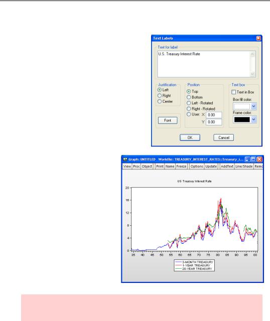
To add the title “US Treasury Interest Rates,” click the  button. Enter the title in the
Text for label field and change Position to Top.
The graph now looks almost like the picture opening the chapter. The remaining difference is that all the series in this picture are drawn with solid lines, while the opening picture used a variety of solid, dashed, and dotted lines. (Actually, there’s one other difference. The opening graph is stretched horizontally to make it look more dramatic. See Frame & Size in the next chapter.)
Hint: Unlike many customization options,  is only available after a graph has been frozen.
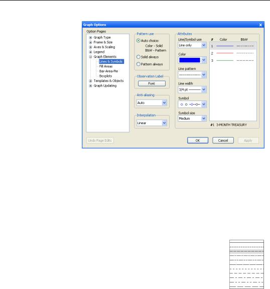
Whenever more than one series appears on a graph, the question arises as to how to visually distinguish one graphed line from another. The two methods are to use different colors and to use different line patterns. Different colors are much easier to distinguish—unless your output device only shows black and white!
A Simple Soup-To-Nuts Graphing Example—123
Click the graph window’s  button. Initially, the dialog opens to the Lines & Symbols section. The default Pattern use is Auto choice, which uses solid lines when EViews renders the graph in color and patterned lines when EViews renders the graph in black and white. Using the
Auto choice
default, the graph appears in solid lines distinguished by colors on your display screen, but patterned black lines are used if you print from EViews to a monochrome printer.
This default is usually the right choice. But imagine that you’re producing a graph for a document that some readers will read electronically, and therefore in color, while others will read in a book, and therefore in black and white. Our best compromise is to use color and line patterns. Readers of the electronic version will see the color, and readers in traditional media will be able to distinguish the lines by their patterns. Change the Pattern use radio button to Pattern always. (I’ll do this for graphs later in the chapter without further ado.)
The default line patterns are solid, short dashes, and long dashes. Click on line 3 in the right side of the dialog to select the 20-year treasury rate. Then select the Line pattern dropdown menu, and change the pattern to the very long dashes appearing at the end of the list.
124—Chapter 5. Picture This!
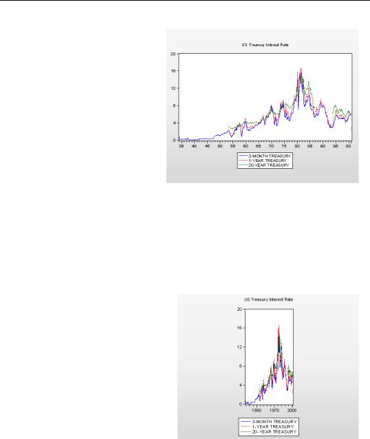
Click  to see the third version of the graph, which is virtually identical to the one that opened the chapter.
Graphic Auto-Tweaks
In making an aesthetically pleasing data graph, EViews hides the details of many complex calculations. Graphic output is tuned with many small tweaks to make the graph look “just right.” In particular, well done graphics scale nonlinearly. In other words, if you double the picture size, picture elements don’t simply grow to twice their original size. If you plan to print or publish a graphic, try to make it as close as possible to its final appearance while it’s still inside EViews. Pay particular attention to color versus monochrome and to the ratio of height versus width.
As an example, we switched the graph above to be tall and skinny. (See Frame & Size in the next chapter.) Notice that EViews switched the tick labeling on both horizontal and vertical axes to keep the labeling looking pretty.
The aesthetic choices made by EViews involve complicated interactions between space, font sizes, and other factors. Although all the options can be controlled manually, it’s generally best to trust EViews’ judgment.
Print, Copy, Or Export
It’s not hard to print a copy of a graph—just click the  button. If you’re sending to a color printer, check the Print in Color checkbox in the print dialog.

A Simple Soup-To-Nuts Graphing Example—125
To make a copy of a graph object inside an EViews workfile, use Object/Copy Object…, or copy and paste the object in the workfile window. To make an external copy, you can either copy-and-paste or save the graph as a file on disk.
Graph Copy-and-Paste
With the graph window active, you copy the graph onto the clipboard by hitting the  button and choosing Copy…, or by choosing Copy… from the right-click menu, or with the usual Ctrl-C. Then paste into your favorite graphics program or word processor. EViews pictures are editable, so a certain amount of touch-up can be done in the destination program.
If you’d like to do even more editing after your graph is in your source document, you should paste as an embedded graph. Embedded graphs are images which can be opened up and edited in EViews. When you paste into your source document, choose Paste Special...
and select Paste as EViews Object in the dialog.
To keep EViews completely in the picture, you can paste as a link, which will be updated whenever EViews changes. Select Paste Link as EViews Object in the Paste Special... dialog.
See the User’s Guide for a complete discussion of using OLE (Object Linking and Embedding).
Hint: Copying a graph object in the workfile window is different from copying from a graph window. The latter puts a picture on the clipboard that can be pasted into another program. The former copies the internal representation of the graph which can only be pasted into an EViews workfile. The picture you want won’t show up on the clipboard.
Exporting options are covered in some detail in Chapter 6, “Intimacy With Graphic Objects,” but two options are used frequently enough that we mention them now.
By default, EViews copies in color. If the graph’s final destination is black-and-white, it’s generally better to take a monochrome copy out of EViews, because EViews makes different choices for line styles and backgrounds when it renders in monochrome.
The picture placed on the clipboard is provided as an enhanced metafile, or EMF. While this is the best all-around choice, some graphics and typesetting programs prefer encapsulated postscript, or EPS. This is particularly true for LaTeX and some desktop publishing programs. Although EViews won’t put an EPS picture on the clipboard, it will save a file in EPS format using Proc/Save graph to disk… as described in the next section.