

Beginning SharePoint With Excel - From Novice To Professional (2006)
.pdf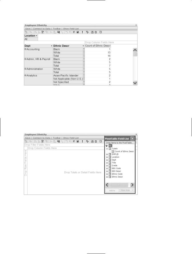
186 CHAPTER 9 ■ USING SHAREPOINT’S OFFICE WEB PARTS
Figure 9-8. You use the Office PivotTable Web Part to summarize, aggregate, and analyze data in columns and rows.
In a PivotTable, you can put fields in the Column Area, as in a datasheet, but in addition, you can add fields to the Row Area, and summarize them in the Data Area. You can also add fields to the PivotTable in the Filter Area that allow you to filter the data.
Figure 9-9 shows an empty PivotTable ready to receive data fields.
Figure 9-9. In an Office PivotTable Web Part, you can add fields to the Column, Row, Data, and Filter Areas.

CHAPTER 9 ■ USING SHAREPOINT’S OFFICE WEB PARTS |
187 |
To begin building a PivotTable, click Show Field List on the toolstrip. Drag fields from the field list to the appropriate areas.
■Note Just a reminder that if you’re unfamiliar with PivotTables, we recommend that you study them in Excel before attempting to work with them in SharePoint. Although they’re basically the same, Excel offers extensive help on how to work with PivotTables.
To group items, select the items in the Row Area you want to group. If they’re noncontiguous, hold Ctrl to select the items. Right-click the selection and choose Group. The PivotTable displays the group to the left of the column. To change the name of the group, follow these steps:
1.Click the Commands and Options button on the toolbar.
2.Click the Captions tab.
3.Click the item in the PivotTable you want to rename and then enter a new name in the Caption text box. You can use this method to rename any fields.
Using the Office PivotChart Web Part
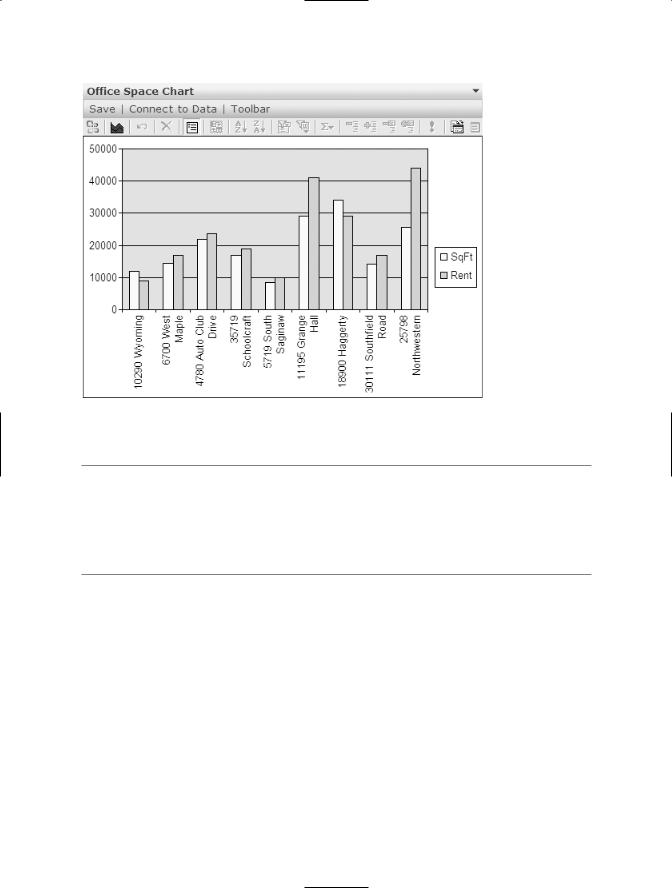
The Office PivotChart Web Part, shown in Figure 9-10, converts tabular data to graphical. The available features closely resemble Excel’s Chart Wizard, but the PivotChart Web Part isn’t nearly as intuitive or easy to use. When you connect the data sources, the web part automatically creates a chart based on the data. However, it might be a long way from the chart you want to see. First of all, the PivotChart Web Part cannot chart noncontiguous data. To chart data that isn’t contiguous, you need to rearrange the original data source to make the columns or rows you want to chart contiguous.
188 CHAPTER 9 ■ USING SHAREPOINT’S OFFICE WEB PARTS
Figure 9-10. The Office PivotChart Web Part displays data in a graphical format.
■Tip If the data source is a Spreadsheet Web Part, you can easily identify the data you want to chart from the data source itself. To modify the data range displayed in the PivotChart Web Part, select the data you want to chart in the Spreadsheet Web Part, then click the down arrow on the data source’s title bar. Choose Set Chart Range to establish a new data range for the chart. Using these two web parts together, you can create a nifty reporting interface for your users.
 To modify the data ranges within the PivotChart Web Part, follow these steps:
1.Click the Commands and Options button on the toolbar.
2.On the General tab of the Commands and Options dialog box, select Chart Workspace from the Select drop-down list.
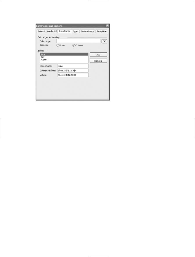
3.Click the Data Range tab, shown in Figure 9-11, to add and remove data series, set a data range for a series, name a series, and set data ranges for category labels.
4.Once you have the correct data ranges set, select the Type tab and choose which chart you want to use.
CHAPTER 9 ■ USING SHAREPOINT’S OFFICE WEB PARTS |
189 |
Figure 9-11. Choose data range options using the Data Range tab.
Use the other options in the Commands and Options dialog box to change colors, add titles, add data labels, and so on. Remember to select the chart element you want to work with from the Select list on the General tab. The options related to a particular chart element, such as the Legend, are only available if the element is selected.
Using the Office PivotView Web Part
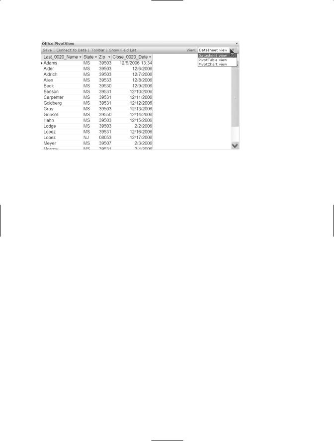
The Office PivotView Web Part, shown in Figure 9-12, offers the ultimate in flexibility. Use this web part if you want to let users switch between Datasheet, PivotTable, and PivotChart views of the same data. Click the View drop-down menu to choose among the three views.
190 CHAPTER 9 ■ USING SHAREPOINT’S OFFICE WEB PARTS
Figure 9-12. The Office PivotView Web Part lets users choose between the Datasheet, PivotTable, and PivotChart views.
Modifying Office Web Parts
As you work more with Office web parts, you’ll probably get to a place where you want to change some things about them. For example, rather than saying Office Spreadsheet in the title bar, it would be nice if the web part had a descriptive name. You might also want to limit the height or width of the web part as it displays on the web page. These and other options are available from the Office web part task pane (the task pane has the name of the web part in its title bar).
To open the task pane to modify a web part, click Modify Shared Page at the top right of the page. Click Modify Shared Web Parts and select the web part you want to modify. You can change properties in four categories: Appearance, Layout, Advanced, and Spreadsheet or PivotView. In the following sections, we describe the most important properties that you might want to reset.
Appearance
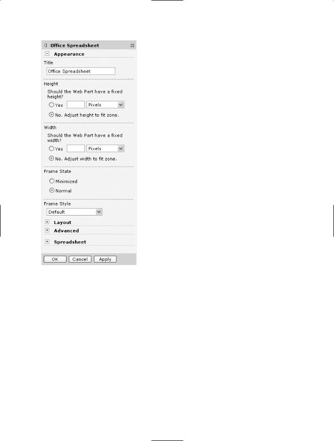
Appearance properties, shown in Figure 9-13, include the web part Title. We recommend changing the title to something more descriptive. It makes it easier to use in data connections and looks better on the page.
CHAPTER 9 ■ USING SHAREPOINT’S OFFICE WEB PARTS |
191 |
Figure 9-13. Modify the Appearance properties to set the web part’s title, size, and frame style.
You can also change the Height and Width of the web part from an adjustable size to a fixed size. Use these properties if you want to control how much of the web part is visible on the page.
Depending on how you want the web part to display, you can use the Frame State property to have the web part minimized on opening the page. Users have to know to click the down arrow and choose Restore to work with the web part.
In the Frame Style property, you can choose if you want no frame, title bar, and border; title bar only; or the default setting, which includes a frame, title bar, and border.
192 CHAPTER 9 ■ USING SHAREPOINT’S OFFICE WEB PARTS
Layout
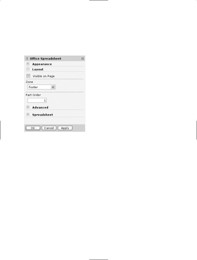
Under Layout properties, shown in Figure 9-14, you can hide a web part by clearing the Visible on Page checkbox. You might want to do this if its only purpose is to serve as
a connector to another web part on the page.
Figure 9-14. Use the Layout properties to move the part to another zone or hide the part.
Using the Zone drop-down menu, you can change the position of the web part on the page.
Advanced
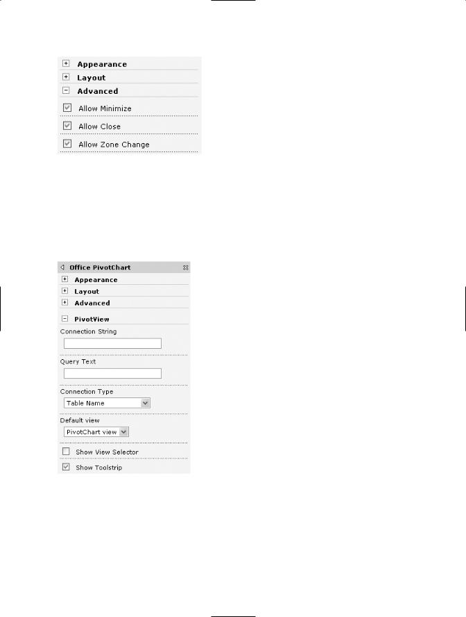
In the Advanced properties, shown in Figure 9-15, you can control if you want users to be able to minimize the web part, close it, or change its position (zone change) on a page.
CHAPTER 9 ■ USING SHAREPOINT’S OFFICE WEB PARTS |
193 |
Figure 9-15. Use the Advanced properties to limit the users’ ability to move or close the web part.
Spreadsheet or PivotView
The Spreadsheet and PivotView options vary depending on whether the web part is a Spreadsheet or a PivotView Web Part. Figure 9-16 shows the PivotView properties.
Figure 9-16. Use PivotChart Web Part’s PivotView properties to hide or display the toolstrip.
When you’ve finished modifying properties, close the task pane to take you back out of design view.

194 CHAPTER 9 ■ USING SHAREPOINT’S OFFICE WEB PARTS
Summary
In this chapter, we explored the Office web parts, a dynamic way to display and work with data from a variety of sources in a SharePoint site. The Office Spreadsheet Web Part is
a useful tool for your online data entry needs, and the Office PivotTable Web Part gives you tremendous power to display, analyze, and aggregate data. Office Datasheets give you flexibility in displaying, sorting, and filtering data, letting you and your users slice and dice data any way you want to see it. Office PivotCharts present a dynamic graphical view of data. Finally, the Office PivotView Web Part lets users decide how they want to see the data.
By adding any or all of these web parts to a SharePoint web part page, you can create exciting dashboards that keep site users up to date with all the current trends by turning raw data into sources of useful information.
In Chapter 10, we take the concept of web parts a step further as we explore how to build custom web parts that are designed to solve your specific business problems.

C H A P T E R 1 0
■ ■ ■
Building Excel Spreadsheet
Web Parts
You’ve seen many of the web parts that are included with SharePoint in previous chapters, in which we’ve used SharePoint web parts to create web part pages. In the last chapter, you learned to create a simple Spreadsheet web part by adding one directly to a web part page from the Web Part Gallery on a Windows SharePoint Services site.
In this chapter, we add another tool for Excel and SharePoint integration: the Windows SharePoint Services Spreadsheet Web Part Add-in for Excel 2003. An Excel add-in is a special type of workbook saved using the XLA extension. Add-ins extend the functionality of Excel, and an add-in usually includes code but can also include worksheets.
When you open an add-in, it isn’t displayed like a normal workbook. It’s added to the current workbook’s Project Explorer, visible only in the Visual Basic Editor. Most add-ins are password protected; you can see them in Project Explorer, but you cannot view or modify the code. Several Excel add-ins are available on the Microsoft site. You can create your own add-ins simply by saving an Excel workbook using the Add-in file type.
With the Windows SharePoint Services Web Part Add-in for Excel 2003, you can create your own web parts in Excel to perform custom calculations or retrieve and display data using an Extensible Markup Language (XML) map. If you haven’t worked with XML maps in Excel, you’ll find all the information you need to get started in Appendix B.
■Note The Spreadsheet Web Part Add-in for Excel 2003 is still being tested (the version used in this chapter is Beta 2). If you download a newer version, the look and feel and the features might be slightly different than is shown in this chapter. Don’t let this discourage you; this add-in has been in Beta 2 for almost a year, and many people are using it to create custom web parts.
The simple Payment Calculator web part shown in Figure 10-1 lets the user enter information about the length of the loan, interest rate, and principal, then returns the monthly payment. The user can select other cells, such as the monthly payment, but
195