Beginning Python - From Novice To Professional (2005)
.pdf
412 |
C H A P T E R 2 1 ■ P R O J E C T 2 : P A I N T I N G A P R E T T Y P I C T U R E |
Center, a part of the U.S. National Oceanic and Atmospheric Administration) and to create a line diagram from this data.
Specific Goals
The program should be able to do the following:
•Download a data file from the Internet.
•Parse the data file and extract the interesting parts.
•Create PDF graphics based on the data.
As in the previous project, these goals might not be fully met by the first prototype.
Useful Tools
The crucial tool in this project is the graphics-generating package. There are quite a few such packages to choose from. If you visit the Vaults of Parnassus site (http://www.vex.net/parnassus), you will find a separate category for graphics. I have chosen to use ReportLab because it is easy to use and has extensive functionality for both graphics and document generation in PDF. If you want to go beyond the basics, you might also want to consider the PYX graphics package (http://pyx.sf.net), which is really powerful, and has support for TEX-based typography.
To get the ReportLab package, go to the official Web page at http://reportlab.org. There you will find the software, documentation, and samples. The software should be available at http://reportlab.org/downloads.html. Simply download the ReportLab toolkit, uncompress the archive (ReportLab_X.zip, where X is a version number), and put the resulting directory in your Python path.
When you have done this, you should be able to import the reportlab module, as follows:
>>> import reportlab
>>>
How Does It Work?
Although I show you how some ReportLab features work in this project, much more functionality is available. To learn more, I suggest you obtain the user guide and the (separate) graphics guide, made available on the ReportLab Web site (on the documentation page). They are quite readable, and are much more comprehensive than this one chapter could possibly be.
Preparations
Before we start programming, we need some data with which to test our program. I have chosen (quite arbitrarily) to use data about sunspots, available from the Web site of the Space Environment Center (http://www.sec.noaa.gov). You can find the data I use in my examples at http:// www.sec.noaa.gov/ftpdir/weekly/Predict.txt.
This data file is updated weekly and contains information about sunspots and radio flux. (Don’t ask me what that means.) Once you’ve got this file, you’re ready to start playing with the problem.
C H A P T E R 2 1 ■ P R O J E C T 2 : P A I N T I N G A P R E T T Y P I C T U R E |
413 |
Here is a part of the file to give you an idea of how the data looks:
#Predicted Sunspot Number And Radio Flux Values
# |
|
|
With Expected Ranges |
|
|
||
# |
|
|
|
|
|
|
|
# |
|
-----Sunspot Number |
------ |
----10.7 cm Radio Flux---- |
|||
# YR MO |
PREDICTED |
HIGH |
LOW |
PREDICTED |
HIGH |
LOW |
|
#-------------------------------------------------------------- |
|
|
|
|
|
|
|
2004 |
12 |
34.2 |
35.2 |
33.2 |
100.6 |
101.6 |
99.6 |
2005 |
01 |
31.5 |
34.5 |
28.5 |
97.8 |
100.8 |
94.8 |
2005 |
02 |
28.8 |
33.8 |
23.8 |
94.5 |
99.5 |
89.5 |
2005 |
03 |
27.1 |
34.1 |
20.1 |
91.8 |
98.8 |
84.8 |
2005 |
04 |
24.9 |
32.9 |
16.9 |
89.2 |
98.2 |
80.2 |
2005 |
05 |
22.0 |
31.0 |
13.0 |
86.2 |
97.2 |
75.2 |
2005 |
06 |
20.3 |
30.3 |
10.3 |
83.6 |
96.6 |
70.6 |
2005 |
07 |
19.1 |
30.1 |
8.1 |
81.4 |
96.4 |
66.4 |
2005 |
08 |
17.4 |
29.4 |
5.4 |
79.1 |
96.1 |
62.1 |
2005 |
09 |
15.8 |
28.8 |
2.8 |
77.2 |
96.2 |
58.2 |
First Implementation
In this first implementation, let’s just put the data into our source code, as a list of tuples. That way, it’s easily accessible. Here is an example of how you can do it:
data = [
#Year Month Predicted High Low
(2004, |
12, |
34.2, |
35.2, |
33.2), |
(2005, |
1, |
31.5, |
34.5, |
28.5), |
# Add more data here |
|
|
||
] |
|
|
|
|
With that out of the way, let’s see how you can turn the data into graphics.
Drawing with ReportLab
ReportLab consists of many parts and enables you to create output in several ways. The most basic module for generating PDFs is pdfgen. It contains a Canvas class with several low-level methods for drawing. To draw a line on a Canvas called c, you call the c.line method, for example.
We’ll use the more high-level graphics framework (in the package reportlab.graphics and its submodules), which will enable us to create various shape objects and to add them to a Drawing object that we can later output to a file in PDF format.
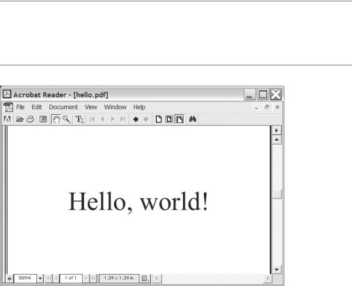
Listing 21-1 shows a sample program that draws the string “Hello, world!” in the middle of a 100×100-point PDF figure. (You can see the result in Figure 21-1.) The basic structure is as follows: You create a drawing of a given size, you create graphical elements (in this case, a String object) with certain properties, and then you add the elements to the drawing. Finally, the drawing is rendered into PDF and is saved to a file.
C H A P T E R 2 1 ■ P R O J E C T 2 : P A I N T I N G A P R E T T Y P I C T U R E |
415 |
Constructing Some PolyLines
To create a line diagram (a graph) of the sunspot data, you have to create some lines. In fact, you have to create several lines that are linked. ReportLab has a special class for this: PolyLine.
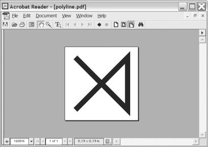
A PolyLine is created with a list of coordinates as its first argument. This list is of the form [(x0, y0), (x1, y1), ...], with each pair of x and y coordinates making one point on the PolyLine. See Figure 21-2 for a simple PolyLine.
Figure 21-2. PolyLine([(0, 0), (10, 0), (10, 10), (0, 10)])
To make a line diagram, one polyline must be created for each column in the data set. Each point in these polylines will consist of a time (constructed from the year and month) and a value (which is the number of sunspots taken from the relevant column). To get one of the columns (the values), list comprehensions can be useful:
pred = [row[2] for row in data]
Here pred (for “predicted”) will be a list of all the values in the third column of the data. You can use a similar strategy for the other columns. (The time for each row would have to be calculated from both the year and month: for example, year + month/12.)
Once you have the values and the time stamps, you can add your polylines to the drawing like this:
drawing.add(PolyLine(zip(times, pred), strokeColor=colors.blue))
It isn’t necessary to set the stroke color, of course, but it makes it easier to tell the lines apart. (Note how zip is used to combine the times and values into a list of tuples.)
416 |
C H A P T E R 2 1 ■ P R O J E C T 2 : P A I N T I N G A P R E T T Y P I C T U R E |
The Prototype
You now have what you need to write your first version of the program. The source code is shown in Listing 21-2.
Listing 21-2. The First Prototype for the Sunspot Graph Program
from reportlab.lib import colors
from reportlab.graphics.shapes import * from reportlab.graphics import renderPDF
data = [
#Year Month Predicted High Low
(2005, |
8, |
113.2, |
114.2, |
112.2), |
(2005, |
9, |
112.8, |
115.8, |
109.8), |
(2005, |
10, |
111.0, |
116.0, |
106.0), |
(2005, |
11, |
109.8, |
116.8, |
102.8), |
(2005, |
12, |
107.3, |
115.3, |
99.3), |
(2006, |
1, |
105.2, |
114.2, |
96.2), |
(2006, |
2, |
104.1, |
114.1, |
94.1), |
(2006, |
3, |
99.9, |
110.9, |
88.9), |
(2006, |
4, |
94.8, |
106.8, |
82.8), |
(2006, |
5, |
91.2, |
104.2, |
78.2), |
] |
|
|
|
|
drawing = Drawing(200, 150)
pred = [row[2]-40 for row in data] high = [row[3]-40 for row in data] low = [row[4]-40 for row in data]
times = [200*((row[0] + row[1]/12.0) - 2005)-110 for row in data]
drawing.add(PolyLine(zip(times, pred), strokeColor=colors.blue)) drawing.add(PolyLine(zip(times, high), strokeColor=colors.red)) drawing.add(PolyLine(zip(times, low), strokeColor=colors.green))
drawing.add(String(65, 115, 'Sunspots', fontSize=18, fillColor=colors.red))
renderPDF.drawToFile(drawing, 'report1.pdf', 'Sunspots')
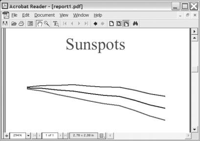
As you can see, I have adjusted the values and time stamps to get the positioning right. The resulting drawing is shown in Figure 21-3.
C H A P T E R 2 1 ■ P R O J E C T 2 : P A I N T I N G A P R E T T Y P I C T U R E |
417 |
Figure 21-3. A simple sunspot graph
Although it is pleasing to have made a program that works, there is clearly still room for improvement.
Second Implementation
So, what did you learn from your prototype? You have figured out the basics of how to draw stuff with ReportLab. You have also seen how you can extract the data in a way that works well for drawing your graph. However, there are some weaknesses in the program. To position things properly, I had to add some ad hoc modifications to the values and time stamps. And the program doesn’t actually get the data from anywhere. (More specifically, it “gets” the data from a list inside the program itself, rather than reading it from an outside source.)
Unlike Project 1 (in Chapter 20), the second implementation won’t be much larger or more complicated than the first. It will be an incremental improvement that will use some more appropriate features from ReportLab and actually fetch its data from the Internet.
Getting the Data
As you saw in Chapter 14, you can fetch files across the Internet with the standard module urllib. Its function urlopen works in a manner quite similar to open, but takes a URL instead of a file name as its argument. When you have opened the file and read its contents, you have to filter out what you don’t need. The file contains empty lines (consisting of only whitespace) and lines beginning with some special characters (# and :). The program should ignore these. (See the example file fragment in the section “Preparations” earlier in this chapter.)

418 |
C H A P T E R 2 1 ■ P R O J E C T 2 : P A I N T I N G A P R E T T Y P I C T U R E |
Assuming that the URL is kept in a variable called URL, and that the variable COMMENT_CHARS has been set to the string '#:', you can get a list of rows (as in our original program) like this:
data = []
for line in urlopen(URL).readlines():
if not line.isspace() and not line[0] in COMMENT_CHARS: data.append(map(float, line.split()))
The preceding code will include all the columns in the data list, although we aren’t particularly interested in the ones pertaining to radio flux. However, those columns will be filtered out when we extract the columns we really need (as we did in the original program).
■Note If you are using a data source of your own (or if, by the time you read this, the data format of the sunspot file has changed), you will, of course, have to modify this code accordingly.
Using the LinePlot Class
If you thought getting the data was surprisingly simple, drawing a prettier line plot isn’t much of a challenge either. In a situation like this, it’s best to thumb through the documentation (in this case, the ReportLab docs) to see if there is a feature already in the system that can do what you need, so you don’t have to implement it all yourself. Luckily, there is just such a thing: the
LinePlot class from the module reportlab.graphics.charts.lineplots. Of course, we could have looked for this to begin with, but in the spirit of rapid prototyping, we just used what was at hand to see what we could do. Now it’s time to go one step further.
The LinePlot is instantiated without any arguments, and then you set its attributes before adding it to the Drawing. The main attributes you need to set are x, y, height, width, and data. The first four should be self-explanatory; the latter is simply a list of point-lists, where a pointlist is a list of tuples, like the one we used in our PolyLines.
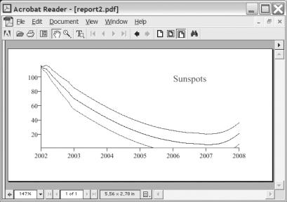
To top it off, let’s set the stroke color of each line. The final code is shown in Listing 21-3. The resulting figure is shown in Figure 21-4.
Listing 21-3. The Final Sunspot Program
from urllib import urlopen
from reportlab.graphics.shapes import *
from reportlab.graphics.charts.lineplots import LinePlot from reportlab.graphics.charts.textlabels import Label from reportlab.graphics import renderPDF
URL = 'http://www.sec.noaa.gov/ftpdir/weekly/Predict.txt'
COMMENT_CHARS = '#:'
drawing = Drawing(400, 200) data = []