Добавил:
Опубликованный материал нарушает ваши авторские права? Сообщите нам.
Вуз: Предмет: Файл:

Beginning ActionScript 2.0 2006

.pdf
Скачиваний:
105
Добавлен:
17.08.2013
Размер:
12.47 Mб
Скачать

Chapter 10

mediaViewerPane.contentPath = mediaPath; mediaViewerProgress._visible = true; mediaViewerProgress.setProgress(0, 100);

}

}

function loadMediaError() : Void

{

trace(“loadMediaError”); mediaViewerProgress._visible = false; imageList.selectedIndex = null; videoList.selectedIndex = null; mediaViewerPane.contentPath = “”;

}

function setZoom(zoomValue:Number) : Void

{

mediaViewerPane.content._xscale = zoomValue; mediaViewerPane.content._yscale = zoomValue; mediaViewerPane.invalidate();

}

init();

9.Save the file, return to the Macromedia Flash project file, and select Control Test Movie.

How It Works

First, listener objects are created to handle functionality from different parts of the application. The media list listener deals only with handling the interaction between the two list components:

var mediaListListener:Object = new Object(); mediaListListener.change = function(eventObject:Object)

{

if (eventObject.target._name == “imageList”)

{

movieList.selectedIndex = null;

}

else if (eventObject.target._name == “movieList”)

{

imageList.selectedIndex = null;

}

}

The listener checks to see which list component generated the event. If the image list component generated the event, the listener deselects anything that might be selected in the movie list component, and vice versa. This code does not deal with any aspects of loading the media, just with managing the menu. If you were to add additional functionality — say, for example, thumbnail image buttons for selecting images — only this listener would need to be updated to accommodate it.

The media viewer listener manages the loading and presentation of the media in the scroll pane component:

var mediaViewerListener:Object = new Object(); mediaViewerListener.change = function(eventObject:Object)

268

Interacting with the User

{

if (eventObject.target._name == “imageList”)

{

loadMedia(eventObject.target.selectedItem.data, “image”);

}

else if (eventObject.target._name == “movieList”)

{

loadMedia(eventObject.target.selectedItem.data, “video”);

}

else if (eventObject.target._name == “zoomStepper”)

{

setZoom(eventObject.target.value);

}

}

Once again, the listener checks to see which component generated the event. If it is one of the list components, it loads the selected media clip into the scroll pane; if the event originates from the zoom box, it adjusts the scaling of the content.

The two loadMedia() functions pass along a parameter selecting the media type. This is not actually used here, but it could handle different media presentation implementations based on the media type. For instance, the video could be placed inside a movie clip instead of the scroll pane because movies generally should not scroll. If this change were to be made, only the media viewer listener would need to change. The media list listener would not need to be touched.

Next, the initialization function is defined. The image list component is loaded with data, and both listeners are registered with this component:

var imageArray:Array = new Array(); imageArray.push({data:”images/aStudyInTexture.jpg”, label:”A Study In Texture”}); imageArray.push({data:”images/buntzenWinter.jpg”, label:”Buntzen Winter”}); imageArray.push({data:”images/flowerInDetail.jpg”, label:”Flower In Detail”}); imageArray.push({data:”images/galianoSunset.jpg”, label:”Galiano Sunset”}); imageList.dataProvider = imageArray;

imageList.addEventListener(“change”, mediaListListener); imageList.addEventListener(“change”, mediaViewerListener);

The movie list component is loaded with data, and both listeners are registered with this component:

// Send data to the video list component var movieArray:Array = new Array();

movieArray.push({data:”images/animation.swf”, label:”Animation”}); movieArray.push({data:”movies/snowStorm.swf”, label:”Snow Storm”}); movieList.dataProvider = movieArray; movieList.addEventListener(“change”, mediaListListener); movieList.addEventListener(“change”, mediaViewerListener);

The zoom stepper is initialized, and the media viewer listener is registered with this component. The listener call takes the place of the separate zoom stepper listener:

// Setup for the zoom stepper component zoomStepper.maximum = 400;

269

Chapter 10

zoomStepper.minimum = 25; zoomStepper.stepSize = 25; zoomStepper.value = 100;

zoomStepper.addEventListener(“change”, mediaViewerListener);

The remaining code deals with the actual implementation of the loading and resizing, and is not changed significantly from the previous exercise with this project.

Manually Invoking Events in a Component

So far, it’s been assumed that component events are always triggered by a user action. That is not always the case; sometimes you may want to manually trigger an event, just so you do not have to write code to do something that’s already been handled. Say you have a list component, and you want to pre-select the first item in the list. You would do this with

componentHandle.selectedIndex = 0;

The problem is that the change event is generated only when a change is initiated by the user, so setting the selected row doesn’t affect the rest of your interface. You could manually call the same code that the event handler calls, but that is a waste. Instead, manually trigger the event using the dispatchEvent() method as follows, and any interested listeners also will be triggered:

componentHandle.dispatchEvent({type:”change”});

Try it out in the following exercise.

Try It Out

Manually Trigger an Event

In this exercise you manually trigger an event that otherwise would require a user action.

1.Create a new Macromedia Flash document.

2.Rename the existing layer in the timeline to Script. Create a new layer below it called

Components.

3.Click the keyframe on the Components layer to select it. Open the Components panel’s User Interface section. Drag one List component to the stage.

4.Open the Properties panel, click the button on the stage, and set the instance ID to myList.

5.The code for this example is small, so enter it in the Actions panel instead of creating a separate ActionScript file. Click the first frame in the timeline, open the Actions panel, and type in the following ActionScript code:

var listListener:Object = new Object(); listListener.change = function(eventObject:Object)

{

trace(“Selected item: “ + eventObject.target.selectedItem.data);

270

Interacting with the User

}

var listArray:Array = new Array(); listArray.push({data:”value1”, label:”Label 1”}); listArray.push({data:”value2”, label:”Label 2”});

listArray.push({data:”value3”, label:”Label 3”}); myList.dataProvider = listArray; myList.addEventListener(“change”, listListener);

myList.selectedIndex = 0;

6.Name the file tryItOut_manualEvent.fla, choose an appropriate directory, and save it. Select Control Test Movie.

7.Add the following line to the end of the code listing and then test the movie again:

myList.dispatchEvent({type:”change”});

How It Works

When you run this program without the dispatchEvent() call, the change event is not dispatched so nothing’s sent to the output panel even though the first item is selected. By adding the dispatchEvent() method, the listener’s change event is triggered, and the output panel shows a line giving the value of the selected row.

Summar y

This chapter explored the process of working with component events. Some points to remember include the following:

Events are used for user interaction. They are captured through the use of listeners that are invoked whenever an event is broadcasted from a component.

Listeners work on a subscription model where a component builds a list of all the listeners interested in a particular event from that component, and it notifies them all when that event takes place.

Listeners can be structured so that there’s good separation between different areas of functionality. Listeners do not need to be created to provide a one-to-one mapping to component instances.

The stage is itself an object, and functions on the stage can be used as listeners for some simple setups.

Listener functions can be used in place of listener objects. Which you use is largely a matter of personal preference, but listener objects are more commonly used and better documented.

271

Chapter 10

Exercise

1.Extend exercise 2 from Chapter 9 by adding two event listener objects to respond to the click events of each of the three buttons and to the change event of the data grid. The first event listener is to manage adding, removing, and updating rows in the data grid when any of the three buttons are clicked. The second event listener manages what to show in the title and the text fields when any of the buttons are clicked or a new row is selected in the data grid. The interface should behave as follows:

The Add, Save, and Delete buttons are disabled by default.

Making changes to the Title or Text fields enables the Add and Save buttons.

Clicking a row populates the Title and the Text fields, and enables the Delete button.

Clicking Delete removes the selected row, and automatically selects the next row in the list. If there are no rows left, the Delete button is disabled.

Clicking the Add button creates a new row based on the contents of the Title and the Text fields, and automatically highlights the new row in the list.

Clicking the Save button updates the values for the currently selected row to reflect any changes to the Title and the Text fields.

272

11

Controlling Components

Macromedia Flash has, since MX 2004, the capability for components to pass data between each other automatically. This is done through the concept of data binding, in which component inputs and outputs are linked to each other. You can set up data bindings either through the Component Inspector panel or by using the set of bindings classes. This book introduces how to set up bindings only through the Component Inspector panel because using the bindings classes is a complicated process that would almost require its own book.

Introducing the Component

Inspector Panel

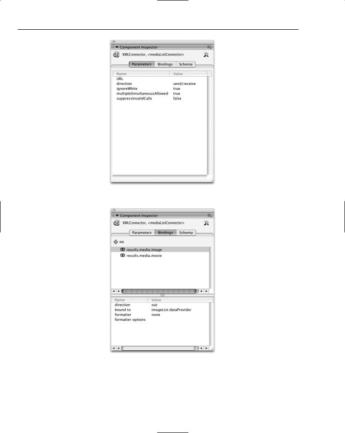
The Component Inspector panel (Window Component Inspector) contains a tabbed interface as shown in Figure 11-1.

The Parameters tab, open in Figure 11-1, is a duplicate of the Parameters tab in the Properties panel. It contains basic startup information such as the URL for the XML file to load for the XMLConnector component.

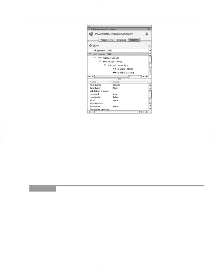
The Bindings tab (see Figure 11-2) provides the means to link components together. One component can bind to multiple properties on multiple different components.

The Schema tab, open in Figure 11-3, shows the properties that are available for binding with other components. For the XMLConnector component, you can link specific tags in your XML file to different components by adding information about the XML data. You can also define custom properties that can send and receive data.

Chapter 11

Figure 11-1

Figure 11-2

274

Controlling Components

Figure 11-3

Through these three panels, nearly every exposed property on any of the pre-installed components can be linked to any other exposed property on any other component.

Creating Data Bindings between Components Using the Bindings Tab

The process of creating a binding between two components basically involves selecting a source component, choosing the parameter on the source component to use as data, and then selecting a target component and a data parameter for the target. An example is the easiest way to demonstrate how this works.

Try It Out

Setting Up a Binding

In this exercise you link together two bindable properties on two different components. Here’s what to do:

1.Create a new Macromedia Flash document.

2.Open the User Interface section of the Components panel. Drag one DateChooser component and one Label component to the stage.

3.Click the DateChooser component to select it. Open the Properties panel and give the component the instance name myDateChooser.

4.Select the Label component and give it the instance name myLabel. Go to the Parameters tab of the Properties panel and set the autoSize parameter to left.

275

Chapter 11

5.Click the DateChooser component again. Open the Component Inspector panel (Window Component Inspector) and select the Bindings tab.

6.Click the + icon under the tab names. In the dialog box that opens, choose the selectedDate option and click OK.

7.In the binding details area at the bottom of the panel, change the direction to out. Double-click the data area next to the bound to label. In the dialog box that opens, select myLabel, make sure the text property is highlighted, and click OK. The panel should now look like Figure 11-4.

Figure 11-4

8.Select File Save As, name the file tryItOut_bindingComponents.fla, choose an appropriate directory, and save it. Select Control Test Movie, and select a date from the date chooser.

9.Close the movie test window and return to the Flash file. Return to the Bindings tab for the date chooser, and select the Date option from the drop-down menu next to the formatter label. Double-click the data area next to the formatter options field, enter MM/DD/YYYY into the prompt that appears, and click OK.

10.Click the Label component on the stage and observe that it shows a binding as well, but from the opposite direction of the data flow.

11.Save the Flash file and select Control Test Movie. Select a date from the date chooser.

How It Works

In this exercise, you create a simple binding between the selectedDate property in the myDateChooser component and the text property of the myLabel component. The binding is created from the perspective of the date chooser component, where data is flowing out of the component. Once you set up the data binding, the Flash binding framework automatically deals with the flow of data between the components. In this case, any time the calendar component’s selectedDate property changes, the binding framework automatically broadcasts that change to all interested listeners. The only interested listener here is a label component, whose text property is assigned the value of the calendar’s selectedDate property.

The binding could also have been created the other way around, by selecting the label component, linking its text property to the selectedDate property of the date chooser, and setting the data direction to in instead of out. Figure 11-5 shows what the settings look like when viewing from the perspective of the label instead of the date chooser.

276

Controlling Components

Figure 11-5

Setting up a binding for simple components is a straightforward process, although there are a couple of issues to keep in mind. First, you are restricted to the properties that are designated as bindable. For instance, the selected property of a checkbox cannot be linked to the enabled property of another component, because no components expose a bindable enabled property even though all components have that property.

The other issue is that as the number of components increase, the number of connections can potentially increase significantly as well. It also means that dependencies can form where there is not a clear separation in functionality between one part of the interface and another.

As a result of these issues, I recommend avoiding component binding for anything other than low to medium complexity interfaces.

Using an XML File as a Data Source

A fairly natural extension of list-type components — ComboBox, DataGrid, List, and Tree — is to be able to populate them from an external data source. (Chapter 21 covers XML in depth, so we skip many of those details here when using XML with data bindings to populate components.)

The steps for using an XML file as a data source are similar to those used in the previous data binding example, except that you need to add an XML schema. A schema is a model for data. Although many components already have a pre-built schema that provides a list of bindable properties, there is no way that the Flash authoring environment can know the data makeup of your XML file without actually seeing it. Once the schema of your XML file is known, you can start binding XML data to other components.

The first step in setting up an XML connector is to give it a sample XML file that represents the data that you will be using. There’s an icon on the top right of the Schema tab in the Component Inspector panel that enables you to select an XML file. Here’s an example file:

277