

Beginning ActionScript 2.0 2006
.pdf

9
Working with Components
Imagine what it would be like if you had to build everything that you work with during the day from scratch! It sounds silly, but in the “old” days that’s what developers had to do with their code. Many developers continue to do so, although it’s redundant and adds to the workload.
Since MX 2004 (version 7), Flash has had a complete component architecture that lends itself to drag-and-drop authoring and to re-use between developers. Components can be bundled into individual extensions, and the extension manager is responsible for putting the pieces of each component in all the right places. The component architecture makes use of the class development mechanism to simplify component creation, and the idea of the compiled clip allows components to be completely self-contained into clips that could not be tinkered with except through defined mechanisms.
Thankfully, you do not need to re-create user interface controls every time they are needed. There is a growing body of components out there that anyone can use to extend their projects. Take a look at Macromedia’s component exchange at http://www.macromedia.com/exchange/ for a large collection of components.
New to Version 2.0
Version 1.0 of the component architecture was introduced with Flash MX, which corresponds to the introduction of version 6 of the Flash player. Version 2.0 was introduced with Flash MX 2004 (version 7) and continues mostly unchanged in Flash 8. The version 2.0 component architecture includes many new features over version 1.0:
The version 2.0 components are written using ActionScript 2.0 instead of ActionScript 1.0.
A fresh appearance makes components look more professional.
Creating a new skin can change the global look of all components.
Updating styles can modify many appearance traits. Styles can be applied for a single component instance, for all instances of a component, or globally across all v2 components.

Chapter 9
A focus manager handles keyboard access of components.
A more flexible event model is used.
There are other benefits as well, such as for component creators. You examine the creation of a sample component in Chapter 27.
Unfortunately, not everything that is new is good. The main drawback to version 2 components over version 1 components is the amount that they add to the size of the .swf files that contain them. The first component used adds a total of approximately 40 KB to the size of the published file because the entire component framework needs to be included in the file. Subsequent components add less, but it can still add up quickly.
Even though version 2.0 of the component architecture was introduced with version 7 of the Flash player, it works in movies that target version 6.0.79 and later. They require only that the movie be published to target ActionScript 2.0. This should not be a concern, because movies that target ActionScript 2.0 can still run ActionScript 1.0 code.
Exploring Components
First, take a look at Flash’s Components panel (see Figure 9-1) and the default component groupings.
Figure 9-1
The following sections explore the components available in each grouping.
Data Components
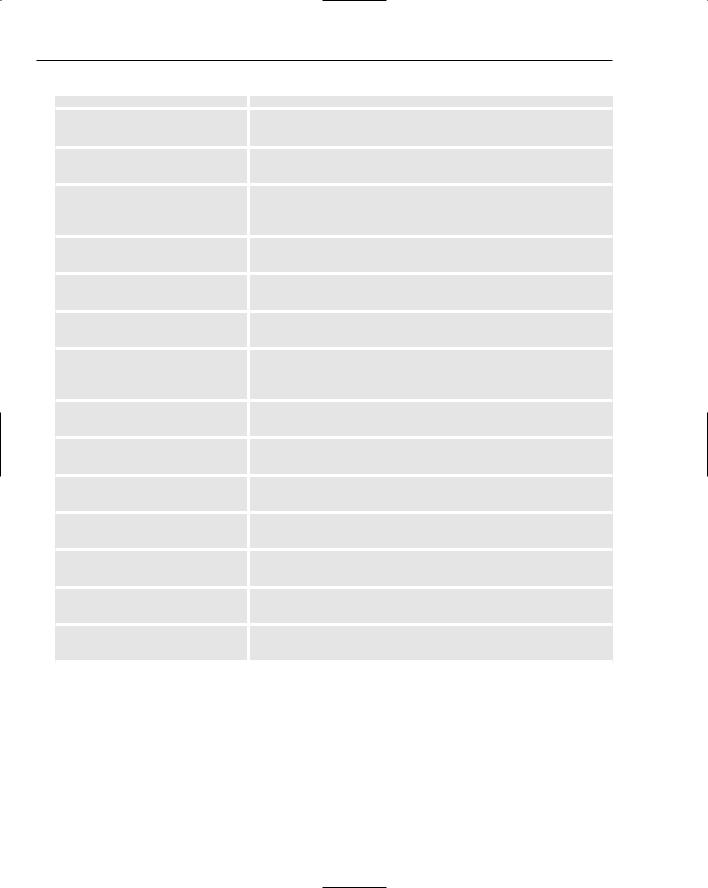
Data components specialize in managing data. They communicate with each other through a data-binding mechanism, which is a structured way of passing data from one component to another. The Name column of the following table provides the component name and its fully qualified class name used for placing the component on the stage with code. Here are descriptions of the various data components:
230

|
|
Working with Components |
|
|
|
|
|
|
|
Name |
Description |
|
|
|
|
DataHolder |
A repository for data that generates events when the data has |
|
mx.data.components |
changed. Allows for the storing of arbitrary data. |
|
.DataHolder |
|
|
DataSet |
A repository for a collection of data records. Provides methods |
|
mx.data.components |
for iterating, sorting, and broadcasting events. |
|
.DataSet |
|
|
RDBMSResolver |
An interface between the DataSet component and a server-side |
|
mx.data.components |
database. Provides a synchronization of data between the two |
|
.RDBMSResolver |
data stores. |
|
WebServiceConnector |
An interface that allows access to web services through the |
|
mx.data.components |
standard SOAP protocol. |
|
.WebServiceConnector |
|
|
XMLConnector |
A means to send and receive data packaged into an XML |
|
mx.data.components |
document. |
|
.XMLConnector |
|
|
XUpdateResolver |
An interface between the DataSet component and a server-side |
|
mx.data.components |
XML database. Uses the XUpdate language specification to |
|
.XUpdateResolver |
synchronize data between the two data stores. |
FLV Playback and FLV Playback Custom UI Components
The FLV Playback component enables you to play video content through a user interface that is already set up to allow the user to control playback and volume. Although this component enables you to choose from a number of pre-made designs through the skin parameter in the Parameters panel, you may want to customize the look further. Along with the FLV Playback component, Macromedia now provides a number of custom UI components that you can incorporate into your own design. If you want to create your own custom control layout, take the following steps:
1.Drag an FLV Playback component to the stage and click the component to select it.
2.Open the Properties panel (Window Properties) and give the component an instance name, such as videoPlayer.
3.Open the Parameters panel (Window Parameters) and select None from the skin drop-down.
4.Drag any number of the custom UI components listed in the following table and arrange them on the stage in the way that you want. Give each of the components you place on the state an instance name using the Properties panel.
5.For each custom UI component that you have placed on the stage, add a line of ActionScript code to the main timeline to link the component to the video player. If your video player has the instance name videoPlayer, and you are adding a button that automatically switches between pause and play with the instance name newPausePlayButton, use
videoPlayer.pausePlayButton = newPausePlay;
231

Chapter 9
The following table describes the FLV Playback component, and gives the linkage information for each custom component:
Name |
Description |
|
|
FLVPlayback |
A video player component that provides basic play, pause, scrub, |
mx.video.FLVPlayback |
and mute controls, plus a huge number of properties and methods |
|
that can be called to modify the component’s behavior. [Flash Player |
|
version 8] |
BackButton |
An add-on button that sends a back message to the video player. Use |
|
the backButton property of the FLV Player component to link a |
|
BackButton component to the player. |
BufferingBar |
An add-on interface element that shows when a streaming video is |
|
being buffered. Use the bufferingBar property of the FLV Player |
|
component to link a BufferingBar component to the player. |
ForwardButton |
An add-on button that sends a forward message to the video player. |
|
Use the forwardButton property of the FLV Player component to |
|
link a ForwardButton component to the player. |
MuteButton |
An add-on mute button for the video player. Use the muteButton |
|
property of the FLV Player component to link a MuteButton component |
|
to the player. |
PauseButton |
An add-on button that sends a pause message to the video player. |
|
Use the pauseButton property of the FLV Player component to link |
|
a PauseButton component to the player. |
PlayButton |
An add-on button that sends a play message to the video player. Use |
|
the playButton property of the FLV Player component to link a |
|
PlayButton component to the player. |
PlayPauseButton |
An add-on button that toggles between sending a pause and a play |
|
message to the video player. The button switches between showing a |
|
pause symbol or a play symbol, according to playback state. Use the |
|
playPauseButton property of the FLV Player component to link a |
|
PlayPauseButton component to the player. |
SeekBar |
An add-on interface element that allows the user to scrub through |
|
the video. Use the seekBar property of the FLV Player component |
|
to link a SeekBar component to the player. |
StopButton |
An add-on button that sends a stop message to the video player. Use |
|
the stopButton property of the FLV Player component to link a |
|
StopButton component to the player. |
VolumeBar |
An add-on control that sends a volume set message to the video |
|
player. Use the volumeBar property of the FLV Player component to |
|
link a VolumeBar component to the player. |
|
|
232

Working with Components
Media Components for Flash Players 6 and 7
The media components are recommended only if you need to support version 6 or 7 of the Flash plug-in. The component’s name and its fully qualified class name (used for placing the component on the stage with code) are included in the first column of the following table, which describes these components:
Name |
Description |
|
|
MediaController |
A video controller, providing interface controls for controlling |
mx.controls.MediaController |
video playback. |
MediaDisplay |
A canvas area for displaying video. |
mx.controls.MediaDisplay |
|
MediaPlayback |
A combination of the MediaController and MediaDisplay |
mx.controls.MediaPlayback |
components. |
User Interface Components
User interface (UI) components are available for building interfaces to interact with the user. The following table describes these components. Below each name is the package name, needed for placing components with script:
Name |
Description |
|
|
Accordion |
A holder for controls for a multi-step process. As the user |
mx.containers.Accordion |
finishes one process, the container holding controls for the next |
|
step slides into view. A user can easily navigate back to previ- |
|
ous steps. |
Alert |
A modal window that displays a message, and a combination of |
mx.controls.Alert |
OK, Cancel, Yes, and No buttons. |
Button |
A standard push button. |
mx.controls.Button |
|
CheckBox |
A standard checkbox form element. |
mx.controls.CheckBox |
|
ComboBox |
A drop-down selection list. |
mx.controls.ComboBox |
|
DataGrid |
A way of presenting multi-row tabular data. Provides ways to |
mx.controls.DataGrid |
select rows, place custom controls within each row, and, |
|
through data binding, load data from an external data source. |
DateChooser |
A monthly calendar that allows the user to select a date. |
mx.controls.DateChooser |
|
DateField |
A text field with a clickable date chooser icon. |
mx.controls.DateField |
|
|
Table continued on following page |
233
Chapter 9
Name |
Description |
|
|
Label |
A single line of text to show to the user. Similar to a dynamic |
mx.controls.Label |
text field, only it is set up to better enable accessibility. |
List |
A scrollable list box. It allows for singleand multi-selections, |
mx.controls.List |
and it can link up with an external data provider. |
Loader |
A container for externally loaded images and movies. It allows |
mx.controls.Loader |
for automatic scaling of images, and can work together with the |
|
progress bar to provide progress status. |
Menu |
A pop-up menu. Can be triggered from a menu bar, or from a |
mx.controls.Menu |
contextual menu event. |
MenuBar |
A menu holder that behaves like a standard application menu |
mx.controls.MenuBar |
bar. |
NumericStepper |
A container for a number that provides up and down buttons |
mx.controls.NumericStepper |
for progressively increasing or decreasing the number. |
ProgressBar |
A mechanism for showing loading progress. It can be used to |
mx.controls.ProgressBar |
show how much is left to load, or if the load amount is not |
|
known, it can just show that an activity is in progress. |
RadioButton |
A standard radio button. |
mx.controls.RadioButton |
|
ScrollPane |
A scrollable area for externally loaded image or movie content. |
mx.containers.ScrollPane |
|
TextArea |
A scrollable area for allowing the user to enter a large amount |
mx.controls.TextArea |
of text. |
TextInput |
A standard text input field. |
mx.controls.TextInput |
|
Tree |
A means of showing hierarchical data, such as directory |
mx.controls.Tree |
structures. |
UIScrollBar |
A scroll bar that can be added to a standard text field. |
mx.controls.UIScrollBar |
|
Window |
A component that behaves like a standard window. It can be |
mx.containers.Window |
either modal or non-modal. |
The rest of the chapter shows you how to use components.
Placing Components Manually
You can place components on the stage in two ways: manually and with ActionScript. To place a component manually, simply drag it to the stage (see Figure 9-2).
234

Working with Components
Figure 9-2
That’s the easiest way to place components, and it is also the most appropriate for using Flash as a rapid application prototyping tool.
Once the component is on the stage, you have two ways to customize its startup parameters. The first is to set the parameters in the Properties panel (see Figure 9-3).
Figure 9-3
The second is to give the component an instance name and set the parameters with script:
var comboBoxArray:Array = new Array(); comboBoxArray.push({data:1, label:”Selection 1”}); comboBoxArray.push({data:2, label:”Selection 2”}); comboBoxArray.push({data:3, label:”Selection 3”});
comboBoxArray.push({data:4, label:”Selection 4”}); comboBoxArray.push({data:5, label:”Selection 5”});
myComboBox.dataProvider = comboBoxArray;
You use both the manual and ActionScript methods of putting components on the screen as you progress through this chapter.
235

Chapter 9
Try It Out |
Placing Components on the Stage |
This example demonstrates how to place components on the stage, how to set properties with the authoring environment, and the effect of components on the size of the published file. Figure 9-4 shows the result of this exercise.
Figure 9-4
1.Create a new Macromedia Flash document by selecting File New and choosing Flash Document from the New Document panel.
2.Select File Save As, name the file tryItOut_scriptingComponents.fla, choose an appropriate directory, and save it.
3.Open the Components panel (Window Components), open the UI Components section, and then drag the List component to the stage.
4.With the new List component selected, go to the Properties panel (Window Properties) and set the x position to 18, the y position to 75, the width to 150, and the height to 275. Give it the instance name imageList.
5.Select File Publish to create the SWF file. Open a file browser with your operating system, and locate the file tryItOut_scriptingComponents.swf. Take a look at its properties, noting the file size.
6.Return to the Flash project file. Add a ScrollPane component by dragging it onto the stage from the Components panel. Give it an x position of 182, a y position of 75, a width of 350, a height of 275, and an instance name of imageViewerPane.
7.Drag a ProgressBar component onto the stage from the Components panel. Give it x position 280 and y position 200. Give it the instance name imageViewerProgress.
236

Working with Components
8.Drag a NumericStepper component onto the stage from the Components panel. Give it x position 230 and y position 360. Make the instance name zoomStepper.
9.With the new NumericStepper still selected, choose the Parameters tab within the Properties panel. Set the maximum value to 200, minimum to 25, stepSize to 25, and value to 100.
10.Drag a Label component onto the stage from the Components panel. Set the x position to 18 and the y position to 53. In the Properties panel, set the text property to Image List.
11.Drag a second Label component to the stage. Set the x position to 182 and the y position to 381. Within the Properties panel, set the text property to Zoom:.
12.Drag a third Label component to the stage. Set the x and y positions to 18. In the Properties panel, set the text property to Image Browser:.
13.Save the file and select Control Test Movie. Open a file browser with your operating system, and locate the file tryItOut_scriptingComponents.swf. Take a look at its properties, noting the file size.
How It Works
Placing a component on the stage automatically adds the component to the library. When you publish the project, the file size of the generated SWF file is quite big, likely on the order of 48 KB for a single component. After adding four different components and publishing the project, the published file is larger only by about 16 KB.
When any one of the built-in components is included in a project, it automatically pulls in a large set of support classes. Those classes are part of the overall version 2.0 component framework, and are shared among all of the components. As a result, adding a second, third, or fourth component only increases the size of the published file by a small amount.
In this example, you set some of the parameters for the NumericStepper and Label components in the Parameters panel. If you interact with the NumericStepper instance in the test movie environment, clicking the up and down arrows raises and lowers the value by 25 each time. The stepper should limit the range to a minimum value of 25, a maximum value of 200, and a starting value of 100, as specified in the Parameters panel. The panel is specific to components, and it allows certain startup values to be set without requiring code. Because coding is what you’re learning here, the next exercise shows you how to perform the same tasks with ActionScript.
Placing Components on the Stage with Script
It’s possible to place every user interface component on the stage with script instead of manually dragging it to the stage. Using script to place components on the stage gives maximum control over all aspects of your user interface, and it means that you can create an entire application with code in only one frame and with nothing on the timeline. It isn’t the Holy Grail of development that some make it out to be because issues exist with this type of development as well, including the following:
You cannot see the results of what you are developing until you compile and test the movie.
It is harder to do rapid application development because small changes in layout result in needing to calculate how many pixels to adjust each component’s position and size, making the adjustment, and then compiling to see whether your calculations were correct.
237