

ASP.NET 2.0 Visual Web Developer 2005 Express Edition Starter Kit (2006)
.pdf
Chapter 5
An Extensible Style Language Translation (XSLT) style sheet can perform this conversion. There is not enough room in this book to provide a tutorial for XSLT, but the next listing shows the style sheet so that you can see what it is trying to achieve. XSLT works by processing templates, which can execute other templates in turn for each node in the current context. This style sheet selects the root <sitemap> element in the original Web.sitemap file and then processes it. This processing involves selecting first the “Home” <siteMapNode> element, and then all of its child <siteMapNode> elements (but not any other descendant <siteMapNode> elements). For each element it processes, it simply copies that element to the output.
<xsl:stylesheet version=”1.0” xmlns:xsl=”http://www.w3.org/1999/XSL/Transform” xmlns:wsm=”http://schemas.microsoft.com/AspNet/SiteMap-File-1.0”>
<xsl:template match=”/”> <footerLinks>
<xsl:apply-templates select=”//wsm:siteMap” /> </footerLinks>
</xsl:template>
<xsl:template match=”wsm:siteMap”> <xsl:apply-templates select=”./wsm:siteMapNode” />
<xsl:apply-templates select=”./wsm:siteMapNode/wsm:siteMapNode” /> </xsl:template>
<xsl:template match=”wsm:siteMapNode”> <xsl:copy-of select=”.” />
</xsl:template>
</xsl:stylesheet>
This process does not remove the descendant child nodes within each of the nodes it processes, but they have no effect on the operation of the XmlDataSource control. The important point is that all of the nodes required for the links in the footer are now at the top level of the XML document. The style sheet you have just seen, named FooterLinksTransform.xsl, is in the user-controls folder of the examples.
Creating the User Control
This section describes the steps for creating the user control that implements the text links and footer section for the pages in the PPQ site.
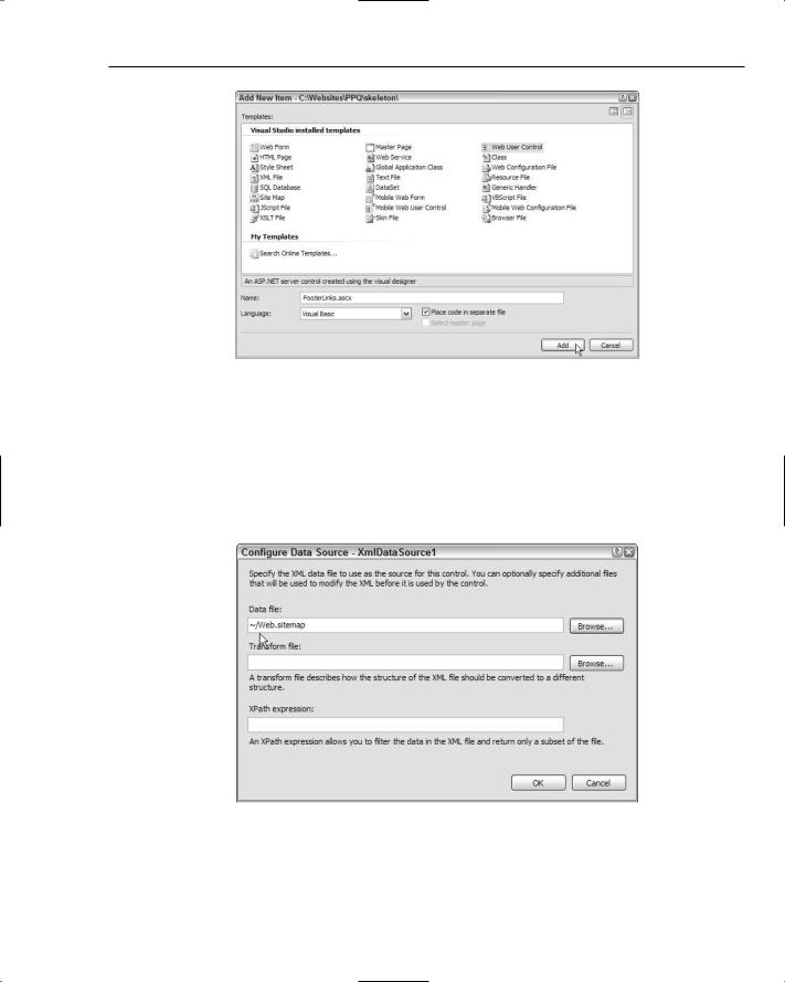
1.Go to the Solution Explorer window, and select the folder named user-controls. Right-click, and select Add New Item . . . to open the Add New Item dialog (doing this from a folder in the Solution Explorer window means that the new item will be created within the selected folder, rather that at the root of the Web site). Select Web User Control, change the filename to FooterLinks.ascx, and click Add (see Figure 5-42).
164
Displaying Nested and XML Data
Figure 5-42: Add New Item dialog
2.Switch to Design view, and drag an XmlDataSource control from the Data section of the Toolbox onto the page. Click Configure Data Source in the XmlDataSource Tasks pane that appears to open the Configure Data Source dialog. Click the Browse . . . button next to the “Data file” text box to open the Select XML File dialog, change the “Files of type” list at the bottom to All Files (*.*). Then select Web.sitemap and click OK (see Figure 5-43). Notice that VWD adds the tilde character (~) to the start of the filename to indicate that it is in the root folder of the Web site’s ASP.NET application.
Figure 5-43: Tilde character (~) at beginning of filename
165

Chapter 5
3.Click the Browse . . . button next to the “Transform file” text box to open the Select XML Transform File dialog. Select FooterLinksTransform.xsl from the user-controls subfolder (see Figure 5-44), and click OK. Then click OK again to close the Configure Data Source dialog.
Figure 5-44: Filling in the Transform File dialog
4.Drag a Div control from the HTML section of the Toolbox onto the page, and then drag a Repeater control from Data section of the Toolbox and drop it into the Div control. Select XmlDataSource1 in the Choose Data Source drop-down list of the Repeater Tasks pane (see Figure 5-45).
Figure 5-45: Repeater Tasks pane
5.Drag another Div control from the HTML section of the Toolbox onto the page, placing it below the Repeater control. Then drag a Hyperlink control from Standard section of the Toolbox and drop it into the Div control (see Figure 5-46).
166
Displaying Nested and XML Data
Figure 5-46: Adding a Hyperlink control
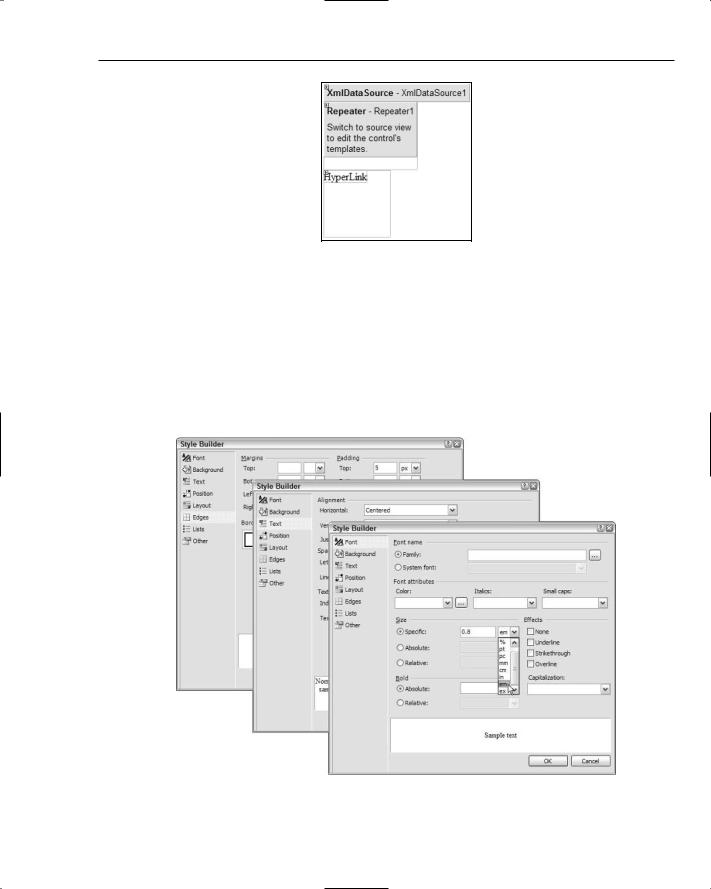
6.Switch to Source view, click on the first opening <div> element, and go to the Properties dialog. Select the Style property, and click the three dots (...) button to open the Style Builder dialog. In the Font page, go to the Size section in the middle of the dialog and select Specific; then enter 0.8 and select em. Then go to the Text page and select Centered for Alignment, Horizontal. Finally, go to the Edges page, enter 5, select px for the Padding, Top setting (see Figure 5-47), and click OK to close the Style Builder dialog. Now, click on the second <div> element and apply the same settings. Together, they will center the text links on the page and use a slightly smaller than standard font.
Figure 5-47: Style Builder dialog
167
Chapter 5
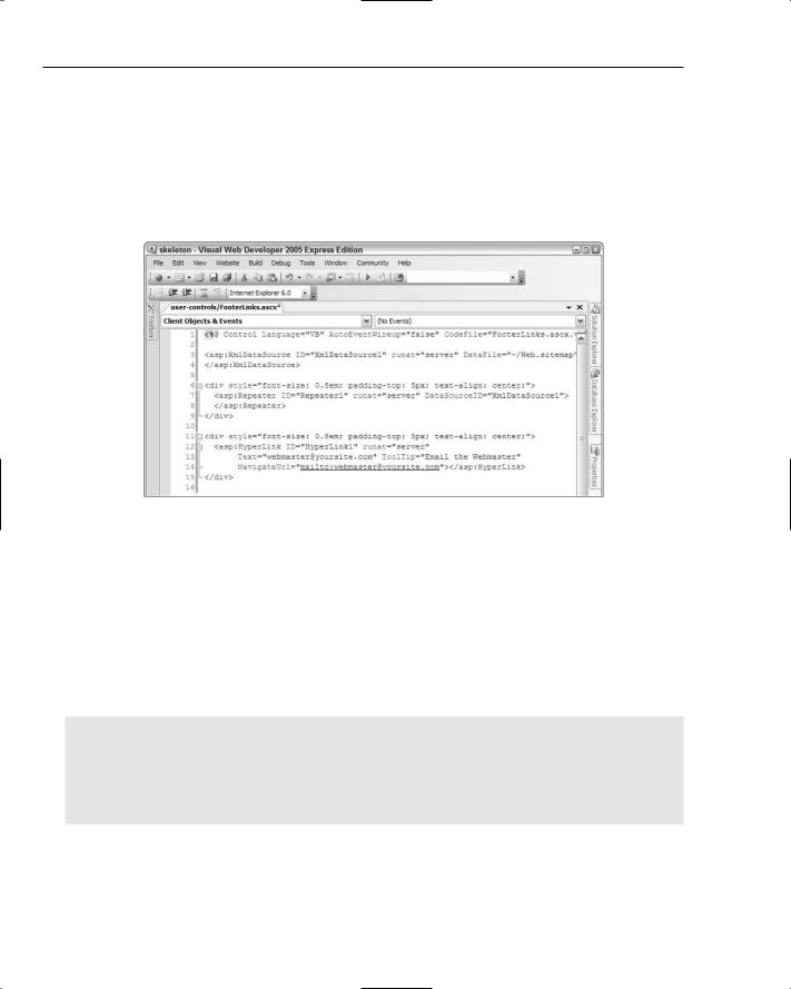
7.Click on the opening <asp:Hyperlink> tag, and open the Properties dialog. Set the Text property to the Webmaster address you want to use for your site, set the Tooltip property to Email the Webmaster, and set the NavigateUrl property mailto:your-email-address. Remove any content (such as “Hyperlink”) that VWD has inserted into the <asp:Hyperlink> element between the opening and closing tags. Also remove the width and height selectors that VWD adds to style attributes as the two <div> elements. Your code should now look something like Figure 5-48 (you can tidy up the layout and add line breaks to make it easier to read and assimilate).
Figure 5-48: Resulting code
8.Now you can add the data binding statements that will pull the data from the XmlDataSource and display it in the page. To bind to the nodes in an XML file, you use the XPath statement (rather than Eval or Bind that you saw in earlier examples with a SqlDataSource control). The following listing shows the completed repeater control declaration, with the data binding statements highlighted. The statement XPath(“@url”) extracts the value of the attribute named url from the current element as the Repeater control is binding to each node in the XML document in turn. This sets the href attribute of a normal HTML anchor <a> element. Similarly, the values of the description and title attributes of the current element set the title attribute (the pop-up tooltip) and the text within the <a> and </a> tags that is displayed in the page.
<asp:Repeater ID=”Repeater1” runat=”server” DataSourceID=”XmlDataSource1”> <ItemTemplate>
<a href=’<%#XPath(“@url”)%>’ title=’<%#XPath(“@description”)%>’><%#XPath(“@title”)%></a>
</ItemTemplate>
<SeparatorTemplate> | </SeparatorTemplate> </asp:Repeater>
To save you having to type this and to avoid errors, you can copy this code from the file named FooterLinks.ascx.txt in the page-content folder of the examples. Figure 5-49 shows what it should look like when complete.
168

Displaying Nested and XML Data
Figure 5-49: Result of adding data-binding statements
9.The final task now is to insert the new user control into the Master Page of the site where the placeholder is currently located. The easiest way to insert a user control into another page is to drag it from the Solution Explorer window into the target page. Open the page PPQ.master in Design view, and drag the file FooterLinks.ascx from the user-controls subfolder in the Solution Explorer window onto the PPQ.master page. Drop it into the bottom section of the page, next to the existing text placeholder (“Footer and text links go here”). Then delete the text placeholder. You will see the contents of your user control in the page (see Figure 5-50).
Figure 5-50: Contents of user control
10.Switch to Source view to see what VWD has done. At the top of the page, it added a Register directive that provides the link between the prefix and name of the element (tag) that will be used to insert the user control into the page, and the file containing the declaration of the user control:
<%@ Register Src=”user-controls/FooterLinks.ascx”
TagName=”FooterLinks” TagPrefix=”uc1” %>
Then, at the position where the control will appear on the page, it added the appropriate element:
<uc1:FooterLinks ID=”FooterLinks1” runat=”server” />
169

Chapter 5
You can, of course, add these elements yourself rather than using the drag-and-drop method. To see the result, click the “run” button on the toolbar, or press F5. VWD executes the Default.aspx page, and the text links and footer can be seen at the bottom of the section of the page that is generated by the Master Page (see Figure 5-51).
Figure 5-51: Master Page text links and footer
Converting Parts of a Page into a User Control
Instead of creating a user control directly, as you did in the previous section, you can convert existing sections of a page into a user control quite easily. Any page content that is repeated across your pages (even if repeated only on a single page), or that would be useful in other sites you build, can be converted into a user control.
You simply copy any HTML, control declarations, or code that you want to place in the user control into a separate file. You can create this file by selecting Web User Control in the Add New Item dialog (select New File . . . from the File menu), or you can do it by removing any unwanted content from an existing Web Form (.aspx) page. Then change the @Page directive to @Control and save the file with the .ascx extension. To insert this file as a user control, just drag it from the Solution Explorer window into your target Web Form page.
Note that a user control should not contain the <html>, <head>, or <body> tags, or a server-side <form> (a <form> element with the runat=”server” attribute). Only one instance of these elements is permitted in a page, and the parent page that contains the user control should declare these elements instead. That way, you can use multiple copies of the user control in the same page if you wish.
You can only use a user control from within the same ASP.NET application, but you can copy your user control (complete with any images or other resources it uses) into another application and use it there. You will come across another example of a user control later in this book, when you see how the process of placing an order in the PPQ Web site is implemented.
Summar y
In this chapter, you have investigated three topic areas. The first was a detailed look into how ASP.NET can create nested data-bound output from a relational database, both by using the data source controls and through custom code that you write yourself. The display of data in nested format might seem an esoteric topic but, in fact, it finds its way into many common scenarios. Examples range from the pizza menu you saw in this chapter to displaying details of customer orders, and even to areas such as stock location in a warehouse.
170

Displaying Nested and XML Data
Getting the most from any programming environment generally means learning more about the tools and the underlying frameworks and languages it supports. To achieve some of the tasks in this chapter, you need to learn more about the programming techniques available within the .NET Framework — but this is no bad thing. In this chapter, you discovered more about how data access works in ADO.NET and how custom code can improve the performance of your pages.
The second topic area covered in this chapter is the way that you can handle XML data using a data source control and the same data display controls as you used earlier with relational data from a database. XML data is becoming increasingly common, and ASP.NET provides plenty of techniques for managing it. As with ADO.NET, there are plenty of classes available within the System.Xml namespace you can use to write your own custom XML data-handling routines.
Finally, this chapter showed how you can create reusable content for your Web sites as user controls. These are simply sections of HTML, code, server controls, or other content that are stored as separate files and then dropped into the target page in VWD. They provide many advantages for situations where you have repeated similar content (for example, you can edit the user control and these changes automatically appear in all the pages that use it).
In Chapter 6, you continue your exploration of the PPQ Web site, and the techniques used to build it, by moving on to the process of taking an order from a customer.
171


6
Managing and Editing Data
In the previous two chapters, we have looked at various ways of displaying data, using the data source controls and grids supplied with ASP.NET. While displaying data is a core requirement of many Web sites, there are times when you also need to allow editing, and you can use the same controls as for displaying data. In the PPQ application, users have no need to update data, but the site administrators might — to update the menu and prices.
In this chapter, we are going to see how the administrator of a site can perform edits on the data. In particular, we’ll be looking at:
How to modify the SqlDataSource control to allow data editing
How to configure the GridView to allow data editing.
Both of these topics extend techniques you’ve already used, so you will find this a natural progression into your exploration of data controls.
Data Source Controls
In Chapter 4, you saw how the SqlDataControl was used to fetch data from a database by specifying a SQL command in the SelectCommand property. When the page is loaded, the SqlDataSource object opens a connection to the database and runs this command to fetch the data. The SqlDataControl also has properties that allow you to define the command to be run to modify data, which are the InsertCommand, UpdateCommand, and DeleteCommand properties. You’ve already seen these in action, even if you didn’t realize it, when you used the test menu pages in Chapter 4 (the grid had editing capabilities).
The properties of the SqlDataSource control allow you to specify different SQL commands for different types of operation. So, we have the following properties: