

Pro CSharp 2008 And The .NET 3.5 Platform [eng]-1
.pdf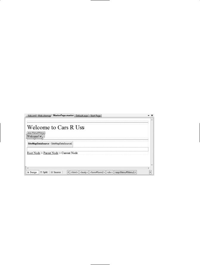
1222 CHAPTER 32 ■ ASP.NET WEB CONTROLS, THEMES, AND MASTER PAGES
<AlternateText>Your new Car?</AlternateText> <Impressions>80</Impressions>
</Ad>
<Ad>
<ImageUrl>car.gif</ImageUrl>
<TargetUrl>http://www.CarSuperSite.com</TargetUrl> <AlternateText>Like this Car?</AlternateText> <Impressions>80</Impressions>
</Ad>
</Advertisements>
Here you have specified two image files (car.gif and slugbug.jpg), and therefore you will need to ensure that these files are in the root of your website (these files have been included with this book’s code download). To add them to your current project, simply select the Web Site Add Existing Item menu option. At this point, you can associate your XML file to the AdRotator controls via the AdvertisementFile property (in the Properties window):
<asp:AdRotator ID="myAdRotator" runat="server" AdvertisementFile="~/Ads.xml"/>
Later when you run this application and post back to the page, you will be randomly presented with one of two image files. Figure 32-10 illustrates the final design-time UI of the master page.
Figure 32-10. The final design of the master page
Defining the Default.aspx Content Page
Now that you have a master page established, you can begin designing the individual *.aspx pages that will define the UI content to merge within the <asp:ContentPlaceHolder> tag of the master page. When you created this new website, Visual Studio 2008 automatically provided you with an initial *.aspx file, but as the file now stands, it cannot be merged within the master page.
The reason is that it is the *.master file that defines the <form> section of the final HTML page. Therefore, the existing <form> area within the *.aspx file will need to be replaced with an <asp:content> scope. While you could update the markup of your initial *.aspx file by hand, go ahead and delete Default.aspx from your project. When you wish to automatically insert a new content page to your project, simply right-click anywhere on the designer surface of the *.master file, and select the Add Content Page menu option. This will generate a new *.aspx file with the following initial markup:
CHAPTER 32 ■ ASP.NET WEB CONTROLS, THEMES, AND MASTER PAGES |
1223 |
<%@ Page Language="C#" MasterPageFile="~/MasterPage.master" AutoEventWireup="true" CodeFile="Default.aspx.cs" Inherits="_Default" Title="Untitled Page" %>
<asp:Content ID="Content1" ContentPlaceHolderID="head" Runat="Server">
</asp:Content> <asp:Content ID="Content2"
ContentPlaceHolderID="ContentPlaceHolder1" Runat="Server"> </asp:Content>
First, notice that the <%@Page%> directive has been updated with a new MasterPageFile attribute that is assigned to your *.master file. Also note that rather than having a <form> element, we have an <asp:Content> scope (currently empty) that has set the ContentPlaceHolderID value identical to the <asp:ContentPlaceHolder> component in the master file.
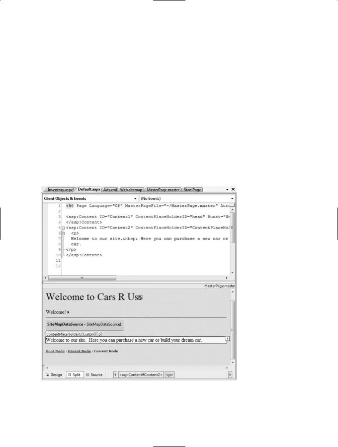
Given these associations, the content page understands where to “plug in” its content, while the master’s content is displayed in a read-only nature on the content page. There is no need to build a complex UI for your Default.aspx content area, so for this example, simply add some literal text that provides some basic site instructions, as you see in Figure 32-11 (also notice on the upper right of the content page that there is a link to switch to the related master file).
Figure 32-11. Authoring the first content page
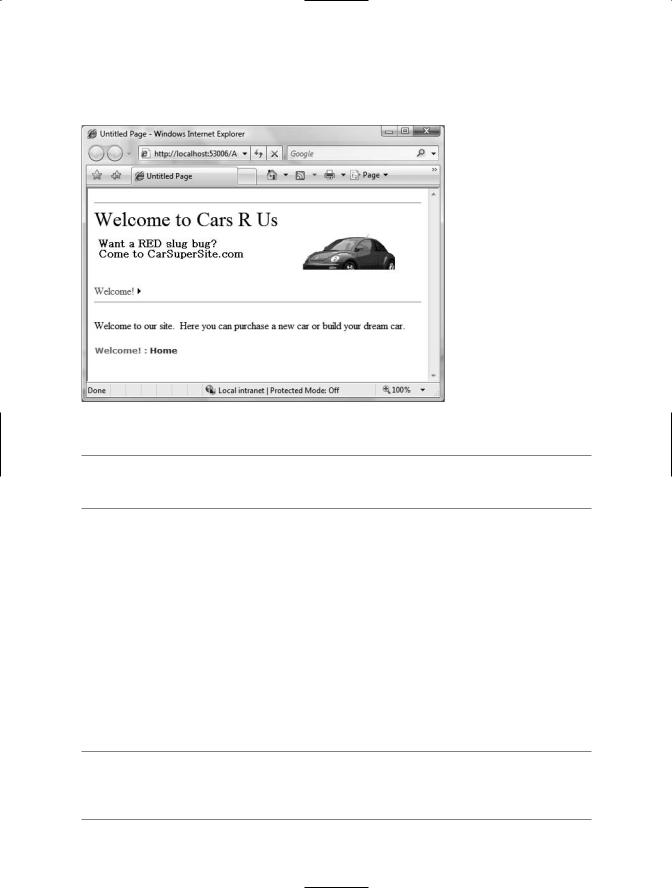
Now, if you run your project, you will find that the UI content of the *.master and Default.aspx files have been merged into a single stream of HTML. As you can see from Figure 32-12, the end
1224 CHAPTER 32 ■ ASP.NET WEB CONTROLS, THEMES, AND MASTER PAGES
user is unaware that the master page even exists. Also, as you refresh the page (via the F5 key), you should see the AdRotator randomly displaying one of two images.
Figure 32-12. At runtime, master files and content pages render back a single form.
■Note Do be aware that a Page object’s master page can be assigned programmatically within the PreInit event of a Page derived type, using the Master property.
Designing the Inventory Content Page
To insert the Inventory.aspx content page into your current project, open the *.master page in the IDE, select Web Site Add Content Page (if a *.master file is not the active item in the designer, this menu option is not present), and rename this file to Inventory.aspx. The role of the Inventory content page is to display the contents of the Inventory table of the AutoLot database within a GridView control.
Although this control behaves in many ways identically to the legacy ASP.NET 1.x DataGrid, GridView has intrinsic support for the latest data binding engine of ASP.NET. Under the new model, it is now possible to represent connection string data and SQL Select, Insert, Update, and Delete statements (or alternatively stored procedures) in markup. Therefore, rather than authoring all of the necessary ADO.NET code by hand, you can make use of the new SqlDataSource type. Using the visual designers, you are able to declaratively create the necessary markup and then assign the
DataSourceID property of the GridView to the SqlDataSource component.
■Note Despite the name, the SqlDataSource provider can be configured to communicate with any ADO.NET data provider (ODBC, Oracle, etc.) that ships with the Microsoft .NET platform; it is not limited to Microsoft SQL Server. You may set the target DBMS with via the Provider property.

CHAPTER 32 ■ ASP.NET WEB CONTROLS, THEMES, AND MASTER PAGES |
1225 |
With a few simple mouse clicks, you can configure the GridView to automatically select, update, and delete records of the underlying data store. While this zero-code mindset greatly simplifies the amount of boilerplate code, understand that this simplicity comes with a loss of control and may not be the best approach for an enterprise-level application. This model can be wonderful for low-trafficked pages, prototyping a website, or smaller in-house applications.
To illustrate how to work with the GridView (and the new data binding engine) in a declarative manner, begin by updating the Inventory.aspx content page with a descriptive label. Next, open the Server Explorer tool (via the View menu) and make sure you have added a data connection to the AutoLot database created during our examination of ADO.NET (see Chapter 22 for a walkthrough of the process of adding a data connection). Now, select the Inventory icon and drag it onto the content area of the Inventory.aspx file. Once you have done so, the IDE responds by performing the following steps:
1.Your web.config file was updated with a new <connectionStrings> element.
2.A SqlDataSource component was configured with the necessary Select, Insert, Update, and
Delete logic.
3.The DataSourceID property of the GridView has been set to the new SqlDataSource component.
■Note As an alternative, you can configure a GridView widget using the inline editor. Select New Data Source from the Choose Data Source drop-down box. This will activate a wizard that walks you through a series of steps to connect this component to the required data source.
If you examine the opening declaration of the GridView control, you will see that the DataSourceID property has been set to the SqlDataSource you just defined:
<asp:GridView ID="GridView1" runat="server" AutoGenerateColumns="False" CellPadding="4" DataKeyNames="CarID" DataSourceID="SqlDataSource1" ForeColor="#333333" GridLines="None">
...
</asp:GridView>
The SqlDataSource type is where a majority of the action is taking place. In the markup that follows, notice that this type has recorded the necessary SQL statements (with parameterized queries no less) to interact with the Inventory table of the AutoLot database. As well, using the $ syntax of the ConnectionString property, this component will automatically read the <connectionString> value from web.config:
<asp:SqlDataSource ID="SqlDataSource1" runat="server"
ConnectionString="<%$ ConnectionStrings:CarsConnectionString1 %>"
DeleteCommand="DELETE FROM [Inventory] WHERE [CarID] = @CarID" InsertCommand="INSERT INTO [Inventory] ([CarID], [Make], [Color], [PetName])
VALUES (@CarID, @Make, @Color, @PetName)"
ProviderName="<%$ ConnectionStrings:CarsConnectionString1.ProviderName %>" SelectCommand="SELECT [CarID], [Make], [Color], [PetName] FROM [Inventory]" UpdateCommand="UPDATE [Inventory] SET [Make] = @Make,
[Color] = @Color, [PetName] = @PetName WHERE [CarID] = @CarID"> <DeleteParameters>
<asp:Parameter Name="CarID" Type="Int32" /> </DeleteParameters>
<UpdateParameters>
<asp:Parameter Name="Make" Type="String" /> <asp:Parameter Name="Color" Type="String" />
CHAPTER 32 ■ ASP.NET WEB CONTROLS, THEMES, AND MASTER PAGES |
1227 |
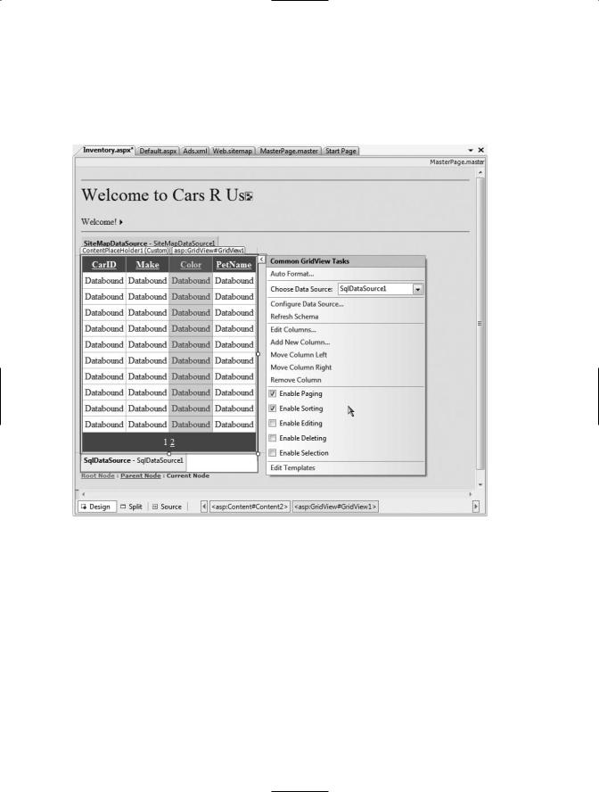
Enabling Sorting and Paging
The GridView control can easily be configured for sorting (via column name hyperlinks) and paging (via numeric or next/previous hyperlinks). To do so, activate the inline editor and check the appropriate options, as shown in Figure 32-14.
Figure 32-14. Enabling sorting and paging
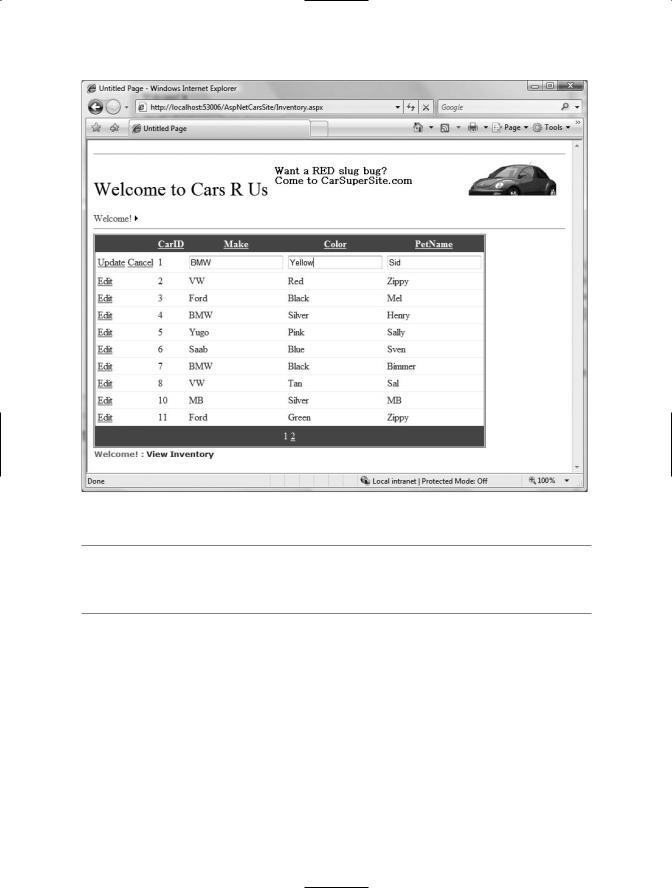
When you run your page again, you will be able to sort your data by clicking the column names and scrolling through your data via the paging links (provided you have enough records in the Inventory table!).
Enabling In-Place Editing
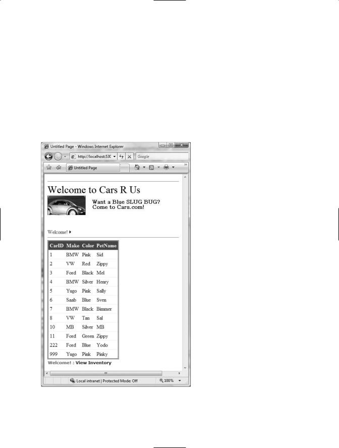
The final detail of this page is to enable the GridView control’s support for in-place activation. Given that your SqlDataSource already has the necessary Delete and Update logic, all you need to do is check the Enable Deleting and Enable Editing check boxes of the GridView (see Figure 32-14 for a reference point). Sure enough, when you navigate back to the Inventory.aspx page, you are able to edit and delete records, as shown in Figure 32-15, and update the underlying Inventory table of the AutoLot database.
1228 CHAPTER 32 ■ ASP.NET WEB CONTROLS, THEMES, AND MASTER PAGES
Figure 32-15. Editing and deleting functionality
■Note Enabling in-place editing for a GridView requires that the database table be assigned a primary key. If you do not see these options enabled, chances are very good you forgot to set CarID as the primary key of the Inventory table within the AutoLot database.
Designing the Build-a-Car Content Page
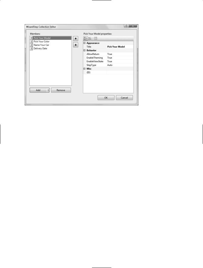
The final task for this example is to design the BuildCar.aspx content page. Insert this file into the current project (via the Web Site Add Content Page menu option). This new page will make use of the ASP.NET Wizard web control, which provides a simple way to walk the end user through a series of related steps. Here, the steps in question will simulate the act of building an automobile for purchase.
Place a descriptive Label and Wizard control onto the content area. Next, activate the inline editor for the Wizard and click the Add/Remove WizardSteps link. Add a total of four steps, as shown in Figure 32-16.
CHAPTER 32 ■ ASP.NET WEB CONTROLS, THEMES, AND MASTER PAGES |
1229 |
Figure 32-16. Configurng our wizard
Once you have defined these steps, you will notice that the Wizard defines an empty content area where you can now drag and drop controls for the currently selected step. For this example, update each step with the following UI elements (be sure to provide a descent ID value for each item using the Properties window):
•Pick Your Model: A TextBox control
•Pick Your Color: A ListBox control
•Name Your Car: A TextBox control
•Delivery Date: A Calendar control
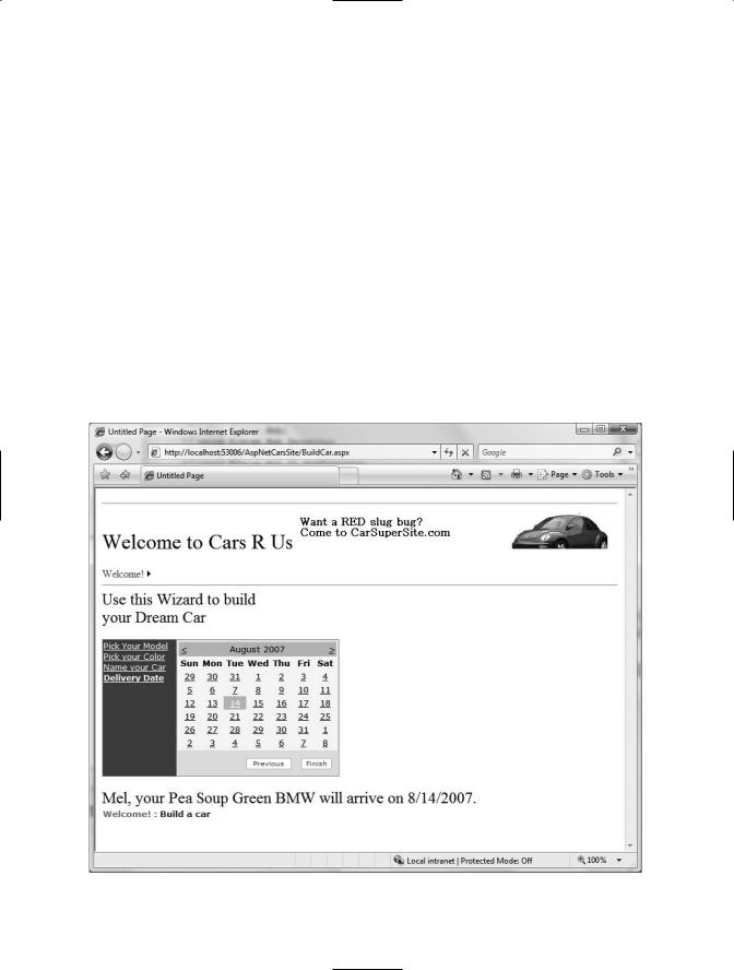
The ListBox control is the only UI element of the Wizard that requires additional steps. Select this item on the designer (making sure you first select the Pick Your Color link) and fill this widget with a set of colors using the Items property of the Properties window. Once you do, you will find markup much like the following within the scope of the Wizard definition:
<asp:ListBox ID="ListBoxColors" runat="server" Width="237px"> <asp:ListItem>Purple</asp:ListItem> <asp:ListItem>Green</asp:ListItem> <asp:ListItem>Red</asp:ListItem> <asp:ListItem>Yellow</asp:ListItem>
<asp:ListItem>Pea Soup Green</asp:ListItem> <asp:ListItem>Black</asp:ListItem> <asp:ListItem>Lime Green</asp:ListItem>
</asp:ListBox>
Now that you have defined each of the steps, you can handle the FinishButtonClick event for the autogenerated Finish button. Within the server-side event handler, obtain the selections from each UI element and build a description string that is assigned to the Text property of an additional
Label type named lblOrder:

CHAPTER 32 ■ ASP.NET WEB CONTROLS, THEMES, AND MASTER PAGES |
1231 |
That wraps up our examination of various ASP.NET UI-centric web controls. Next up, let’s look at the validation controls.
■Source Code The AspNetCarsSite project is included under the Chapter 32 subdirectory.
The Role of the Validation Controls
The next set of Web Form controls we will examine are known collectively as validation controls. Unlike the other Web Form controls we’ve examined, validation controls are not used to emit HTML for rendering purposes, but are used to emit client-side JavaScript (and possibly related server-side code) for the purpose of form validation. As illustrated at the beginning of this chapter, client-side form validation is quite useful in that you can ensure that various constraints are in place before posting back to the web server, thereby avoiding expensive round-trips. Table 32-3 gives a rundown of the ASP.NET validation controls.
Table 32-3. ASP.NET Validation Controls
Control |
Meaning in Life |
CompareValidator |
Validates that the value of an input control is equal to a given value |
|
of another input control or a fixed constant. |
CustomValidator |
Allows you to build a custom validation function that validates a |
|
given control. |
RangeValidator |
Determines that a given value is in a predetermined range. |
RegularExpressionValidator |
Checks whether the value of the associated input control matches |
|
the pattern of a regular expression. |
RequiredFieldValidator |
Ensures that a given input control contains a value (i.e., is not |
|
empty). |
ValidationSummary |
Displays a summary of all validation errors of a page in a list, |
|
bulleted list, or single-paragraph format. The errors can be |
|
displayed inline and/or in a pop-up message box. |
|
|
All of the validation controls ultimately derive from a common base class named System.Web.UI.WebControls.BaseValidator, and therefore they have a set of common features. Table 32-4 documents the key members.
Table 32-4. Common Properties of the ASP.NET Validators
Member |
Meaning in Life |
ControlToValidate |
Gets or sets the input control to validate |
Display |
Gets or sets the display behavior of the error message in a validation |
|
control |
EnableClientScript |
Gets or sets a value indicating whether client-side validation is enabled |
ErrorMessage |
Gets or sets the text for the error message |
ForeColor |
Gets or sets the color of the message displayed when validation fails |
|
|