

Pro CSharp 2008 And The .NET 3.5 Platform [eng]-1
.pdf
1052 CHAPTER 28 ■ INTRODUCING WINDOWS PRESENTATION FOUNDATION AND XAML
Figure 28-22. SimpleXamlPad.exe in action
Great! I am sure you can think of many possible enhancements to this application, but to do so you need to be aware of how to work with WPF controls and the panels that contain them. Before examining the WPF control model in the next chapter, we will close this chapter by quickly examining the Microsoft Expression Blend application.
■Source Code The SimpleXamlPad project can be found under the Chapter 28 subdirectory.
The Role of Microsoft Expression Blend
While learning new technologies such as XAML and WPF is exciting to most developers, few of us are thrilled by the thought of authoring thousands of lines of markup to describe windows, 3D images, animations, and other such things. Even with the assistance of Visual Studio 2008, generating a feature-rich XAML description of complex entities is tedious and error-prone. Visual Studio 2008 is much better equipped to author procedural code and tweak XAML definitions generated by a tool that is dedicated to the automation of XAML descriptions.
Recall that one of the biggest benefits of WPF is the separation of concerns. However, WPF does not simply use separation of concerns at the file level (e.g., C# code files and XAML files). In fact, a WPF application honors the separation of concerns at the level of the tools we use to build our applications. This is important, as a professional WPF application will typically require you to make use of the services of a talented graphic artist to give the application the proper look and feel. As you can imagine, nontechnical individuals would rather not use Visual Studio 2008 to author XAML.
To address these problems, Microsoft has created a new family of products that fall under the Expression umbrella. Full details of each member of the Expression family can be found at http:// www.microsoft.com/expression, but in a nutshell, Expression Blend is a tool geared toward building feature-rich WPF front ends.
Benefits of Expression Blend
The first major benefit of Expression Blend is that the manner in which a graphic artist would author the UI feels similar (but certainly not identical to) to other multimedia applications such as Adobe Photoshop or Macromedia Director. For example, Expression Blend supports tools to build story frames for animations, color blending utilities, layout and graphical transformation tools, and so forth. In addition, Expression Blend provides features that lean a bit closer to the world of code,

CHAPTER 28 ■ INTRODUCING WINDOWS PRESENTATION FOUNDATION AND XAML |
1053 |
including support to establish data bindings and event triggers. Regardless, a graphic artist can build extremely rich UIs without ever seeing a single line of XAML or procedural C# code. Figure 28-23 shows a screen shot of Expression Blend in action.
Figure 28-23. Expression Blend generates XAML transparently in the background.
The next major benefit of Expression Blend is that it makes use of the same exact project workspace as Visual Studio 2008! Therefore, once a graphic artist renders the UI, a C# professional is able to open the same project and author code, add event handlers, tweak XAML, and so forth. Likewise, graphic artists can open existing Visual Studio 2008 WPF project into Expression Blend to spruce up a lackluster front end. The short answer is, WPF is a highly collaborative endeavor between related code files and development tools.
While it is true that use of a tool like Expression Blend is more or less mandatory when using WPF to generate bleeding-edge media-rich applications, this edition of the text will not cover the details of doing so. To be sure, the purpose of this book is to examine the underlying programming model of WPF, not to dive into the details of art theory. However, if you are interested in learning more, you are able to download evaluation copies of the members of the Microsoft Expression family from the supporting website. At the very least I suggest downloading a trial copy of Expression Blend just to see what this tool is capable of.
Summary
Windows Presentation Foundation (WPF) is a user interface toolkit introduced since the release of
.NET 3.0. The major goal of WPF is to integrate and unify a number of previously unrelated desktop technologies (2D graphics, 3D graphics, window and control development, etc.) into a single unified programming model. Beyond this point, WPF programs typically make use of Extendable

1054 CHAPTER 28 ■ INTRODUCING WINDOWS PRESENTATION FOUNDATION AND XAML
Application Markup Language (XAML), which allows you to declare the look and feel of your WPF elements via markup.
As you have seen in this chapter, XAML allows you to describe trees of .NET objects using a declarative syntax. During this chapter’s investigation of XAML, you were exposed to several new bits of syntax including property-element syntax and attached properties, as well as the role of type converters and XAML markup extensions. The chapter wrapped up with an examination of how you can programmatically interact with XAML definitions using the XamlReader and XamlWriter types, you took a tour of the WPF-specific features of Visual Studio 2008, and you briefly looked at the role of Microsoft Expression Blend.


1056 CHAPTER 29 ■ PROGRAMMING WITH WPF CONTROLS
Table 29-1. The Core WPF Controls
WPF Control Category |
Example Members |
Meaning in Life |
Core user input controls |
Button, RadioButton, ComboBox, |
As expected, WPF provides a |
|
CheckBox, Expander, ListBox |
whole family of controls that |
|
Slider, ToggleButton, TreeView, |
can be used to build the crux of |
|
ContextMenu, ScrollBar, Slider, |
a user interface. |
|
TabControl, TextBox, RepeatButton, |
|
|
RichTextBox, Label |
|
Window frame |
Menu, ToolBar, StatusBar, ToolTip, |
These UI elements are used to |
adornment controls |
ProgressBar |
decorate the frame of a Window |
|
|
object with input devices (such |
|
|
as the Menu) and user |
|
|
informational elements |
|
|
(StatusBar, ToolTip, etc.). |
Media controls |
Image, MediaElement, |
These provide support for |
|
SoundPlayerAction |
audio/video playback and |
|
|
image display. |
Layout controls |
Border, Canvas, DockPanel, Grid, |
WPF provides numerous |
|
GridView, GroupBox, Panel, |
controls that allow you to group |
|
StackPanel, Viewbox, WrapPanel |
and organize other controls for |
|
|
the purpose of layout |
|
|
management. |
|
|
|
Beyond the GUI types in Table 29-1, WPF defines additional controls for advanced document processing (DocumentViewer, FlowDocumentReader, etc.) as well as types to support the Ink API (useful for tablet PC development) and various canned dialog boxes (PasswordBox, PrintDialog, FileDialog,
OpenFileDialog, and SaveFileDialog).
■Note The FileDialog, OpenFileDialog, and SaveFileDialog types are defined within the Microsoft. Win32 namespace of the PresentationFramework.dll assembly.
If you are coming to WPF from a Windows Forms background, you may notice that the current offering of intrinsic controls is somewhat less than that of Windows Forms (for example, WPF does not have “spin button” controls). The good news is that many of these missing controls can be expressed in XAML quite quickly and can even be modeled as a user control or custom control for reuse between projects.
■Note This edition of the text does not cover the construction of custom WPF user controls or WPF control libraries. If you are interested in learning how to do so, consult the .NET Framework 3.5 SDK documentation.
WPF Controls and Visual Studio 2008
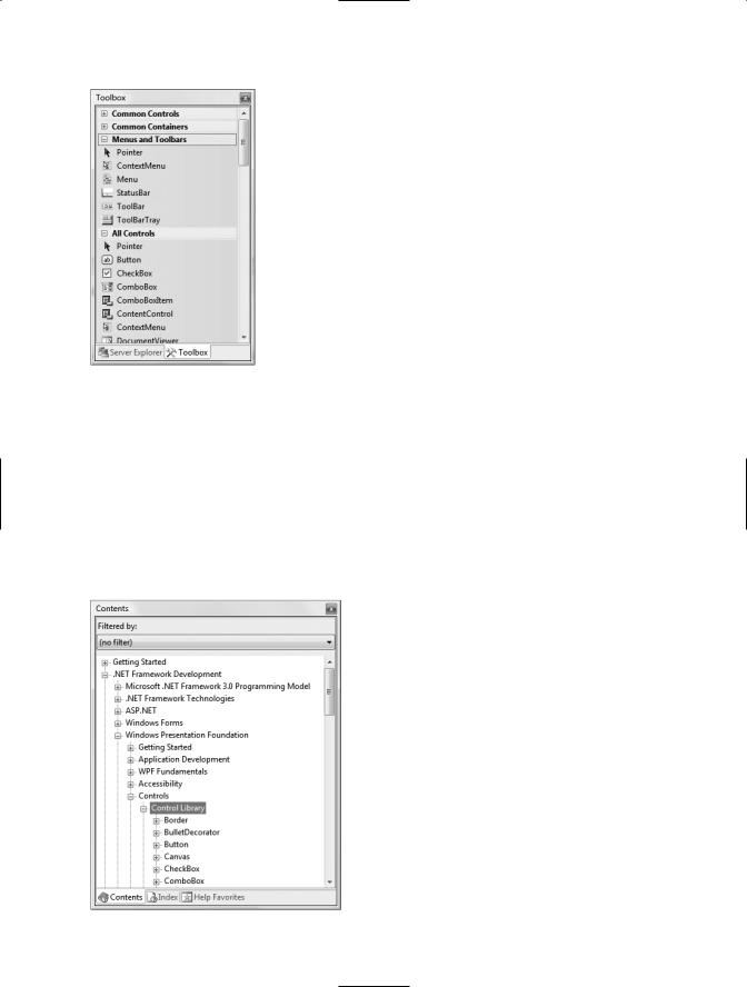
When you create a new WPF Application project using Visual Studio 2008 (see the previous chapter), you will see a majority of controls exposed from the Toolbox (grouped by related category), as shown in Figure 29-1.
Like a Windows Forms project, these controls can be dragged onto the visual designer and configured with the Properties window. Furthermore, recall from Chapter 28 that if you handle events using the XAML editor, the IDE will autogenerate an appropriate event handler in your code file.


CHAPTER 29 ■ PROGRAMMING WITH WPF CONTROLS |
1059 |
By way of a simple compare and contrast, consider how this same control would be built using Windows Forms. Under this API, you could achieve this control only by building a custom Button- derived type that manually handled the rendering of the graphical content, updated the internal controls collection, overrode various event handlers, and so forth.
Given the birth of desktop markup, the only compelling reasons to build custom WPF controls are if you need a widget that supports custom behaviors (events, overriding of virtual methods, support for additional interface types, etc.) or must support customized design-time configuration utilities. If you are only concerned with generating a customized rendering, XAML fits the bill.
Interacting with Controls in Code Files
Recall from the previous chapter that the properties of a WPF type can be set using attributes within an element’s opening tag (or alternatively using property-element syntax). In the majority of cases, attributes of an XAML element directly map to the properties and events of the control’s class representation within the System.Windows.Controls namespace. As such, you always have the option to define a control completely in markup or completely in code, or to use a mix of the two.
■Note You can only gain direct access to a control within a related code file if it has been declared using the Name attribute in the opening element of the XAML definition.
Given that the previous XAML markup contains types that have been assigned a Name attribute, you can directly access the type in your code file as well as handle any declared events. For example, we could change the value of the Label’s FontSize property as follows:
public partial class MainWindow : System.Windows.Window
{
public MainWindow()
{
InitializeComponent();
// Change FontSize of Label. lblInstructions.FontSize = 14;
}
}
This is possible because controls that are given a Name attribute in the XAML definition result in a member variable in the autogenerated *.g.cs file (see Chapter 28):
public partial class MainWindow : System.Windows.Window, System.Windows.Markup.IComponentConnector
{
// Member variables defined based on the XAML markup. internal System.Windows.Controls.Button btnPurchaseOptions; internal System.Windows.Controls.Label lblInstructions; internal System.Windows.Controls.Expander colorExpander; internal System.Windows.Controls.Expander MakeExpander; internal System.Windows.Controls.Expander paymentExpander;
...
}
When you wish to handle events for a given control, you are able to assign a method name to a given event in your XAML definition as follows:


CHAPTER 29 ■ PROGRAMMING WITH WPF CONTROLS |
1061 |
Like a “normal” .NET property (often termed a CLR property in the WPF literature), dependency properties can be set declaratively using XAML or programmatically within a code file. Furthermore, dependency properties (like CLR properties) exist to encapsulate data fields and can be configured as read-only, write-only, or read-write, and so forth.
To make matters more interesting, in most cases you will be blissfully unaware that you have actually set a dependency property as opposed to a CLR property! For example, the Height and Width members WPF controls inherit from FrameworkElement, as well as the Content member inherited from ControlContent, are all dependency properties:
<!-- You just set three dependency properties! -->
<Button Name = "btnMyButton" Height = "50" Width = "100" Content = "OK"/>
Given all of these similarities, you may wonder exactly why WPF has introduced a new term for a familiar concept. The answer lies in how a dependency property is implemented under the hood. Once implemented, dependency properties provide a number of powerful features that are used by various WPF technologies including data binding, animation services, themes and styles, and so forth. In a nutshell, dependency properties provide the following benefits above and beyond the simple data encapsulation found with a CLR property:
•Dependency properties can inherit their values from a parent element’s XAML definition.
•Dependency properties support the ability to have values set by external types (recall from Chapter 28 that attached properties do this very thing, as attached properties are based on dependency properties).
•Dependency properties allow WPF to compute a value based on multiple external values.
•Dependency properties provide the infrastructure for callback notifications and triggers (used quite often when building animations, styles, and themes).
•Dependency properties allow for static storage of their data (which helps conserve memory consumption).
One key difference of a dependency property is that it allows WPF to compute a value based on values from multiple property inputs. The other properties in question could include OS system properties (including systemwide user preferences), values based on data binding and animation/ storyboard logic, resources and styles, or values known through parent/child relationships with other XAML elements.
Another major difference is that dependency properties can be configured to monitor changes of the property value to force external actions to occur. For example, changing the value of a dependency property might cause WPF to change the layout of controls on a Window, rebind to external data sources, or move through the steps of a custom animation.
Examining an Existing Dependency Property
To be completely honest, the chances that you will need to manually build a dependency property for your WPF projects are quite slim. In reality, the only time you will typically need to do so is if you are building a custom WPF control, where you have subclassed an existing control to modify its behaviors. In this case, if you are creating a property that needs to work with the WPF data-binding engine, theme engine, or animation engine, or if the property must broadcast when it has changed, a dependency property is the correct course of action. In all other cases, a normal CLR property will do.
While this is true, it is helpful to understand the basic composition of a dependency property, as it will make some of the more “mysterious” features of WPF less so and deepen your understanding of underlying WPF programming model. To illustrate the internal composition of a dependency