

Pro CSharp 2008 And The .NET 3.5 Platform [eng]
.pdf
1152 CHAPTER 30 ■ WPF 2D GRAPHICAL RENDERING, RESOURCES, AND THEMES
Assigning Styles Implicitly
WPF styles also support the ability to be implicitly set to all UI widgets within a given XAML scope. When you build a named style, assigning a Key property is technically optional, if you have narrowed the application of your style using the TargetType property:
<Style TargetType = "{x:Type Button}">
...
</Style>
By doing so, all Button types within scope will implicitly take on the MyFunkyStyle style, even though they are not making use of the StaticResource markup extension:
<Button Grid.Column ="1" Name="btnClickMe"
Height="80" Width = "100" Content = "Click Me"/>
<Button Grid.Column ="2" Name="btnClickMeToo" Height="80" Width = "100" Content = "Me Too"/>
Be aware that when you define a style using the TargetType property that does not have a Key value established, the style is applied only to identically named types. Therefore, if we were to update the current style to the following:
<Style TargetType = "{x:Type Control}">
...
</Style>
neither the Button nor the TextBox type would adopt the style! Again, the reason is that this iteration of our style is targeting the Control base class. Always remember that the notion of a style representing a class or a derivative thereof works only for named styles.
■Source Code The FunWithResources project can be found under the Chapter 30 subdirectory.
Defining Styles with Triggers
The next aspect of WPF styles to examine here is the notion of triggers, which allow you to define certain <Setter> elements in such a way that they will only be applied if a given condition is true. For example, perhaps you want to increase the size of a font when the mouse is over a button. Or maybe you want to make sure that the text box with the current focus is highlighted with a given color. Triggers are very useful for these sorts of situations, in that they allow you to take specific actions when a property changes without the need to author explicit C# code in a code-behind file.
The following XAML markup defines three TextBox types, all of which have their Style property set to the TextBoxStyle style. While all text boxes will have a shared look and feel (height, width, etc.), only the text box that has the current focus will receive a yellow background.
<Window
xmlns="http://schemas.microsoft.com/winfx/2006/xaml/presentation"
xmlns:x="http://schemas.microsoft.com/winfx/2006/xaml">
<Window.Resources>
<Style x:Key ="TextBoxStyle" TargetType = "{x:Type TextBox}"> <Setter Property = "Foreground" Value = "Black"/>
<Setter Property = "Background" Value = "LightGray"/> <Setter Property = "Height" Value = "30"/>
<Setter Property = "Width" Value = "100"/>


1154 CHAPTER 30 ■ WPF 2D GRAPHICAL RENDERING, RESOURCES, AND THEMES
Assigning Styles Programmatically
To conclude our examination of styles, let’s now build a simple application that illustrates how you can assign styles to UI elements in code using a new Visual Studio WPF Windows Application project named StylesAtRuntime.
Our goal is to define three different styles for a Button type within the resource dictionary of the <Window> element. The first style, TiltStyle, rotates the button 10 degrees. The second style, GreenStyle, simply sets the Background, Foreground, and FontSize properties to preset values. The final style, MouseOverStyle, is based on GreenStyle, but adds a trigger condition that will increase the font size and text of the button widget. Here are the XAML descriptions for each style:
<Window.Resources>
<!-- |
This style tilts buttons at a 10-degree angle -- |
> |
<Style x:Key ="TiltStyle" TargetType = "{x:Type Button}"> <Setter Property = "RenderTransform">
<Setter.Value>
<RotateTransform Angle = "10"/> </Setter.Value>
</Setter>
</Style>
<!-- |
This style gives buttons a springtime feel -- |
> |
<Style x:Key ="GreenStyle" TargetType = "{x:Type Button}"> <Setter Property = "Background" Value ="Green"/> <Setter Property = "Foreground" Value ="Yellow"/> <Setter Property ="FontSize" Value ="15" />
</Style>
<!-- This style increases the size of a button when the mouse is over it -->
<Style x:Key ="MouseOverStyle" BasedOn ="{StaticResource GreenStyle}" TargetType = "{x:Type Button}">
<Style.Triggers>
<Trigger Property ="IsMouseOver" Value ="True"> <Setter Property ="FontSize" Value ="20" /> <Setter Property ="Foreground" Value ="Black" />
</Trigger>
</Style.Triggers>
</Style>
</Window.Resources>
The Window object will maintain a Grid that maps out locations for a TextBlock, ListBox, and Button. This ListBox will contain the names of each theme and will handle the SelectionChanged event. Here is the relevant XAML for the UI:
<Grid>
<Grid.ColumnDefinitions> <ColumnDefinition /> <ColumnDefinition /> </Grid.ColumnDefinitions>
<StackPanel Grid.Column="0">
<TextBlock TextWrapping ="Wrap" FontSize ="20" Padding="5,5,5,5">
Please select a style for the button on the left. </TextBlock>
<ListBox Name ="lstStyles" Height ="60" Background = "Yellow" SelectionChanged ="comboStyles_Changed" />


1156 CHAPTER 30 ■ WPF 2D GRAPHICAL RENDERING, RESOURCES, AND THEMES
Altering a Control’s UI Using Templates
Styles are a great (and simple) way to change the basic look of a WPF control, by establishing a default set of values for a widget’s property set. However, even though styles allow us to change various UI settings, the overall look and feel of the widget remains intact. Regardless of how we style a Button using various properties, it is basically still the same rectangular widget we have come to know over the years. However, what if you wish to completely replace the look and feel of the Button type (such as a hexagonal 3D image) while still having it behave as a Button? What if you wish to use the functionality of the WPF progress bar, but you would rather have it render its UI as a pie chart to show the completion percentage? Rather than building a custom control by hand (as we would have to do with many other GUI toolkits), WPF provides control templates.
Templates provide a clear separation between the UI of a control (i.e., the look and feel) and the behavior of the control (i.e., its set of events and methods). Using templates, you are free to completely change the rendered output of a WPF widget. Programmatically speaking, control templates are represented by the ControlTemplate base class, which can be expressed in XAML using the identically named <ControlTemplate> element. Once you have established your template, you can then attach it to WPF pages, windows, or controls using the Template property.
One interesting aspect of building a control template is that you have full control over how the widget’s content is positioned within the template using the <ContentPresenter> element. Using this element, you are able to specify the location and UI of the content for a given control template. More important, if you do not define a <ContentPresenter> element within a template, the control that adopts it will not render any content, even if it defines it:
<!-- If the applied template does not have a <ContentPresenter>, it will not display 'OK' -->
<Button Name ="myButton" Template ="{StaticResource roundButtonTemplate}"> Click!
</Button>
Beyond this point, when you are defining a control template, you may not be too surprised by the fact that it feels similar to the process of building a style. For example, templates are typically stored within a resource dictionary, can support triggers, and so on. Given this, you are already quite well equipped to build templates. Let’s see some in action using a new WPF Windows Application project named ControlTemplates.
Building a Custom Template
Here is a simple template that defines a round button using two <Ellipse> types contained within a <Grid>. The content will be in the dead center of the control, as we have set the HorizontalAlignment and VerticalAlignment properties to Center. Notice that our template has been given the name of roundButtonTemplate (via a resource key), which is made reference to when assigning the Template property of the Button:
<Window x:Class="ControlTemplates.MainWindow" xmlns="http://schemas.microsoft.com/winfx/2006/xaml/presentation" xmlns:x="http://schemas.microsoft.com/winfx/2006/xaml" Title="Fun with Control Templates" Height="162" Width="281" > <Grid>
<Grid.Resources>
<!-- A simple template for a round button for items in this grid -->
<ControlTemplate x:Key ="roundButtonTemplate" TargetType ="{x:Type Button}"> <Grid>
<Ellipse Name ="OuterRing" Width ="75" Height ="75" Fill ="DarkGreen"/> <Ellipse Name ="InnerRing" Width ="60" Height ="60" Fill ="MintCream"/> <ContentPresenter HorizontalAlignment="Center"
CHAPTER 30 ■ WPF 2D GRAPHICAL RENDERING, RESOURCES, AND THEMES |
1157 |
VerticalAlignment="Center"/>
</Grid>
</ControlTemplate>
</Grid.Resources>
<!-- |
Applying our template to a Button -- |
> |
<Button Name ="myButton" Foreground ="Black" FontSize ="20" FontWeight ="Bold"
Template ="{StaticResource roundButtonTemplate}"
Click ="myButton_Click"> Click! </Button>
</Grid>
</Window>
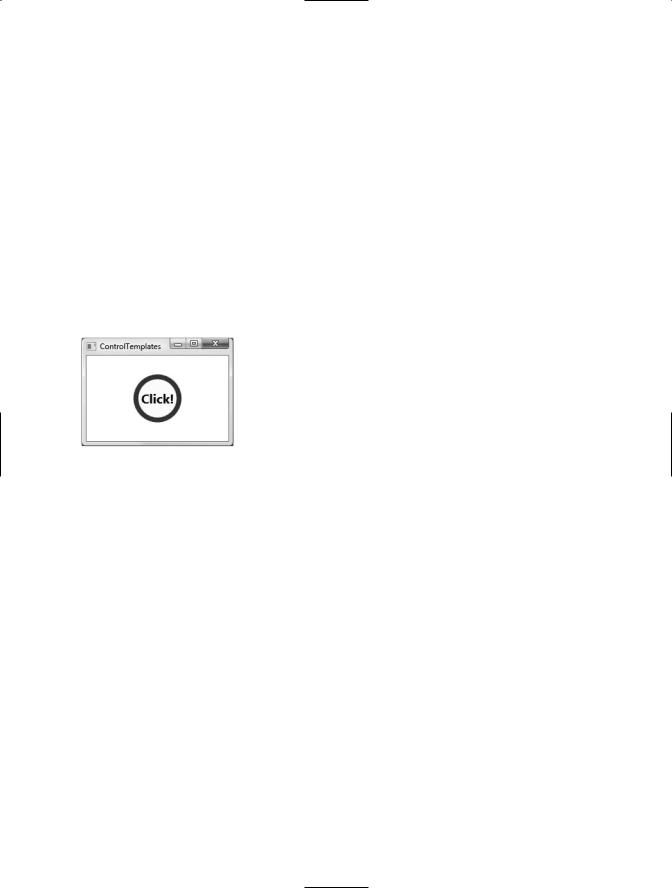
Also notice that our Button type is handling the Click event (assume the Click event handler simply displays an informative message via the MessageBox.Show() method). This is significant, as the Button—despite the fact that it no longer looks anything like a traditional “gray rectangle”—is still a System.Windows.Controls.Button type and has all of the same properties, methods, and events as the canned UI look and feel. Figure 30-17 shows our custom button type in action.
Figure 30-17. A simple template for the Button type
Adding Triggers to Templates
Currently, our control template allows a Button type to render itself in a circular fashion. However, if you actually click the button, you will notice that the Click event does fire (as the MessageBox. Show() method will display your string data); however, there is no visual sign of the button being pressed. The reason is that the default push-button animation has been gutted and replaced by our custom UI! If you wish to put back (or replace) this notion of push-button animation, you will need to add your own custom triggers.
Here is an update to our current template that handles two triggers. The first trigger will monitor if the mouse is over the button. If so, we will change the background color of the outer ellipse (a simple visual effect). The second trigger will monitor if the mouse is clicked over the surface of the button. If this is the case, we will increase the Height and Width values of the outer ellipse to provide visual feedback to the user:
<Grid.Resources>
<!-- A simple template for a round button-->
<ControlTemplate x:Key ="roundButtonTemplate" TargetType ="{x:Type Button}"> <Grid>
<Ellipse Name ="OuterRing" Width ="75" Height ="75" Fill ="DarkGreen"/> <Ellipse Name ="InnerRing" Width ="60" Height ="60" Fill ="MintCream"/> <ContentPresenter HorizontalAlignment="Center"
VerticalAlignment="Center"/>
</Grid>
<!-- Triggers to give the 'push' effect -->
<ControlTemplate.Triggers>

1158 CHAPTER 30 ■ WPF 2D GRAPHICAL RENDERING, RESOURCES, AND THEMES
<Trigger Property ="IsMouseOver" Value ="True">
<Setter TargetName ="OuterRing" Property ="Fill" Value ="MediumSeaGreen"/> </Trigger>
<Trigger Property ="IsPressed" Value ="True">
<Setter TargetName ="OuterRing" Property ="Height" Value ="90"/> <Setter TargetName ="OuterRing" Property ="Width" Value ="90"/>
</Trigger>
</ControlTemplate.Triggers>
</ControlTemplate>
</Grid.Resources>
Figure 30-18 shows the effect of the IsMouseOver trigger, and Figure 30-19 shows the result of the IsPressed trigger.
Figure 30-18. The IsMouseOver trigger in action
Figure 30-19. The IsPressed trigger in action
Incorporating Templates into Styles
Currently, our template simply defines the look and feel of the Button type. The process of establishing the basic properties of the widget (content, font size, font weight, etc.) is the responsibility of the Button itself:
<!-- Currently the Button must set basic property values, not the template -->
<Button Name ="myButton" Foreground ="Black" FontSize ="20" FontWeight ="Bold" Template ="{StaticResource roundButtonTemplate}" Click ="myButton_Click">
It would be ideal to establish these values in the template. By doing so, we can effectively create a default look and feel. As you may have already realized, this is a job for WPF styles. When you build a style (to account for basic property settings), you can define a template within the style! Here is our updated grid resource, with analysis to follow:
<Grid.Resources>
<!-- Our style defines basic settings for the Button here -->
<Style x:Key ="roundButtonTemplate" TargetType ="{x:Type Button}">

CHAPTER 30 ■ WPF 2D GRAPHICAL RENDERING, RESOURCES, AND THEMES |
1159 |
<Setter Property ="Foreground" Value ="Black"/> <Setter Property ="FontSize" Value ="20"/> <Setter Property ="FontWeight" Value ="Bold"/>
<!-- Here is our template! -->
<Setter Property ="Template"> <Setter.Value>
<!-- A simple template for a round button--> <ControlTemplate TargetType ="{x:Type Button}">
<Grid>
<Ellipse Name ="OuterRing" Width ="75" Height ="75" Fill ="DarkGreen"/> <Ellipse Name ="InnerRing" Width ="60" Height ="60" Fill ="MintCream"/> <ContentPresenter HorizontalAlignment="Center"
VerticalAlignment="Center"/>
</Grid>
<!-- A trigger to give the 'push' effect -->
<ControlTemplate.Triggers>
<Trigger Property ="IsMouseOver" Value ="True"> <Setter TargetName ="OuterRing"
Property ="Fill" Value ="MediumSeaGreen"/> </Trigger>
<Trigger Property ="IsPressed" Value ="True">
<Setter TargetName ="OuterRing" Property ="Height" Value ="90"/> <Setter TargetName ="OuterRing" Property ="Width" Value ="90"/>
</Trigger>
</ControlTemplate.Triggers>
</ControlTemplate>
</Setter.Value>
</Setter>
</Style>
</Grid.Resources>
First of all, notice that the <Style> has now been given the resource key value, rather than the <ControlTemplate>. Next, notice that the style is setting the same basic properties we were setting in the Button type’s declaration (Foreground, FontSize, and FontWeight). The <ControlTemplate> element is defined using a normal style <Setter> element by tweaking the Template property. With this update, we can now create our custom button types by setting the Style property as so:
<!-- Applying our style/template to a Button -->
<Button Name ="myButton"
Style ="{StaticResource roundButtonTemplate}" Click ="myButton_Click">
Click!
</Button>
While the rendering and behavior of the button is identical, the benefit of nesting templates within styles is that you are able to provide a canned set of values for common properties. Recall, of course, that you are free to change these defaults on a widget-by-widget value:
<!-- Get style, but change foreground color -->
<Button Name =" myButton"
Style ="{StaticResource roundButtonTemplate}" Click ="myButton_Click" Foreground ="Red"> Click!
</Button>

1160 CHAPTER 30 ■ WPF 2D GRAPHICAL RENDERING, RESOURCES, AND THEMES
■Source Code The ControlTemplates project can be found under the Chapter 30 subdirectory.
That wraps up our look at the styling and template mechanism of WPF. As you have seen, templates are typically composed on numerous graphical types and are ultimately bundled into your application as binary resources.
For that matter, this concludes our examination of WPF itself for this edition of the text. Over the last three chapters, you have learned quite a bit about the underlying WPF programming model, the syntax of XAML, control manipulation, and the generation of graphical content. While there is certainly much more to WPF than examined here, you should be in a solid position for further exploration as you see fit.
Summary
Given that fact that Windows Presentation Foundation (WPF) is such a graphically intensive GUI API, it comes as no surprise that we are provided with a number of ways to render graphical output. This chapter began by examining each of three ways a WPF application can do so (shapes, drawings and visuals), and along the way discussed various rendering primitives such as brushes, pens, and transformations.
Next, you covered the role of WPF animation services, from the perspective of procedural C# code as well as XAML declarations. Here you learned various details regarding timelines, storyboards, and key frames. You were exposed to the WPF resource management APIs and came to see that WPF resources can entail items other than the expected set of string tables, icons, and bitmap types, but can also represent custom objects that can be held in a resource dictionary.
The chapter wrapped up by pulling together all of these topics into a cohesive unit and exploring the role of WPF styles and templates. As shown, WPF makes it very simple to stylize the look and feel of a control using graphical primitives, animation services, and a collection of embedded resources.

P A R T 7
Building Web Applications with ASP.NET