

Pro CSharp 2008 And The .NET 3.5 Platform [eng]
.pdf
1102 CHAPTER 29 ■ PROGRAMMING WITH WPF CONTROLS
e.CanExecute = true;
}
private void HelpExecuted(object sender, ExecutedRoutedEventArgs e)
{
MessageBox.Show("Dude, it is not that difficult. Just type something!", "Help!");
}
Here, we have implemented CanHelpExecute() to always allow F1 help to occur by simply returning true. However, if you have certain situations where the help system should not display, you can account for this and return false when necessary. Our “help system” displayed within HelpExecute() is little more than a message box. At this point, you can run your application. When you press the F1 key on your keyboard, you will see your (less than helpful, if not a bit insulting) user guidance system (see Figure 29-29).
Figure 29-29. Our custom help system
■Source Code The MySpellChecker project can be found under the Chapter 29 subdirectory.
Understanding the WPF Data-Binding Model
Controls are often the target of various data-binding operations. Simply put, data binding is the act of connecting control properties to data values that may change over the course of your application’s lifetime. By doing so, a user interface element can display the state of a variable in your code; for example:
•Checking a CheckBox control based on a Boolean property of a given object
•Displaying data in TextBox types from a relational database table
•A Label connected to an integer representing the number of files in a folder

CHAPTER 29 ■ PROGRAMMING WITH WPF CONTROLS |
1103 |
When using the intrinsic WPF data-binding engine, you must be aware of the distinction between the source and the destination of the binding operation. As you might expect, the source of a data-binding operation is the data itself (a Boolean property, relational data, etc.), while the destination (or target) is the UI control property that will use the data content (a CheckBox, TextBox, and so on).
■Note The target property of a data-binding operation must be a dependency property of the UI control.
Truth be told, using the WPF data-binding infrastructure is always optional. If a developer were to roll his or her own data-binding logic, the connection between a source and destination typically would involve handling various events and authoring procedural code to connect the source and destination. For example, if you had a ScrollBar on a window that needed to display its value on a Label type, you might handle the ScrollBar’s ValueChange event and update the Label’s content accordingly.
However, using WPF data binding, you can connect the source and destination directly in XAML (or using C# code in your code file) without the need to handle various events or hard-code the connections between the source/destination. As well, based on how you set up your data-binding logic, you can ensure that the source and destination stay in sync if either of their values change.
A First Look at Data Binding
To begin examining WPF’s data-binding capabilities, assume you have a new WPF Application project (named SimpleDataBinding) that defines the following markup for a Window type:
<Window x:Class="SimpleDataBinding.MainWindow" xmlns="http://schemas.microsoft.com/winfx/2006/xaml/presentation" xmlns:x="http://schemas.microsoft.com/winfx/2006/xaml" Title="Simple Data Binding" Height="152" Width="300" WindowStartupLocation="CenterScreen">
<StackPanel Width="250">
<Label Content="Move the scroll bar to see the current value"/>
<!-- The scrollbar's value is the source of this data bind -->
<ScrollBar Orientation="Horizontal" Height="30" Name="mySB" Maximum = "100" LargeChange="1" SmallChange="1"/>
<!-- The label's content value is the target of the data bind -->
<Label Height="30" BorderBrush="Blue" BorderThickness="2"
Content = "{Binding ElementName=mySB, Path=Value}"
/>
</StackPanel>
</Window>
Notice that the <ScrollBar> type (which we have named mySB) has been configured with a range between 0 and 100. As you reposition the thumb of the scrollbar (or click the left or right arrow), the Label will be automatically updated with the current value. The “glue” that makes this happen is the {Binding} markup extension that has been assigned to the Label’s Content property. Here, the ElementName value represents the source of the data-binding operation (the ScrollBar object), while the Path value represents (in this case) the property of the element to obtain.

1104 CHAPTER 29 ■ PROGRAMMING WITH WPF CONTROLS
■Note ElementName and Path may seem oddly named, as you might expect to find more intuitive names such as “Source” and “Destination.” However, as you will see later in this chapter, XML documents can be the source of a data-binding operation (typically using XPath). In this case, the names ElementName and Path fit the bill.
As an alternative format, it is possible to break out the values specified by the {Binding} markup extension by explicitly setting the DataContext property to the source of the binding operation as follows:
<!-- Breaking object/value apart via DataContext --> <Label Height="30" BorderBrush="Blue" BorderThickness="2"
DataContext = "{Binding ElementName=mySB}" Content = "{Binding Path=Value}"
/>
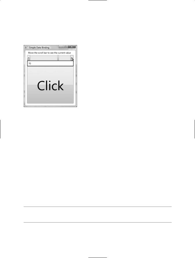
In either case, if you were to run this application, you would be pleased to find this Label updating without the need to write any procedural C# code (see Figure 29-30).
Figure 29-30. Binding the ScrollBar value to a Label
The DataContext Property
In the current example, you have seen two approaches to establish the source and destination of a data-binding operation, both of which resulted in the same output. Given this point, you might wonder when you would want to explicitly set the DataContext property. This property can be very helpful in that it is a dependency property, and therefore its value can be inherited by subelements. In this way, you can easily set the same data source to a family of controls, rather than having to repeat a bunch of redundant "{Binding ElementName=X, Path=Y}" XAML values to multiple controls. Consider the following updated XAML definition for our current <StackPanel>:
<!-- |
Note the StackPanel sets the DataContext property -- |
> |
<StackPanel Width="250" DataContext = "{Binding ElementName=mySB}"> <Label Content="Move the scroll bar to see the current value"/>
<ScrollBar Orientation="Horizontal" Height="30" Name="mySB"
Maximum = "100" LargeChange="1" SmallChange="1"/>
<!-- Now both UI elements use the scrollbar's value in unique ways. -->
<Label Height="30" BorderBrush="Blue" BorderThickness="2" Content = "{Binding Path=Value}"/>
<Button Content="Click" Height="200" FontSize = "{Binding Path=Value}"/>
</StackPanel>
CHAPTER 29 ■ PROGRAMMING WITH WPF CONTROLS |
1105 |
Here, the DataContext property has been set on the <StackPanel> directly. Therefore, as we move the thumb, not only will we see the current value on the Label, but we will also find the font size of the Button grow and shrink accordingly based on the same value. Figure 29-31 shows one possible output.
Figure 29-31. Binding the ScrollBar value to a Label and a Button
The Mode Property
When establishing a data-binding operation, you are able to choose among various modes of operation by setting a value to the Mode property at the time you establish the Path value. By default, the Mode property is set to the value OneWay, which specifies that changes in the target do not affect the source. In our example, changing the Content property of the Label does not set the position of the
ScrollBar’s thumb.
If you wish to keep changes between the source and the target in sync, you can set the Mode property to TwoWay. Thus, changing the value of the Label’s content changes the value of the scrollbar’s thumb position. Of course, the end user would be unable to change the content of the Label, as the content is presented in a read-only manner (we could of course change the value programmatically).
To illustrate the use of the TwoWay mode, assume we have replaced the Label displaying the current scrollbar value with the following TextBox (note the value of the Text property). In this case, when you type a new value into the text area, the thumb position (and font of the Button type) automatically update when you tab off the TextBox object:
<TextBox Height="30" BorderBrush="Blue"
BorderThickness="2" Text = "{Binding Path=Value}"/>
■Note You may also set the Mode property to OneTime. This option sets the target when initialized but does not track further changes.

1106 CHAPTER 29 ■ PROGRAMMING WITH WPF CONTROLS
Data Conversion Using IValueConverter
The ScrollBar type uses a double to represent the value of the thumb, rather than an expected whole number (e.g., an integer). Therefore, as you drag the thumb, you will find various floatingpoint numbers displayed within the TextBox (such as 61.0576923076923), which would be rather unintuitive to the end user, who is most likely expecting to see whole numbers (such as 61, 62, 63, and so on).
When you wish to convert the value of a data-binding operation into an alternative format, one way to do so is to create a custom class type that implements the IValueConverter interface of the System.Windows.Data namespace. This interface defines two members that allow you to perform the conversion to and from the target and destination. Once you define this class, you can use it to further qualify the processing of your data-binding operation.
■Note While any data-binding operation can be achieved entirely using procedural code, the following examples will make use of XAML to convert between data types. Doing so involves the use of custom resources, which will be fully examined in Chapter 30. Therefore, don’t fret if some of the markup appears unfamiliar.
Assuming that you wish to display whole numbers within the TextBox control, you could build the following class type (be sure you import the System.Windows.Data namespace in the defining file):
class MyDoubleConverter : IValueConverter
{
public object Convert(object value, Type targetType, object parameter, System.Globalization.CultureInfo culture)
{
// Convert the double to an int. double v = (double)value; return (int)v;
}
public object ConvertBack(object value, Type targetType, object parameter, System.Globalization.CultureInfo culture)
{
//Return the incoming value directly.
//This will be used for 2-way bindings.
//In our example, when the user tabs
//off the TextBlock.
return value;
}
}
The Convert() method will be called when the value is transferred from the source (the ScrollBar) to the destination (the Text property of the TextBox). While we receive a number of incoming arguments, for this conversion we only need to manipulate the incoming object, which is the value of the current double. Using this type, we simply cast the type into an integer and return the new number.
The ConvertBack() method will be called when the value is passed from the destination to the source (if you have enabled a two-way binding mode). Here, we simply return the value straightaway. By doing so, we are able to type a floating-point value into the TextBox (such as 99.9) and have it automatically convert to a whole number value (99) when the user tabs off the control. This “free” conversion happens due to the fact that the Convert() method is called once again after a call to

CHAPTER 29 ■ PROGRAMMING WITH WPF CONTROLS |
1107 |
ConvertBack(). If you were to simply return null from ConvertBack(), your binding would appear to be out of sync, as the text box would still be displaying a floating-point number!
With this class in place, consider the following XAML updates, which will leverage our custom converter class to display data in the TextBox:
<Window x:Class="SimpleDataBinding.MainWindow" xmlns="http://schemas.microsoft.com/winfx/2006/xaml/presentation" xmlns:x="http://schemas.microsoft.com/winfx/2006/xaml"
<!-- Need to define a CLR namespace to gain access to our type --> xmlns:myConverters ="clr-namespace:SimpleDataBinding"
Title="Simple Data Binding" Height="334" Width="288"
WindowStartupLocation="CenterScreen">
<!-- Resource dictionaries allow us to define objects that can be obtained by their key. More details in Chapter 30. -->
<Window.Resources>
<myConverters:MyDoubleConverter x:Key="DoubleConverter"/> </Window.Resources>
<!-- The panel is setting the data context to the scrollbar object --> <StackPanel Width="250" DataContext = "{Binding ElementName=mySB}">
<Label Content="Move the scroll bar to see the current value"/>
<ScrollBar Orientation="Horizontal" Height="30" Name="mySB"
Maximum = "100" LargeChange="1" SmallChange="1"/>
<!-- Notice that the {Binding} extension now sets the Converter property. -->
<TextBox Height="30" BorderBrush="Blue" BorderThickness="2" Name="txtThumbValue" Text = "{Binding Path=Value, Converter={StaticResource DoubleConverter}}"/>
<Button Content="Click" Height="200"
FontSize = "{Binding Path=Value}"/>
</StackPanel>
</Window>
Once we define a custom XML namespace that maps to our project’s root namespace (see Chapter 28), we add to the Window’s resource dictionary an instance of our MyDoubleConverter type, which we can obtain later in the XAML file by the key name DoubleConverter. The Text property of the TextBox has been modified to make use of our MyDoubleConverter type, assigning the Converter property to yet another markup extension named StaticResource. Again, full details of the WPF resource system can be found in Chapter 30. In any case, if you were to run your application, you would find that only whole numbers will be displayed in the TextBox.
Converting Between Diverse Data Types
An implementation of the IValueConverter interface can be used to convert between any data types, even if they do not seem related on the surface. In reality, you are able to use the current value of the ScrollBar’s thumb to return any object type to connect to a dependency property. Consider the following ColorConverter type, which uses the value of the thumb to return a new green SolidColorBrush (with a green value between 155 and 255):

1108 CHAPTER 29 ■ PROGRAMMING WITH WPF CONTROLS
class MyColorConverter : IValueConverter
{
public object Convert(object value, Type targetType, object parameter, System.Globalization.CultureInfo culture)
{
// Use value of thumb to build a varied green brush. double d = (double)value;
byte v = (byte)d;
Color color = new Color(); color.A = 255;
color.G = (byte) (155 + v); return new SolidColorBrush(color);
}
public object ConvertBack(object value, Type targetType, object parameter, System.Globalization.CultureInfo culture)
{
return value;
}
}
If we were to add a new member to our resource dictionary as follows:
<Window.Resources>
<myConverters:MyDoubleConverter x:Key="DoubleConverter"/>
<myConverters:MyColorConverter x:Key="ColorConverter"/>
</Window.Resources>
we could then use the key name to set the Background property of our Button type as follows:
<Button Content="Click" Height="200"
FontSize = "{Binding Path=Value}"
Background= "{Binding Path=Value, Converter={StaticResource ColorConverter}}"/>
Sure enough, if you run your application once again, you’ll find the color of the Button change based on the scrollbar’s position. To wrap up our look at WPF data binding, let’s check out how to map custom objects and XML document data to our UI layer.
■Source Code The SimpleDataBinding project can be found under the Chapter 29 subdirectory.
Binding to Custom Objects
The next flavor of data binding we will examine is how to connect the properties of custom objects to your UI layer. Begin by creating a new WPF Application project named CarViewerApp and, using the steps outlined in Chapter 28, change the name of your initial Window1 type to MainWindow. Next, handle the Loaded event of MainWindow, and update the <Grid> definition to contain two rows and two columns:
<Window x:Class="CarViewerApp.MainWindow" xmlns="http://schemas.microsoft.com/winfx/2006/xaml/presentation" xmlns:x="http://schemas.microsoft.com/winfx/2006/xaml" Title="Car Viewer Application" Height="294" Width="502" ResizeMode="NoResize" WindowStartupLocation="CenterScreen"
Loaded="Window_Loaded"

CHAPTER 29 ■ PROGRAMMING WITH WPF CONTROLS |
1109 |
>
<Grid>
<Grid.ColumnDefinitions> <ColumnDefinition Width="200"/> <ColumnDefinition Width="*"/>
</Grid.ColumnDefinitions>
<Grid.RowDefinitions> <RowDefinition Height="Auto"/> <RowDefinition Height="*"/>
</Grid.RowDefinitions>
</Grid>
</Window>
The first row of the <Grid> will consist of a menu system containing a File menu with two submenus (Add New Car and Exit). Notice that we are handling the Click event of each submenu, and that we are assigning an “input gesture” to the Exit menu to allow the item to be activated when the user presses the Alt+F4 keystroke. Finally, notice the value of Grid.ColumnSpan has been set to 2, allowing the menu system to be positioned within each cell of the first row.
<!-- Menu Bar -->
<DockPanel
Grid.Column="0"
Grid.ColumnSpan="2"
Grid.Row="0">
<Menu DockPanel.Dock ="Top" HorizontalAlignment="Left" Background="White"> <MenuItem Header="File">
<MenuItem Header="New Car" Click="AddNewCarWizard"/> <Separator />
<MenuItem Header="Exit" InputGestureText="Alt-F4" Click="ExitApplication"/>
</MenuItem>
</Menu>
</DockPanel>
The remaining left portion of the <Grid> consists of a <DockPanel> containing a ListBox, while the right portion of the <Grid> contains a single TextBlock. The ListBox type will eventually become the destination for a data-binding operation involving a collection of custom objects, so set the ItemsSource property to the {Binding} markup extension (the source of the binding will be specified in code in just a bit). As the user selects one of the items in the ListBox, we will capture the SelectionChanged event in order to update the content within the TextBlock. Here is the definition of these remaining types:
<!-- |
Left pane of grid -- |
> |
<ListBox Grid.Column="0"
Grid.Row="2" Name="allCars" SelectionChanged="ListItemSelected" Background="LightBlue" ItemsSource="{Binding}">
</ListBox>
<!-- |
Right pane of grid -- |
> |
<TextBlock Name="txtCarStats" Background="LightYellow"
Grid.Column="1" Grid.Row="2"/>
At this point, the UI of your window should look like what you see in Figure 29-32.
Before we implement the data-binding logic, finalize the File Exit menu handler as follows:
private void ExitApplication(object sender, RoutedEventArgs e)
{
Application.Current.Shutdown();
}

1110 CHAPTER 29 ■ PROGRAMMING WITH WPF CONTROLS
Figure 29-32. The UI of our main window
Working with the ObservableCollection<T> Type
.NET 3.0 introduced a new collection type within the System.Collections.ObjectModel namespace named ObservableCollection<T>. The benefit of working with this type is that when its contents are updated, it will send notifications to interested listeners, such as the destination of a data-binding operation. Insert a new C# file into your application that defines a class named CarList that extends ObservableCollection<T>, where T is of type Car. This iteration of the Car type makes use of C# automatic properties to establish some basic state data (which can be set using a custom constructor), and provides a fitting implementation of ToString():
using System;
using System.Collections.ObjectModel;
namespace CarViewerApp
{
public class CarList : ObservableCollection<Car>
{
public CarList()
{
// Add a few entries to the list.
Add(new Car(40, "BMW", "Black", "Sidd")); Add(new Car(55, "VW", "Black", "Mary")); Add(new Car(100, "Ford", "Tan", "Mel")); Add(new Car(0, "Yugo", "Green", "Clunker"));
}
}
public class Car
{
public int Speed { get; set; } public string Make { get; set; } public string Color { get; set; } public string PetName { get; set; }

CHAPTER 29 ■ PROGRAMMING WITH WPF CONTROLS |
1111 |
public Car(int speed, string make, string color, string name)
{
Speed = speed; Make = make; Color = color; PetName = name;
}
public Car(){}
public override string ToString()
{
return string.Format("{0} the {1} {2} is going {3} MPH", PetName, Color, Make, Speed);
}
}
}
Now, open the code file for your MainWindow class and define a member variable of type CarList named myCars. Within the Loaded event handler of your Window type, set the DataContext property of the allCars ListBox to the myCars object (recall we did not set this value via XAML with the {Binding} extension, therefore for a change of pace, we will do so using procedural code):
private void Window_Loaded(object sender, RoutedEventArgs e)
{
// Set the data context. allCars.DataContext = myCars;
}
At this point, you should be able to run your application and see the ListBox containing the ToString() values for each Car in the custom ObservableCollection<T>, as shown in Figure 29-33.
Figure 29-33. The initial data-binding operation
Creating a Custom Data Template
Currently, ListBox is displaying each item in the CarList object; however, because we have not specified a binding path, each list entry is simply the result of calling ToString() on the subobjects. As we have already examined how to establish simple binding paths, this time we will construct a custom data template. Simply put, a data template can be used to inform the destination of a databinding operation how to display the data connected to it. Our template will fill each item in the ListBox with a <StackPanel> that consists of an Ellipse object and a TextBlock that has been bound to the PetName property of each item in the CarList type. Here is the modified markup of the
ListBox type.