

Pro CSharp 2008 And The .NET 3.5 Platform [eng]
.pdf
1062 CHAPTER 29 ■ PROGRAMMING WITH WPF CONTROLS
property, consider the following C# code, which approximates the implementation of the Height property of the FrameworkElement class type:
public class FrameworkElement : UIElement, IFrameworkInputElement, IInputElement, ISupportInitialize, IHaveResources
{
...
//Notice this is a static field of type DependencyProperty public static readonly DependencyProperty HeightProperty;
//The static DependencyProperty field is created and "registered"
//in the static constructor.
static FrameworkElement()
{
HeightProperty = DependencyProperty.Register( "Height",
typeof(double),
typeof(FrameworkElement),
new FrameworkPropertyMetadata((double) 1.0 / (double) 0.0, FrameworkPropertyMetadataOptions.AffectsMeasure,
new PropertyChangedCallback(FrameworkElement.OnTransformDirty)), new ValidateValueCallback(FrameworkElement.IsWidthHeightValid));
}
//Note that the Height property still has get/set blocks.
//However, the implemention is using the inherited
//GetValue()/SetValue() methods.
public double Height
{
get { return (double) base.GetValue(HeightProperty); } set { base.SetValue(HeightProperty, value); }
}
}
As you can see, dependency properties require quite a bit of additional logic from a typical CLR property! Here is a breakdown of what is happening: First and foremost, dependency properties are represented using the System.Windows.DependencyProperty class type and are almost always declared as public, static read-only fields. Recall that one benefit of dependency properties is that they are not directly tied to an object instance (which helps memory consumption), hence the use of static data.
Registering Dependency Property
Given that dependency properties are declared as static, they are assigned an initial value within the static constructor of the type. However, unlike a simple numerical field, the DependencyProperty object is created indirectly by capturing the return value of the static DependencyProperty. Register() method. This method has been overloaded a number of times; however, in this example, Register() is invoked as follows:
HeightProperty = DependencyProperty.Register( "Height",
typeof(double),
typeof(FrameworkElement),
new FrameworkPropertyMetadata((double) 1.0 / (double) 0.0, FrameworkPropertyMetadataOptions.AffectsMeasure,
new PropertyChangedCallback(FrameworkElement.OnTransformDirty)), new ValidateValueCallback(FrameworkElement.IsWidthHeightValid));
CHAPTER 29 ■ PROGRAMMING WITH WPF CONTROLS |
1063 |
The first argument to Register() is the name of the “normal” CLR property on the class that makes use of the DependencyProperty field (Height in this case), while the second argument is the type information of the underlying data type it is bound to (a double).
The third argument specifies the type information of the class that this property belongs to (FrameworkElement in this case). While this might seem redundant (after all, the HeightProperty field is already defined within the FrameworkElement class), this is a very clever aspect of WPF in that it allows one type to “attach” properties to another type (even if the class definition has been sealed!).
■Note Recall that C# 2008 extension methods (see Chapter 13) also allow you to add new members to sealed types. Extension methods would be the most direct way of adding new functionality to types that do not need to participate in WPF-centric services (e.g., animation).
The final arguments passed to Register() are what really give dependency properties their own flavor. Here we are able to provide a FrameworkPropertyMetadata object that describes all of the details regarding how WPF should handle this property with respect to callback notifications (if the property needs to notify others when the value changes), how the value will be validated, and various options (represented by the FrameworkPropertyMetadataOptions enum) that control what is effected by the property in question (does it work with data binding, can it be inherited, etc.).
Defining a Wrapper Property for a DependencyProperty Field
Once the details of configuring the DependencyProperty object have been established within a static constructor, the final task is to wrap the field within a typical CLR property (Height in this case). Notice, however, that the “get” and “set” scopes do not simply return or set a class-level doublemember variable, but do so indirectly using the GetValue() and SetValue() methods from the
System.Windows.DependencyObject base class:
public double Height
{
get { return (double) base.GetValue(HeightProperty); } set { base.SetValue(HeightProperty, value); }
}
■Note Strictly speaking, you do not need to build a wrapper property for a DependencyProperty field, if the field is public, as you can access it statically when calling the inherited GetValue()/SetValue() public methods. In practice, most dependency properties do have a friendly wrapper, as it is very XAML-friendly.
Now that you have seen the details of how a dependency property is assembled under the hood, be aware that it would be entirely possible to use a normal CLR property that supported the same services as a WPF dependency property (notifications, static memory allocation, etc.). However, to do so would require a good deal of boilerplate code that you would need to author by hand and replicate in numerous places. Using the intrinsic DependencyProperty type (and additional bits of infrastructure), we are provided with an out-of-the-box implementation of the same services.
Because a dependency property is built using various WPF-centric types, it would certainly be possible for you to build your own dependency properties, which will not be necessary for the examples in this text. However, the following code summarizes the core pieces of a dependency property declaration (note here we are registering the property at the time we declare the static read-only DependencyProperty type):

1064 CHAPTER 29 ■ PROGRAMMING WITH WPF CONTROLS
public class MyOwnerClass : DependencyObject
{
//Using a DependencyProperty as the backing store for MyProperty.
//This enables animation, styling, binding, etc...
public static readonly DependencyProperty MyPropertyProperty = DependencyProperty.Register("MyProperty", typeof(int), typeof(OwnerClass), new UIPropertyMetadata(0));
//XAML-friendly wrapper for the
//static read-only field. This is necessary,
//as we can't call methods (GetValue/SetValue)
//in XAML.
public int MyProperty
{
//GetValue/SetValue come from the
//DependencyObject base class.
get { return (int)GetValue(MyPropertyProperty); } set { SetValue(MyPropertyProperty, value); }
}
}
If you are interested in learning further details regarding this WPF programming construct, check out the topic “Custom Dependency Properties” within the .NET Framework 3.5 SDK documentation.
Understanding Routed Events
Properties are not the only .NET programming construct to be given a facelift to work well within the WPF API. The standard CLR event model has also been refined just a bit to ensure that events can be processed in a manner that is fitting for XAML’s description of a tree of objects. Assume you have a new WPF Application project named WPFControlEvents. Now, update the initial XAML description of the initial window by adding the following <Button> type within the initial <Grid>:
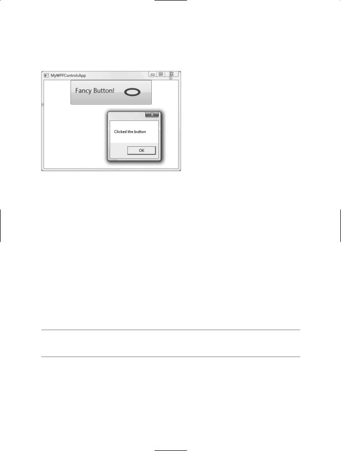
<Button Name="btnClickMe" Height="75" Width = "250" Click ="btnClickMe_Clicked"> <StackPanel Orientation ="Horizontal">
<Label Height="50" FontSize ="20">Fancy Button!</Label> <Canvas Height ="50" Width ="100" >
<Ellipse Name = "outerEllipse" Fill ="Green" Height ="25"
Width ="50" Cursor="Hand" Canvas.Left="25" Canvas.Top="12"/> <Ellipse Name = "innerEllipse" Fill ="Yellow" Height = "15" Width ="36"
Canvas.Top="17" Canvas.Left="32"/>
</Canvas>
</StackPanel>
</Button>
Notice in the <Button>’s opening definition we have handled the Click event by specifying the name of a method to be called when the event is raised. The Click event works with the RoutedEventHandler delegate, which expects an event handler that takes an object as the first parameter and a System.Windows.RoutedEventArgs as the second:
public void btnClickMe_Clicked(object sender, RoutedEventArgs e)
{
// Do something when button is clicked.
MessageBox.Show("Clicked the button");
}
CHAPTER 29 ■ PROGRAMMING WITH WPF CONTROLS |
1065 |
Figure 29-4 shows the expected output when clicking the current control (for display purposes, I changed the initial <Grid> type to a <StackPanel>, which explains why the Button is mounted on the top-center of this Window, rather than positioned in the center).
Figure 29-4. Handling events for a composite Button type
Now, consider the current composition of our Button. It contains numerous nested elements to fully represent its user interface (Canvas, Ellipse, Label, etc.). Imagine how tedious WPF event handling would be if we were forced to handle a Click event for each and every one of these subelements. After all, the end user could click anywhere within the scope of the button’s boundaries (on the Label, on the green area of the oval, on the surface of the button, etc.). Not only would the creation of separate event handlers for each aspect of the Button be labor intensive, we would end up with some mighty nasty code to maintain down the road.
Under the Windows Forms event model, a custom control such as this would require us to handle the Click event for each item on the button. Thankfully, WPF routed events take care of this automatically. Simply put, the routed events model automatically propagates an event up (or down) a tree of objects, looking for an appropriate handler.
Specifically speaking, a routed event can make use of three “routing strategies.” If an event is moving from the point of origin up to other defining scopes within the object tree, the event is said to be a bubbling event. Conversely, if an event is moving from its point of origin down into related subelements, the event is said to be a tunneling event. Finally, if an event is raised and handled only by the originating element (which is what could be described as a normal CLR event), it is said to be a direct event.
■Note Like dependency properties, routed events are a WPF-specific construct implemented using WPF-specific helper types. Thus, there is no special C# syntax you need to learn to handle routed events.
The Role of Routed Bubbling Events
In the current example, if the user clicks the inner yellow oval, the Click event bubbles out to the next level of scope (the Canvas), and then to the StackPanel, and finally to the Button where the Click event handler is handled. In a similar way, if the user clicks the Label, the event is bubbled to the StackPanel and then finally to the Button type.
1066 CHAPTER 29 ■ PROGRAMMING WITH WPF CONTROLS
Given this routed bubbling event pattern, we have no need to worry about registering specific Click event handlers for all members of a composite control. However, if you wished to perform custom clicking logic for multiple elements within the same object tree, you can do so. By way of illustration, assume you need to handle the clicking of the outerEllipse control in a unique manner. First, handle the MouseDown event for this subelement (graphically rendered types such as the Ellipse do not support a “click” event; however, they can monitor mouse button activity via
MouseDown, MouseUp, etc.):
<Button Name="btnClickMe" Height="75" Width = "250" Click ="btnClickMe_Clicked"> <StackPanel Orientation ="Horizontal">
<Label Height="50" FontSize ="20">Fancy Button!</Label> <Canvas Height ="50" Width ="100" >
<Ellipse Name = "outerEllipse" Fill ="Green"
Height ="25" MouseDown ="outerEllipse_MouseDown"
Width ="50" Cursor="Hand" Canvas.Left="25" Canvas.Top="12"/> <Ellipse Name = "innerEllipse" Fill ="Yellow" Height = "15" Width ="36"
Canvas.Top="17" Canvas.Left="32"/>
</Canvas>
</StackPanel>
</Button>
Then implement an appropriate event handler, which for illustrative purposes will simply change the Title property of the main window:
public void outerEllipse_MouseDown(object sender, RoutedEventArgs e)
{
// Change title of window.
this.Title = "You clicked the outer ellipse!";
}
With this, we now can take different courses of action depending on where the end user has clicked (which boils down to the outer ellipse and everywhere else within the button’s scope).
■Note Routed bubbling events always move from the point of origin to the next defining scope. Thus, in this example, if we were to click the innerEllipse object, the event would be bubbled to the Canvas, not to the outerEllipse, as they are both Ellipse types within the scope of Canvas.
Continuing or Halting Bubbling
Currently, if the user clicks the outerEllipse object, it will trigger the registered MouseDown event handler for this Ellipse type, at which the bubbling logic stops (therefore, we would not see the Button’s Click event handler execute). Most of the time, this is the effect you desire; however, if you wish to inform WPF to continue bubbling up the object tree, you can set the Handled property of the
RountedEventArgs type to false:
public void outerEllipse_MouseDown(object sender, RoutedEventArgs e)
{
// Change title of window.
this.Title = "You clicked the outer ellipse!";
// Keep bubbling! e.Handled = false;
}
CHAPTER 29 ■ PROGRAMMING WITH WPF CONTROLS |
1067 |
In this case, we would find that the title of the window is changed, followed by the launching of the MessageBox displayed within the Click event handler of the Button type. In a nutshell, routed bubbling events make it possible to allow a complex group of content to act either as a single logical element (e.g., a Button) or as discrete items (e.g., an Ellipse within the Button).
The Role of Routed Tunneling Events
Strictly speaking, routed events can be bubbling (as just described) or tunneling in nature. Tunneling events (which all begin with the Preview suffix—e.g., PreviewMouseDown) drill down from the originating element into the inner scopes of the object tree. By and large, each bubbling event in the WPF base class libraries is paired with a related tunneling event that fires before the bubbling counterpart. For example, before the bubbling MouseDown event fires, the tunneling PreviewMouseDown event fires first.
Handling a tunneling event looks just like the processing of handling any other events; simply assign the event handler name in XAML (or, if needed, using the corresponding C# event-handling syntax in your code file) and implement the handler in the code file. Just to illustrate the interplay of tunneling and bubbling events, begin by handling the PreviewMouseDown event for the outerEllipse object:
<Ellipse Name = "outerEllipse" Fill ="Green" Height ="25" MouseDown ="outerEllipse_MouseDown"
PreviewMouseDown ="outerEllipse_PreviewMouseDown"
Width ="50" Cursor="Hand" Canvas.Left="25" Canvas.Top="12"/>
Next, retrofit the current C# class definition by updating each event handler (for all types) to append data to and eventually display the value within a new string member variable. This will allow us to observe the flow of events firing in the background:
public partial class MainWindow : System.Windows.Window
{
//This is used to hold data on the mouse-related
//activity.
string mouseActivity = string.Empty;
public MainWindow()
{
InitializeComponent();
}
public void btnClickMe_Clicked(object sender, RoutedEventArgs e)
{
// Show the final string.
mouseActivity += "Button Click event fired!\n"; MessageBox.Show(mouseActivity);
// Clear string for next test. mouseActivity = string.Empty;
}
public void outerEllipse_MouseDown(object sender, RoutedEventArgs e)
{
// Add data to string.
mouseActivity += "MouseDown event fired!\n";
1068 CHAPTER 29 ■ PROGRAMMING WITH WPF CONTROLS
// Keep bubbling! e.Handled = false;
}
public void outerEllipse_PreviewMouseDown(object sender, RoutedEventArgs e)
{
// Add data to string.
mouseActivity = "PreviewMouseDown event fired!\n";
// Keep bubbling! e.Handled = false;
}
}
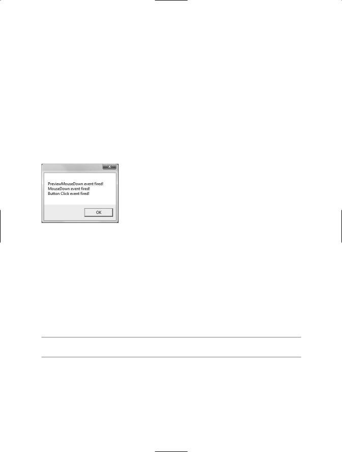
When you run the program and do not click within the bounds of the outer ellipse, you will simply see the message “Button Click event fired!” displayed within the message box. However, if you do click within the outer ellipse image, the message box shown in Figure 29-5 will display.
Figure 29-5. Tunneling first, bubbling second
So you may be wondering why in the world WPF events typically tend to come in pairs (one tunneling and one bubbling)? The answer is that by previewing events, you have the power to perform any special logic (data validation, disable bubbling action, etc.) before the bubbling counterpart fires. In a vast majority of cases, you will not need to handle the Preview prefixed tunneling events and simply have to worry about the (non–Preview-prefixed) bubbling events.
Much like the task of manually authoring a dependency property, the need to handle tunneling events is typically only necessary when subclassing an existing WPF control. On a related note, if you are building a custom WPF control, be aware that you can create custom routed events (which may be bubbling or tunneling) using a mechanism similar to that of building a custom dependency property. If you are interested, check out the topic “How to: Create a Custom Routed Event” within the .NET Framework 3.5 SDK documentation.
■Source Code The WPFControlEvents project is included under the Chapter 29 subdirectory.
Working with Button Types
Now that you have examined the details of dependency properties and routed events, you are in a good position to better understand the WPF controls themselves, beginning with button types. Instinctively, we all know the role of button types. They are UI elements that can be pressed via the mouse or via the keyboard (with the Enter key or spacebar) if they have the current focus. In WPF,
CHAPTER 29 ■ PROGRAMMING WITH WPF CONTROLS |
1069 |
the ButtonBase class serves as a parent for three core derived types: Button, RepeatButton, and
ToggleButton.
The ButtonBase Type
Like any parent class, ButtonBase provides a polymorphic interface for derived types (in addition to the members inherited from its base class ContentControl). For example, it is ButtonBase that defines the Click event. As well, this parent class defines the IsPressed property, which allows you to take a course of action when the derived type has been pressed, but not yet released. In addition, Table 29-2 describes some other members of interest for the ButtonBase abstract base class.
Table 29-2. Select Members of the ButtonBase Type
ButtonBase Member |
Meaning in Life |
ClickMode |
This property allows you to establish when the Click event should fire, |
|
based on values from the ClickMode enumeration. |
Command |
As explained later in this chapter, many UI elements can have an |
|
associated “command” that can be attached to a UI element by assigning |
|
the Command property. |
CommandParameter |
This property allows you to pass parameters to the item specified by the |
|
Command property. |
CommandTarget |
This property allows you to establish the recipient of the command set by |
|
the Command property. |
|
|
Beyond the command-centric members (examined at the conclusion of this chapter), the most interesting member would be ClickMode, which allows you to specify three different modes of clicking a button. This property can be assigned any value from the related System.Windows.Controls.
ClickMode enumeration:
public enum ClickMode
{
Release,
Press,
Hover
}
For example, assume you have the following XAML description for a Button type using the
ClickMode.Hover value for the ClickMode property:
<Button Name = "bntHoverClick" ClickMode = "Hover" Click ="btnHoverClick_Click"/>
With this, the Click event will fire as soon as the mouse cursor is anywhere within the bounds of the Button type. While this may not be the most helpful course of action for a typical push button, hover mode can be useful when building custom styles, templates, or animations.
The Button Type
The first derived type, Button, provides two properties of immediate interest, IsCancel and IsDefault, which are very helpful when building dialog boxes containing OK and Cancel buttons. When IsCancel is set to true, the button will be artificially clicked when the user presses the Esc key. If IsDefault is set to true, the button will be artificially clicked when the user presses the Enter key. Consider the following XAML description of two Button types:

1070 CHAPTER 29 ■ PROGRAMMING WITH WPF CONTROLS
<!-- Assume these are defined within a <StackPanel> of a Window type -->
<Button Name ="btnOK" IsDefault = "true" Click ="btnOK_Click" Content = "OK"/> <Button Name ="btnCancel" IsCancel= "true"
Click ="btnCancel_Click" Content = "Cancel"/>
If you were to implement each of the declared event handlers in a related code file, you will be able to run the application and verify the correct handler is invoked when the Enter key or Esc key is pressed. This would be the case even if another UI element of the window (such as a text entry area) has the current focus.
The ToggleButton Type
The ToggleButton type (defined in the System.Windows.Controls.Primitives namespace) has by default a UI identical to the Button type; however, it has the unique ability to hold its pressed state when clicked. To account for this, ToggleButton provides an IsChecked property, which toggles between true and false when the end user clicks the UI element. Furthermore, ToggleButton provides two events (Checked and Unchecked) that can be handled to intercept this state change. Here is an XAML description of a simple toggle that handles each event on two unique event handlers:
<!-- A Yes/No toggle button -->
<ToggleButton Name ="toggleOnOffButton" Checked ="toggleOnOffButton_Checked" Unchecked ="toggleOnOffButton_Unchecked"> Off!
</ToggleButton >
The event handlers simply update the Content property with a fitting textual message:
protected void toggleOnOffButton_Checked(object sender, RoutedEventArgs e)
{
toggleOnOffButton.Content = "On!";
}
protected void toggleOnOffButton_Unchecked(object sender, RoutedEventArgs e)
{
toggleOnOffButton.Content = "Off!";
}
If you wish to consolidate your code-behind file to use a single handler for each event, you could update your XAML definition so that the Checked and Unchecked events both point to a single handler (say, toggleOnOffButtonPressed), and then use the IsChecked property to flip between the message:
protected void toggleOnOffButtonPressed(object sender, RoutedEventArgs e)
{
if (toggleOnOffButton.IsChecked == false ) toggleOnOffButton.Content = "Off!";
else
toggleOnOffButton.Content = "On!";
}
Finally, be aware that ToggleButton also supports tri-state functionality (via the IsThreeState property and Indeterminate event), allowing you to test if the widget is checked, unchecked, or neither. While it might seem odd for a button to monitor itself in this manner, it makes perfect sense for types that derive from ToggleButton, such as the CheckBox type examined in just a moment.
CHAPTER 29 ■ PROGRAMMING WITH WPF CONTROLS |
1071 |
■Note As a general rule, types defined in the System.Windows.Controls.Primitives namespace (including the ToggleButton) are not assumed to be very useful out of the box without additional customizations.
The RepeatButton Type
The final ButtonBase-derived type to discuss is the RepeatButton type, also defined within System.Windows.Controls.Primitives. This type also has a default look and feel to a standard Button; however, it supports the ability to continuously fire its Click event when the end user has the widget in a pressed state. The frequency in which it will fire the Click event is dependent upon the values you assign to the Delay and Interval properties (both of which are recorded in milliseconds).
In reality, the RepeatButton type (like the ToggleButton type) is not that useful on its own. However, the exposed behavior is useful when constructing customized user interfaces. To illustrate, consider the fact that unlike Windows Forms, the initial release of WPF does not supply a spin button control, which allows the user to adjust a numerical value using up and down arrows. Composing a spin button widget can be done quite simply in XAML given the functionality of
RepeatButton.
To illustrate, create a new Visual Studio WPF Application project named CustomSpinButtonApp. Replace the initial <Grid> definition with a <StackPanel> containing the following markup:
<Window x:Class="CustomSpinButtonApp.MainWindow" xmlns="http://schemas.microsoft.com/winfx/2006/xaml/presentation" xmlns:x="http://schemas.microsoft.com/winfx/2006/xaml" Title="CustomSpinButtonApp" Height="300" Width="300"> <StackPanel>
<!-- |
The 'Up' button -- |
> |
<RepeatButton Height ="25" Width = "25" Name ="repeatAddValueButton" Delay ="200" Interval ="1" Click ="repeatAddValueButton_Click" Content = "+"/>
<!-- |
Displays the current value -- |
> |
<Label Name ="lblCurrentValue" Background ="LightGray"
Height ="30" Width = "25"VerticalContentAlignment="Center" HorizontalContentAlignment="Center" FontSize="15"/>
<!-- |
The 'Down' button -- |
> |
<RepeatButton Height ="25" Width = "25" Name ="repeatRemoveValueButton" Delay ="200" Interval ="1"
Click ="repeatRemoveValueButton_Click" Content = "-"/> </StackPanel>
</Window>
Notice how each RepeatButton type handles the Click event with a unique event handler. With this, we can author the following C# logic to increase or decrease the value displayed within the <Label> (feel free to add extra logic to trap maximum and minimum values if you so choose):
public partial class MainWindow : System.Windows.Window
{
private int currValue = 0;
public MainWindow()
{
InitializeComponent(); lblCurrentValue.Content = currValue;