

Beginning Visual C++ 2005 (2006) [eng]-1
.pdf
|
|
Working with Dialogs and Controls |
|
|
|
|
|
|
|
Control Type |
What They Do |
|
|
|
|
Static Controls |
These are used to provide titles or descriptive information. |
|
Button Controls |
Buttons provide a single-click input mechanism. There are basically three fla- |
|
|
vors of button controls, simple push buttons, radio buttons where only one |
|
|
may be in a selected state at any one time, and checkboxes where several may |
|
|
be in a selected state at one time. |
|
Scrollbars |
Scrollbars are typically used to scroll text or images either horizontally or ver- |
|
|
tically within another control. |
|
List Boxes |
These present a list of choices and one or more selections can be in effect at |
|
|
one time. |
|
Edit Controls |
Edit controls allow text input or editing of text that is displayed. |
|
Combo boxes |
Combo boxes present a list of choices from which you can select combined |
|
|
with the option of entering text yourself. |
|
|
|
Figure 16-2 shows some examples of various types of controls.
|
|
|
|
|
|
|
|
|
|
|
A list box presents a predefined |
||||
|
|
|
|
|
|
|
|
|
|
|
list of items from which you can |
||||
|
|
|
|
|
|
|
|
|
|
|
choose. The scroll bar need not be |
||||
Static controls provide static information, |
present for a short list. A list can |
||||||||||||||
also have multiple columns and be |
|||||||||||||||
such as titles or instructions, or simply |
scrolled horizontally. A version of |
||||||||||||||
provide decoration in a dialog in the form |
the list box is available that can |
||||||||||||||
of an icon or a filled rectangle. |
display icons as well as text. |
||||||||||||||
Radio buttons are |
|
|
|
|
|
|
|
||||||||
usually grouped so |
|
|
|
|
|
|
|
||||||||
that if one is checked |
|
|
|
|
|
|
This text box is the |
||||||||
|
|
|
|||||||||||||
all the others are |
|
|
|
|
simplest form of edit |
||||||||||
|
|
||||||||||||||
unchecked. |
|
|
|
|
|
|
|
|
control that allows you |
||||||
|
|
|
|
|
|||||||||||
Check boxes are |
|
|
|
|
|
|
|
|
|
|
|
|
|
to enter and/or edit a |
|
|
|
|
|
|
|
|
line of text. More |
||||||||
individually checked and |
|
|
|
|
|||||||||||
|
|
|
|
sophisticated edit |
|||||||||||
more than one can be |
|
|
|
|
|
|
|
|
|
|
|
|
|||
checked at one time. |
|
|
|
|
|
|
|
|
|
|
|
|
controls can display |
||
|
|
|
|
|
multiple lines of text |
||||||||||
|
|
|
|
|
|
|
|
|
|
|
|
|
|
|
|
Buttons can have labels |
|
|
|
|
|
|
and support scrolling |
||||||||
|
|
|
|||||||||||||
as here and they can |
|
|
|
|
|
|
|
|
of the text. |
||||||
|
|
|
|||||||||||||
also display icons. |
|
|
|
|
|
|
|
|
|
||||||
|
|
|
|
|
|
|
|
|
|
|
|
|
|
|
|
You have already seen scroll |
Comboboxes combine the capability of a |
||||||||||||||
bars attached to the client |
dropdown list from which you can select |
||||||||||||||
area of the Sketcher window. |
with the option of entering data yourself. |
||||||||||||||
Scroll bars can also be free |
The Save As... dialog uses a combobox |
||||||||||||||
|
|
|
standing. |
to enable you to enter the file name. |
|||||||||||
Figure 16-2
819

Chapter 16
A control may or may not be associated with a class object. Static controls don’t do anything directly, so an associated class object may seem superfluous; however, there’s an MFC class, CStatic, that provides functions to enable you to alter the appearance of static controls. Button controls can also be handled by the dialog object in many cases, but again MFC does provide the CButton class for use in situations where you need a class object to manage a control. MFC also provides a full complement of classes to support the other controls. Because a control is a window, they are all derived from CWnd.
Common Controls
The set of standard controls that are supported by MFC and the Resource editor are called common controls. Common controls include all of the controls you have just seen, as well as other more complex controls such as the animate control, for example, which has the capability to play an AVI (Audio Video Interleaved) file, and the tree control that can display a hierarchy of items in a tree.
Another useful control in the set of common controls is the spin button. You can use this to increment or decrement values in an associated edit control. To go into all of the possible controls that you might use is beyond the scope of this book, so I’ll just take a few illustrative examples (including an example that uses a spin button) and implement them in the Sketcher program.
Creating a Dialog Resource
Here’s a concrete example. You could add a dialog to Sketcher to provide a choice of pen widths for drawing elements. This ultimately involves modifying the current pen width in the document, as well as in the CElement class, and adding or modifying functions to deal with pen widths. You’ll deal with all that, though, after you’ve got the dialog together.
Display the Resource View, expand the resource tree for Sketcher, and right-click the Dialog folder in the tree; then click Insert Dialog from the pop-up to add a new dialog resource to Sketcher. This results in the Dialog Resource editor swinging into action and displaying the dialog in the Editor pane along with the Toolbox showing a list of controls that you can add. The dialog has OK and Cancel button controls already in place. Adding more controls to the dialog is simplicity itself; you can just drag the control from the palette to the position where you want to place it in the dialog. Alternatively, you can click a control from the list to select it and then click in the dialog where you want the control to be positioned. When it appears you’ll still be able to move it around to set its exact position, and you’ll also be able to resize it by dragging handles on the boundaries.
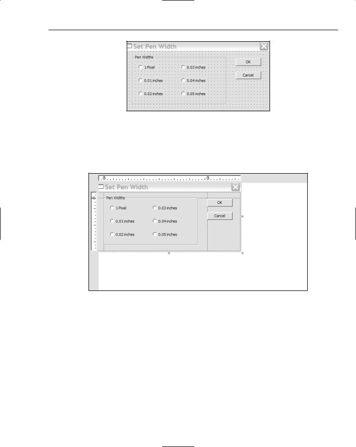
The dialog has a default ID assigned that is IDD_DIALOG1, but it would be better to have an ID that was a bit more meaningful. You can edit the ID by right-clicking the dialog name in the Resource View pane and selecting Properties from the pop-up. You can also display the dialog’s properties by right-clicking in the Dialog Editor pane and selecting from the pop-up. Change the ID to something that relates to the purpose of the dialog such as IDD_PENWIDTH_DLG. At the same time, you could also change the Caption property value to Set Pen Width.
Adding Controls to a Dialog Box
To provide a mechanism for entering a pen width, you can add controls to the basic dialog that’s initially displayed until it looks like the one shown in Figure 16-3.
820
Working with Dialogs and Controls
Figure 16-3
Figure 16-3 shows the grid that you can use to position controls. If the grid is not displayed, you can select the appropriate Toolbar button to display it; the Toolbar button toggles the grid on and off. Alternatively, you can display rules along the side and top of the dialog that you can use to create guide lines as shown in Figure 16-4.
Figure 16-4
You create a horizontal guide by clicking the appropriate rule. You can position a guide line by dragging the arrow for it along the rule and then using one or more guides when positioning a control.
The dialog has six radio buttons that provide the pen width options. These are enclosed within a group box with the caption Pen Widths. The group box serves to enclose the radio buttons and make them operate as a group, where only one member of the group can be checked at any given time. Each radio button has an appropriate label to identify the pen width that is set when selected. There are also the default OK and Cancel buttons that close the dialog. Each of the controls in the dialog has its own set of properties that you can access and modify in the same way as for the dialog box itself.
The next step is to add the group box. As I said, the group box serves to associate the radio buttons in a group from an operational standpoint, and to provide a caption and a boundary for the group of buttons. Where you need more than one set of radio buttons, a means of grouping them is essential if they
821

Chapter 16
are to work properly. You can select the button corresponding to the group box from the common controls palette by clicking it; then click the approximate position in the dialog box where you want the center of the group box. This places a group box of default size on to the dialog. You can then drag the borders of the group box to enlarge it to accommodate the six radio buttons that you add. To set the caption for the group box, type the caption you want (in this, case type Pen Widths).
The last step is to add the radio buttons. Select the radio button control by clicking it and then clicking on the position in the dialog where you want to position a radio button within the group box. Do the same for all six radio buttons. For each button you can select it by clicking it; then type in the caption to change it. You can also drag the border of the button to set its size, if necessary. To display the properties window for a control, select it by clicking it; then select Properties from the pop-up. You can change
the ID for each radio button in the properties window for the control to correspond better with its purpose: IDC_PENWIDTH0 for the 1 pixel pen width, IDC_PENWIDTH1 for the 0.01 inch width pen, IDC_ PENWIDTH2 for the 0.02 inch pen, and so on.
You can position individual controls by dragging them around with the mouse. You can also select a group of controls by selecting successive controls with the Shift key pressed, or by dragging the cursor with the left button pressed to create a rectangle enclosing them. To align a group of controls, select the appropriate button from the Dialog Editor toolbar shown in Figure 16-5.
Figure 16-5
The toolbar is shown in its undocked state — that is, dragged away from the toolbar area at the top of the window. If the toolbar is not visible, you can show it by right-clicking in the toolbar area and selecting it in the list of toolbars that is displayed. You also can align controls in the dialog by selecting from the Format menu.
Testing the Dialog
The dialog resource is now complete. You can test it by selecting the Toolbar button that appears at the left end of the toolbar in Figure 16-5 or by pressing Ctrl+T. This displays the dialog window with the basic operations of the controls available, so you can try clicking on the radio buttons. When you have a group of radio buttons, only one can be selected. As you select one, any other that was previously selected is reset. Click either of the OK or Cancel buttons or even the Close icon in the title bar for dialog to end the test. After you have saved the dialog resource, you’re ready to add some code to support it.
Programming for a Dialog
There are two aspects to programming for a dialog: getting it displayed, and handling the effects of its controls. Before you can display the dialog corresponding to the resource you’ve just created, you must first define a dialog class for it. The Class wizard helps with this.
822

Working with Dialogs and Controls
Adding a Dialog Class
Right-click the dialog box that you just created in the Resource Editor pane and then select Add Class from the pop-up tool display the Class Wizard dialog. You’ll define a new dialog class derived from the MFC class CDialog, so select that class name from the Base Class: drop-down list box. You can enter the class name as CPenDialog in the Class name: edit box. The Class Wizard dialog should look as shown in Figure 16-6.
Figure 16-6
Click the Finish button to create the new class.
The CDialog class is a window class (derived from the MFC class CWnd) that’s specifically for displaying and managing dialogs. The dialog resource that you have created automatically associates with an object of type CPenDialog because the IDD class member is initialized with the ID of the dialog resource:
class CPenDialog : public CDialog
{
DECLARE_DYNAMIC(CPenDialog)
public:
CPenDialog(CWnd* pParent = NULL); // standard constructor virtual ~CPenDialog();
// Dialog Data
enum { IDD = IDD_PENWIDTH_DLG }; |
|
protected: |
|
virtual void DoDataExchange(CDataExchange* pDX); |
// DDX/DDV support |
DECLARE_MESSAGE_MAP() |
|
}; |
|
823

Chapter 16
The highlighted statement defines IDD as a symbolic name for the dialog ID in the enumeration. Incidentally, using an enumeration is the only way you can get an initialized data member into a class definition. If you try putting an initial value for any regular data member declaration, it won’t compile. You will get an error message about illegal use of pure syntax. It works here because an enum defines a symbolic name for a value of type int. Unfortunately, you can only define values of type int in this way. It’s not strictly necessary here because the initialization for IDD could be done in the constructor, but this is how Class wizard chooses to do it. This technique is more commonly used to define a symbol for the dimension of an array (a member of a class), in which case using an enumeration is your only option.
Having your own dialog class derived from CDialog means that you get all the functionality that that class provides. You can also customize the dialog class by adding data members and functions to suit your particular needs. You’ll often want to handle messages from controls within the dialog class, although you can also choose to handle them in a view or a document class if this is more convenient.
Modal and Modeless Dialogs
There two different types of dialog, termed modal and modeless dialogs, and they work in completely different ways. Although a modal dialog remains in effect, all operations in the other windows in the application are suspended until the dialog box is closed, usually by clicking an OK or Cancel button. With a modeless dialog, you can move the focus back and forth between the dialog box and other windows in your application just by clicking them, and you can continue to use the dialog box at any time until you close it. Class wizard is an example of a modal dialog; the Properties window is modeless.
A modeless dialog box is created by calling the Create() function defined in the CDialog class, but because you’ll only be using modal dialogs in the Sketcher example, you’ll call the DoModal() function for the dialog object, as you’ll see shortly.
Displaying a Dialog
Where you put the code to display a dialog in your program depends on the application. In the Sketcher program, it is convenient to add a menu item that, when selected, results in the pen width dialog being displayed. You’ll put this in the IDR_SketcherTYPE menu bar. As both the width and the color are associated with a pen, you can rename the Color menu as Pen. You do this just by double-clicking the Color menu item in the Resource Editor pane to open its Properties window and changing the value of the Caption property to &Pen. Closing the window puts the change into effect.
When you add the Width menu item to the Pen menu, you should separate it from the colors in the menu. You can add a separator after the last color menu item by right-clicking the empty menu item and selecting the Insert Separator menu item from the pop-up. You can then enter the new Width item as the next menu item after the separator. The menu item ends with an ellipsis (three periods) to indicate that it displays a dialog; this is a standard Windows convention. Double-click the menu to display the menu properties for modification, as shown in Figure 16-7.
Enter ID_PENWIDTH as the ID for the menu item as shown in Figure 16-7. You can also add a status bar prompt for it and because you’ll also add a toolbar button, you can include text for the tool tip as well. Remember, you just put the tooltip text following the status bar prompt text, separated from it by “\n”. Here the value for the Prompt property is “Change pen width\nShow pen width options”. The menu will look as shown in Figure 16-8.
824

Working with Dialogs and Controls
Figure 16-7
Figure 16-8
825

Chapter 16
To add the Toolbar button, open the toolbar resource by extending the Toolbar folder in the Resource View and double-clicking IDR_MAINFRAME. You can add a toolbar button to represent a pen width. The one shown in Figure 16-9 tries to represent a pen drawing a line.
Figure 16-9
To associate the new button with the menu item that you just added, open the properties box for the button and specify its ID as ID_PENWIDTH, the same as that for the menu item.
Code to Display the Dialog
The code to display the dialog goes in the handler for the Pen > Width menu item, so in which class should you implement this handler? The view class is a candidate for dealing with pen widths, but following the previous logic with colors and elements, it would be sensible to have the current pen width selection in the document, so the handler should go in the CSketcherDoc class. Right-click the Width. menu item in the Resource View pane for the ID_SketcherTYPE menu and select Add Event Handler from the pop-up. You can then create a function for the COMMAND message handler corresponding to ID_PENWIDTH in the CSketcherDoc class. Now edit this handler and enter the following code:
// Handler for the pen width menu item void CSketcherDoc::OnPenwidth()
{
CPenDialog aDlg; |
// Create a local dialog object |
// Display the dialog as modal aDlg.DoModal();
}
There are just two statements in the handler at the moment. The first creates a dialog object that is automatically associated with your dialog resource. You then display the dialog by calling the DoModal() function for the aDlg object.
Because the handler declares a CPenDialog object, you must add a #include statement for
PenDialog.h to the beginning of SketcherDoc.cpp (after the #include directives for stdafx.h and
Sketcher.h); otherwise, you’ll get compilation errors when you build the program. After you’ve done
826

Working with Dialogs and Controls
that, you can build Sketcher and try out the dialog. It should appear when you click the Toolbar button or the Pen > Width menu item. Of course, if the dialog is to do anything, you still have to add the code to support the operation of the controls; to close the dialog, you can use either of the buttons or the Close icon in the title bar.
Code to Close the Dialog
The OK and Cancel buttons (and the close icon on the title bar) already close the dialog. The handlers to deal with the BN_CLICKED event handlers for the OK and Cancel button controls have been implemented for you. However, it’s useful to know how the action of closing the dialog is implemented in case you want to do more before the dialog is finally closed or if you are working with a modeless dialog.
The CDialog class defines the OnOK() method that is called when you click the default OK button which has IDOK as its ID. This function closes the dialog and causes the DoModal() method to return the ID of the default OK button, IDOK. The OnCancel() function is called when you click the default Cancel button in the dialog and this closes the dialog and DoModal() returns the button ID, which is IDCANCEL. You can override either or both of these functions in your dialog class to do what you want. You just need to make sure you call the corresponding base class function at the end of your function implementation. You’ll probably remember by now that you can add an override class by selecting the overrides button in the Properties window for the class.
For example, you could implement an override for the OnOK() function like this:
void CPenDialog::OnOK()
{
// Your code for data validation or other actions...
CDialog::OnOK(); |
// Close the dialog |
}
In a complicated dialog, you might want to verify that the options selected or the data that has been entered is valid. You could put code here to check the state of the dialog and fix up the data or even leave the dialog open if there are problems.
Calling the OnOK()defined in the base class closes the dialog and causes the DoModal() function to return IDOK. Thus you can use the value returned from DoModal() to detect when the dialog was closed by clicking the OK button.
As I said, you can also override the OnCancel() function in a similar way if you need to do extra cleanup operations before the dialog closes. Be sure to call the base class method at the end of your function implementation.
When you are using a modeless dialog you must implement the OnOK() and OnCancel() function overrides so that they call the inherited DestroyWindow() to terminate the dialog. In this case, you must not call the base class OnOK() or OnCancel() functions, because they not destroy the dialog window, but merely render it invisible.
827

Chapter 16
Supporting the Dialog Controls
For the Pen dialog, you’ll store the selected pen width in a data member, m_PenWidth, of the CPenDialog class. You can either add the data member by right-clicking the CPenDialog class name and selecting from the context menu, or you can add it directly to the class definition as follows:
class CPenDialog : public CDialog
{
// Construction public:
CPenDialog(CWnd* pParent = NULL); // standard constructor
//Dialog Data
enum { IDD = IDD_PENWIDTH_DLG };
//Data stored in the dialog public:
int m_PenWidth; // Record the pen width
// Plus the rest of the class definition....
};
If you do use the context menu for the class to add m_PenWidth, be sure to add a comment to the class definition. This is a good habit to get into, even when the member name looks self-explanatory.
You’ll use the m_PenWidth data member to set the radio button corresponding to the current pen width in the document as checked. You’ll also arrange that the pen width selected in the dialog is stored in this member, so that you can retrieve it when the dialog closes. At this point you could arrange to initialize m_PenWidth to 0 in the class constructor.
Initializing the Controls
You can initialize the radio buttons by overriding the OnInitDialog() function that is defined in the base class, CDialog. This function is called in response to a WM_INITDIALOG message, which is sent during the execution of DoModal() just before the dialog box is displayed. You can add the function to the CPenDialog class by selecting OnInitDialog in the list of overrides in the Properties window for the CPenDialog class, as shown in Figure 16-10.
828