Добавил:
Опубликованный материал нарушает ваши авторские права? Сообщите нам.
Вуз: Предмет: Файл:

Professional Visual Studio 2005 (2006) [eng]

.pdf
Скачиваний:
132
Добавлен:
16.08.2013
Размер:
21.9 Mб
Скачать

Chapter 42

With a Web Parts page, you first create a WebPartManager component that sits on the page to look after any areas of the page design that are defined as parts. You then use WebPartZone containers to set where you want customizable content on the page, and then finally place the actual content into the

WebPartZone container.

While these two components are the core of implementing Web Parts, you need only look at the WebParts group in the Toolbox to discover a whole array of additional components that can be used as well (see Figure 42-8). You use these additional components to enable your users to customize their experience of your web site. They will be discussed in a moment.

Figure 42-8

WebPartManager

The WebPartManager component represents a class that controls a set of WebPart objects. This is basically the engine for the entire Web Parts experience, providing methods to add, move, and remove individual WebPart components and add the personalization aspects to the page for the user. It also manages connections between WebPart controls.

The DisplayMode property is used to specify what state the Web Parts are being shown in, out of the five possible states that the WebPartManager allows. You can programmatically change the DisplayMode to whichever state you require, thus making it easy to turn the user customization of the page layout on and off. The five states are as follows:

Browse: The default view, which presents users with a normal view of the page, with the Web Parts displayed as static entities on the page

Design: Enables users to move or delete individual Web Part controls to change their page’s layout

Edit: Enables any EditorZone controls to be shown, which users can then use to customize the appearance of each of the Web Parts

586

Additional Web Techniques

Catalog: Includes any CatalogZone components you have defined on the page, from which users can select individual Web Parts to add to their existing page layout for additional content

Connect: Enables users to control how different Web Parts connect to each other. This requires Web Parts to have compatible communications paths set up so they can talk to each other.

WebPartZones define sections of your page that contain the customizable sections. In other words, a Web PartZone contains a Web Part. Each WebPartZone component can be themed individually, and is used to contain any kind of control. It does this by enclosing the content that makes up the static part of the Web Part with ZoneTemplate tags.

The best way to explain how this works is to show the source view of a page that has Web Parts. The following listing is from the sample site used previously. It uses two WebPartZone components to store a Menu (which uses the sitemap information discussed previously in this chapter) and a main content area with some static text. Here’s the page in its entirety:

<%@ Page Language=”VB” AutoEventWireup=”false” CodeFile=”Default.aspx.vb” Inherits=”_Default” %>

<!DOCTYPE html PUBLIC “-//W3C//DTD XHTML 1.0 Transitional//EN” “http://www.w3.org/TR/xhtml1/DTD/xhtml1-transitional.dtd”>

<html xmlns=”http://www.w3.org/1999/xhtml” > <head runat=”server”>

<title>Untitled Page</title> </head>

<body>

<form id=”form1” runat=”server”>

<asp:WebPartManager ID=”WebPartManager1” runat=”server”> </asp:WebPartManager>

<asp:SiteMapDataSource ID=”SiteMapDataSource1” runat=”server” /> <div>

<table style=”width: 100%”> <tr>

<td style=”width: 21px” valign=”top”>

<asp:WebPartZone ID=”WebPartZone1” runat=”server” HeaderText=”Navigation”> <ZoneTemplate>

<asp:Menu ID=”Menu1” runat=”server” DataSourceID=”SiteMapDataSource1”> </asp:Menu>

</ZoneTemplate>

</asp:WebPartZone>

</td>

<td style=”width: 100px” valign=”top”>

<asp:WebPartZone ID=”WebPartZone2” runat=”server” HeaderText=”Main” Width=”408px”> <ZoneTemplate>

<asp:Label ID=”Label1” runat=”server” title=”MainContent”> <h1>Home Page For My Products</h1>

<p>Welcome to my main page!</p> </asp:Label>

</ZoneTemplate>

</asp:WebPartZone>

</td>

587

Chapter 42

</tr>

</table>

</div>

</form>

</body>

</html>

Notice that each WebPartZone component contains a set of ZoneTemplate tags, which in turn encapsulate the code that is to be treated as the actual contents of the Web Part. Within the ZoneTemplate tags, you can insert any web or custom control.

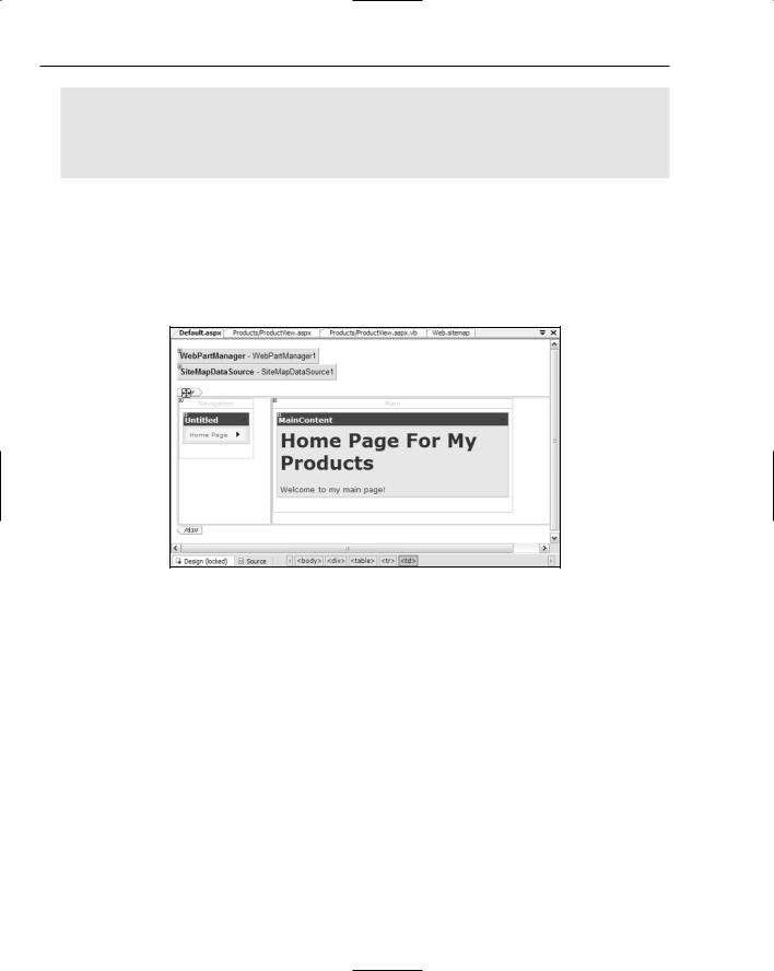
The Design view of this page, with the WebPartZone controls formatted with some of the built-in themes, is shown in Figure 42-9. Notice how the controls within the WebPartZone components are also formatted with the theme.

Figure 42-9

Using just these two classes, you can build a web site that is fully customizable in your program code. You first define all the variable parts of your site into WebPartZone components, and then use the WebPartManager component’s methods to add or remove the Web Parts as needed. However, you can also use other controls to enable users to personalize their own unique experience of your site.

EditorZone

The EditorZone control is used to position and house the different types of editing of your design you want to allow. It works much like a WebPartZone, but instead of containing normal web controls, the EditorZone can only contain the EditorPart controls that define access to different settings.

You can place multiple EditorPart components in the one EditorZone by adding them one after the other in the container zone. If you apply a theme to the EditorZone, it is applied across all contained Editor Part components. When the WebPartManager component’s DisplayMode is set to Edit, any EditorZone components defined on the page are displayed to the user.

588

Additional Web Techniques

The EditorPart components are contextually relative to whichever Web Part component is selected, enabling users to customize each part of your site defined in a WebPartZone to suit their own requirements. You can add four EditorPart components to the EditorZone, each controlling a different set of properties for the selected Web Part.

AppearanceEditorPart

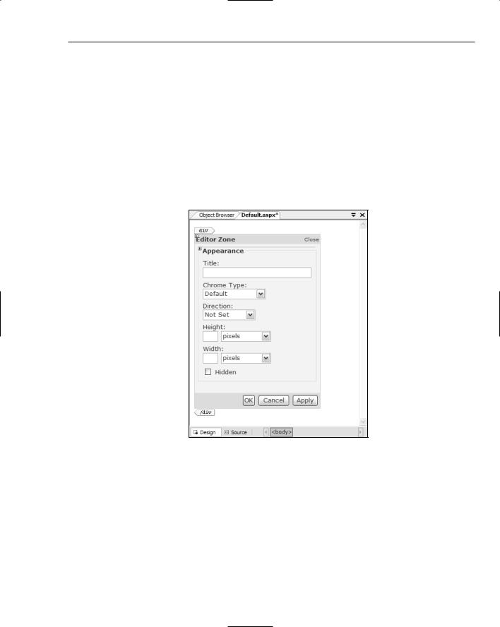
The AppearanceEditorPart enables users to change several aspects of the user interface for the Web Part, including the title and how big it is. They can also use this EditorPart to turn off the title completely, or turn off the borders around the Web Part. Figure 42-10 shows an AppearanceEditorPart in design mode, inheriting the theme from the containing EditorZone.

Users can use the Chrome Type setting to specify whether the title or borders should be shown, while the Hidden checkbox will remove the Web Part from view completely.

Figure 42-10

BehaviorEditorPart

The BehaviorEditorPart provides direct access to a number of system-level properties for the selected Web Part, and is usually not used for general user access. The properties that can be adjusted with BehaviorEditorPart include a number of flags that dictate what actions can be performed on the Web Part, such as AllowClose and AllowEdit. Because an end-user could accidentally disable editing on a Web Part, you should consider carefully whether this part will be included in your exposure of customization settings.

589

Chapter 42

In addition to these flags, users can also set the description and a URL associated with the title, among other items.

LayoutEditorPart

The LayoutEditorPart (shown in Figure 42-11) provides some simple settings that users can change to affect how and where the Web Part will be shown. The first property shown in Figure 42-11 is the Chrome State, which enables users to minimize the Web Part to an icon, while the Zone property gives them the capability to move the chosen Web Part to another WebPartZone elsewhere on the page.

The Zone Index reflects where the Web Part is within the WebPartZone to which it belongs. A value of 0 indicates that it is the first part in the zone, with the others appearing in sequential order down the page.

Figure 42-11

PropertyGridEditorPart

The PropertyGridEditorPart enables you to define custom properties on your Web Parts and then expose those properties to the users of your site. You could use PropertyGridEditorPart to enable your users to specify parameters to specific Web Parts. For example, you might have a Web Part that contains a weather forecast based on a custom property that stores the associated zip code. Exposing the zip code property to the end users would enable them to choose their own location for the weather forecast data.

CatalogZone

The CatalogZone (see Figure 42-12) is used to keep track of all the Web Parts known to the WebPartManager. You can use the CatalogZone to store Web Parts that are not active by default, as well as save Web Parts that are removed from the user’s current configuration so they can be restored if the user chooses.

590

Additional Web Techniques

Figure 42-12

A CatalogZone can contain CatalogPart components, of which there are three types. The Import CatalogPart is used to import new Web Part definition files, and is beyond the scope of this discussion.

DeclarativeCatalogPart

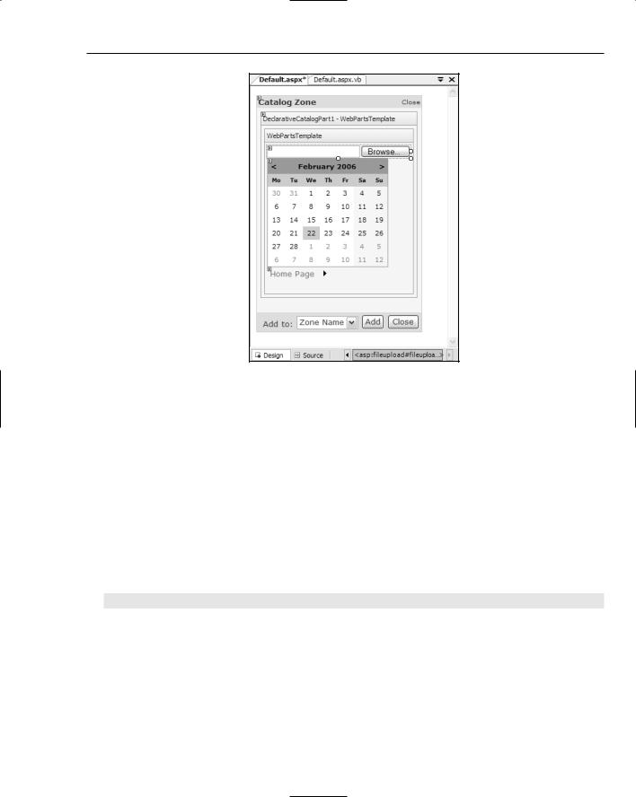
The DeclarativeCatalogPart is where you define all Web Parts that are not visible by default. Once you add the DeclarativeCatalogPart, you need to then enter Template Editing mode to gain access to the container area. In Template Editing mode, you add the Web Parts you want to the DeclarativeCatalogPart by dragging components from the Toolbox, or dragging custom controls from the Solution Explorer.

As you add each component to the DeclarativeCatalogPart, you should switch to Source view and add the title attribute so users have meaningful names to view. For example, you could modify the source definition for a FileUpload control so users see the text File Upload like so:

<asp:FileUpload ID=”FileUpload1” title=”File Upload” runat=”server” />

Without setting the title attribute all your Web Parts will display as Untitled, so make sure you follow this step.

When you’ve finished adding your controls that will serve as additional Web Parts for users to choose from, quit Template Editing mode and verify that you’re happy with the way the catalog list appears.

591

Chapter 42

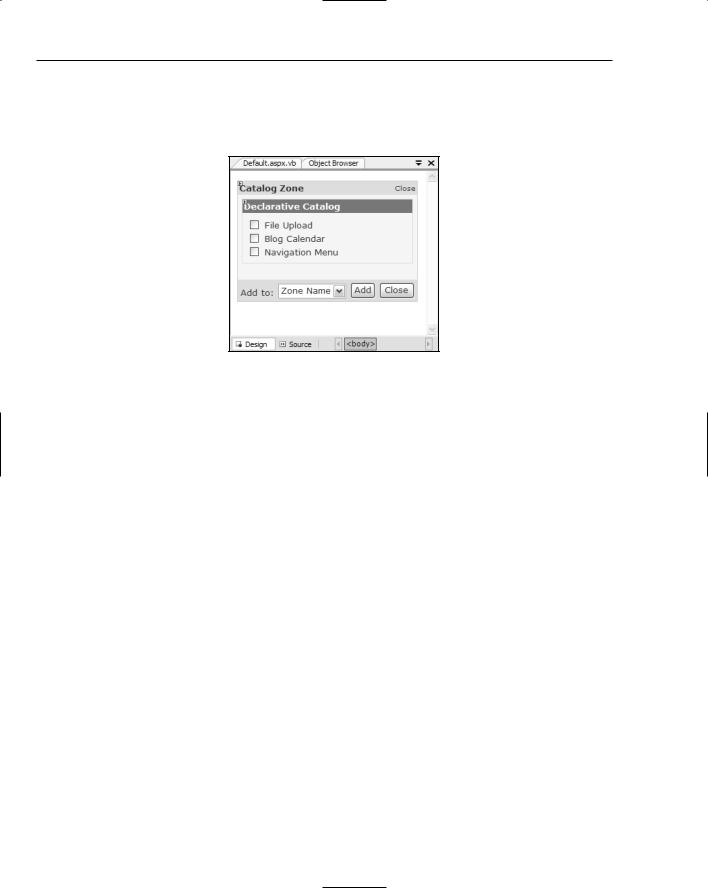
Figure 42-13 shows the same DeclarativeCatalogPart after quitting Template Editing mode. When users see this list, they can simply check the boxes next to the Web Parts they want, select which WebPartZone to add them to, and then the click Add button to insert the extra functionality to the page layout.

Figure 42-13

PageCatalogPart

Conversely, the PageCatalogPart is used to store a list of all Web Parts that were originally on the page but have since been closed by a user. This enables the WebPartManager, in conjunction with the CatalogZone, to keep track of every Web Part available to users, regardless of their state.

If you are going to implement a CatalogZone, you should always include the PageCatalogPart so users can restore Web Parts they have previously hidden from view.

This discussion of Web Parts offers only a basic introduction to how the different components work together to build a customizable web site that can be controlled either programmatically or by your end users depending on your individual requirements. If you would like to know more, Peter Vogel’s

Professional Web Parts and Custom Controls with ASP.NET 2.0 is a fantastic resource that deals with Web Parts.

Summar y

This chapter expanded on the web techniques discussed in Chapter 41 to include more advanced features found in Visual Studio 2005. Notably, the sitemap functionality enables you to automate your navigation controls with a custom-built hierarchical representation of your web site, while Web Parts introduces a comprehensive solution to building customizable web sites.

592

Building Device Applications

In the past, building applications for mobile phones or PDAs was not for the fainthearted. It required not only a special set of tools, but also a great deal of patience to get everything to work properly. The .NET Compact Framework — a smaller, limited feature subset of the full .NET Framework available for Windows Mobile devices, and the associated designer support within Visual Studio — opened up the world of mobile application development to the general developer community. Now developers could build, test, and deploy applications in the same way that they built Windows applications.

Visual Studio 2005 and the .NET Compact Framework 2.0 improve this experience with much richer designer support and a complete set of controls for building applications. This chapter shows you how easy it is to build and test device applications within Visual Studio 2005. (In this chapter you’ll notice references to the .NET Framework; in the absence of any clarification (such as the full .NET Framework), this chapter refers to the .NET Compact Framework.)

Getting Star ted

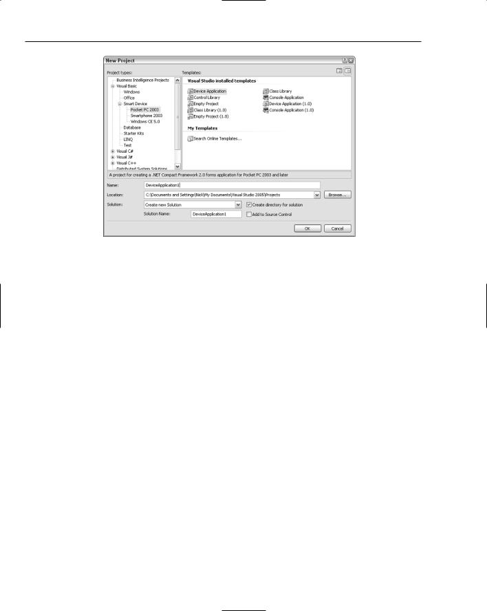
The first thing you need to do to get started building a device application is to create a smart device project. You can either create this in a new solution or, if you are adding a device component to a larger application, add it to an existing solution. Creating a smart device project is done in the same way as you would create any other project type. Select the File New Project menu command, or you can select the Add New Project solution right-click context menu in the Solution Explorer window. Figure 43-1 shows the New Project dialog with the Smart Device node expanded. Notice that the most common types of projects are all present, such as Device (Windows) Application, Control and Class libraries, and Console Application.
Chapter 43

Figure 43-1

After selecting the project type (in this case, a Device Application), and providing a name and location for the project, click OK to generate the device application.

.NET Compact Framework Versions

The other thing you will notice in Figure 43-1 is that the project types are all repeated with the (1.0) suffix. These projects types enable you to build applications based on version 1.0 of the .NET Compact Framework. Visual Studio 2005 supports building device applications for both versions of the .NET Compact Framework, which is not possible for the full .NET Framework. However, you must specify when you create the project that you want it to be a version 1.0 project. If you are in doubt, select the version 1.0 projects, as this project can be upgraded to a version 2.0 project at a later stage. The remainder of this chapter focuses on version 2.0 of the .NET Compact Framework.

Choosing a Version

Building applications using the full .NET Framework within Visual Studio 2005, you don’t have any choice regarding which version of the .NET Framework to use. For the most part, you don’t need to worry about whether the target market will have version 2.0 of the .NET Framework installed because it is easy for them to download and install it as required. However, when building device applications, one of the limitations that you commonly face is storage space. With this limitation in mind, it might be best to target the version of the framework that comes within the ROM of the device. As such, you need to consider which framework version you’re targeting when building your application.

To make an educated decision about which framework version to target, you need to know a bit more about which versions of the framework are packaged with which devices. Just to complicate matters further, there are multiple service packs for version 1.0 of the .NET Framework, and Microsoft has recently released Windows Mobile 5.0, which supports additional functionality. The following table shows which versions of the .NET Framework are packaged with the different versions of the PocketPC and Smartphone operating systems.

594


Building Device Applications


Device

Operating System

Version


Pocket PC

Pocket PC 2002

None


Windows Mobile 2003

.NET Compact Framework 1.0


Windows Mobile 2003

.NET Compact Framework 1.0, Service


Second Edition

Pack 2


Windows Mobile 5.0

.NET Compact Framework 1.0, Service


Pack 3


Smartphone

Smartphone

None


Windows Mobile 5.0

.NET Compact Framework 1.0, Service


Pack 3


You will notice from this table that due to the relative timing of the release of Windows Mobile 5.0 and the .NET Compact Framework 2.0, currently no devices with version 2.0 of the .NET Framework are installed by default. This version of the framework will need to be installed on any device that you are planning to deploy to.

The other consideration when deciding which version of the .NET Framework to use is which devices support version 2.0. While version 1.0 of the .NET Framework is supported on devices back to Pocket PC 2002, version 2.0 can only be installed on Windows Mobile 2003 Second Edition and later. This is an important consideration because it means that older devices will not be able to run applications built with version 2.0 of the .NET Framework.

Framework Compatibility

One of the main design goals of the .NET Compact Framework team was to ensure (as much as possible) that there was 100% backward compatibility between the framework versions. The goal was that any application compiled using version 1.0 of the framework should be able to run on version 2.0 of the

.NET Framework. The results from this team have been quite staggering, as they have for the most part achieved this goal, and existing applications can get massive performance benefits without even needing to be recompiled.

Solution Explorer

When the device project is created, it will appear in the Solution Explorer window with the same layout as a full .NET Framework project. The only difference is that the device project is distinguished from other projects by the icon used. Figure 43-2 shows a single VB.NET device project in the Solution Explorer window.

Figure 43-2

595