
Professional Visual Studio 2005 (2006) [eng]
.pdf
Chapter 41
Features shown in the Starter Kit, such as user authentication and master pages, are discussed in the next several pages, but remember that this great example project is available for you to look through to gain an insight about how the various controls and components are meant to be used. The Personal Web Site Starter Kit is available for all three Microsoft languages — Visual Basic, C# and J#.
Web Development Options
Before you take a look at how to customize the web pages in your site with the many components and features offered in Visual Studio 2005, it’s worth taking a look at some of the web-development-specific options within the IDE that can make your life easier in the long run.
The options related to web development can be found in two places — the HTML text editor and the HTML Designer groups of options. Each of these deals with a different aspect of how you can configure the IDE to suit your own working style.
HTML Text Editor Options
The text editor options group has a section of parameters for each language that Visual Studio 2005 understands, and HTML is no exception. Within the HTML text editor, you’ll find the normal pages of options for tabbing and autocompletion. In addition to these are three pages of HTML-specific options: Format, Miscellaneous, and Validation.
Format options specify how the HTML tags should be capitalized and how the internal attributes on each element should be formatted. Additional formatting options can be specified for each individual HTML tag by clicking the Tag Specific Options button. The tag list includes both straight HTML and ASP.NET control tags, and for each tag you can specify whether it requires a closing tag and whether the contents within the opening and closing tags should be indented. It also enables you to control the color of each tag.
The Miscellaneous page has two innocuous looking options that can have profound effects on your HTML code if you’re unaware of them. The first is “Auto ID elements on paste” in Source view. By default this option is turned on and will assign an ID attribute on every element that is pasted into the source of a web page. This can be both good and bad. It’s great when you’re pasting a whole section of HTML with many elements that you’re going to need to refer to in code because the IDs will be guaranteed to be unique. However, the problem with this is that it will overwrite any pre-existing ID values, so if your HTML and program code depend on the IDs having specific values, you’ll also need to update those places with the newly assigned ID values.
The second option is turned off by default but can be handy in the same situation. “Format HTML on paste” will reformat the HTML source code to fit in with the existing HTML structure in your source, including indentation and spacing. Leaving this option disabled means that the HTML is pasted as is without any reformatting occurring.
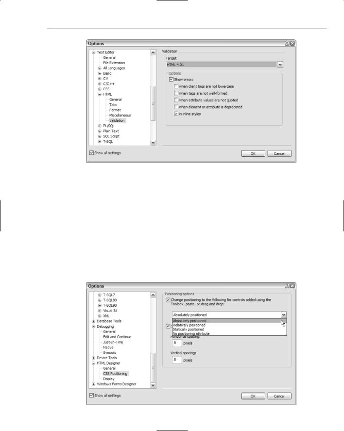
The last page of options for the HTML editor is the Validation options set. With this page you can have Visual Studio 2005 analyze the HTML source and validate it against a particular standard. Figure 41-5 shows this page with the HTML 4.01 standard selected, but you can also pick browser-specific standards, or XHTML 1.0 and 1.1 standards, for comparing your code.
556
Creating Web Applications
Figure 41-5
HTML Designer Options
The HTML Designer group contains a number of options related to the graphical designer for web pages. The General options page only has a couple of simple options that come into play when you open an HTML page for editing or when you place a component on the page. The Display options page supplements these with some extra settings specifying how various controls should be drawn in Design view.
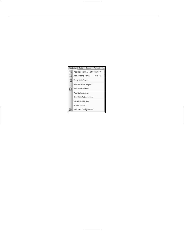
The most important option to be aware of is the positioning setting in the CSS Positioning options page (see Figure 41-6). By default, positioning is specified as absolute, which is great when you want to hardcode a particular layout. However, Visual Studio 2005 takes absolute positioning to the extreme, and can insert absolute values for individual cells in tables and other childlike elements. As a result, you can sometimes find yourself modifying multiple values where one would have sufficed.
Figure 41-6 |
557 |
Chapter 41
Other situations call for the more flexible relative positioning whereby elements are positioned relative to other elements and the page itself, or are even statically positioned. Use this page to choose the type of positioning you need for your specific project.
Website Menu
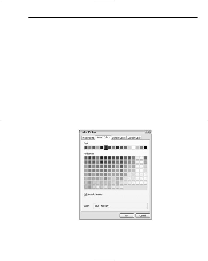
One last topic worthy of mention is the Website menu (see Figure 41-7) that appears in the main menu list when you’re editing a web project. From this menu you can control how the Solution Explorer displays the files and folders in your project, adds new pages and elements to your project, and adds references.
Figure 41-7
In addition, the Website menu is where you can publish your website from a local set of files to a remote destination. Later in this chapter you’ll learn how to deploy a site using this method. Two other important commands are the Start Options and ASP.NET Configuration menu commands. Start Options enables you to set how your website should be started, including startup page and debugging options, while the ASP.NET Configuration command invokes the Web Site Administration Tool with which you can add users, roles, security, and other application-specific settings. Both of these topics are also discussed later in this chapter.
Web Controls
So, you have your first web site project with a single blank page named default.aspx. You can start editing the HTML straight away, using the Visual Studio 2005 IDE as a normal HTML editor, with both Design and Source views. The Design view enables you to start writing content directly onto the page much like any other WYSIWYG web editor. You can add HTML-specific elements such as tables, images, and div tags to the page through the HTML group on the Toolbox. Formatting text with bold and italic, coloring, and setting its size and alignment are all done through the Format menu.
It is also worth noting here that all of the HTML tags in the page layout can have their properties edited just like the .NET components that are added to the design. This can save you time because you don’t need to switch between Design and Source views of the page just to change a simple property.
558
Creating Web Applications
The result is a fairly basic but sturdy editor for your HTML. Of course, there will still be times when you need to edit the HTML directly, which is where the Source view comes in to play. Visual Studio’s HTML text editor color-codes tags, attributes, and values, as well as automatically indents your source code for legibility. The IntelliSense engine also works in HTML, so when you add an opening tag that requires a corresponding closing tag, the editor will automatically add it.
Similarly, when you add an attribute to a tag, the IDE displays a list of available attributes from which you can choose; and if the attribute has a proscribed set of values, you are also presented with those options.
IntelliSense also marks HTML with potential problems, such as an <img> tag without an alt attribute, or elements that don’t meet the HTML standard you chose in the settings discussed earlier.
General Property Settings
Before taking a look at some of the new web components you can harness in your web development projects, note a couple of new dialogs in Visual Studio 2005 that are shared among the web controls you add to your page designs.
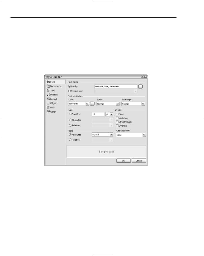
The new Color Picker dialog (shown in Figure 41-8) is a lot larger and easier to navigate than the Color dialog that Windows projects use. You can manually create a color irrespective of whether or not it falls into the official web palette through the Custom Color tab, or choose from web-safe colors in either the Web Palette or Named Colors tab.
Figure 41-8
559
Chapter 41
If you choose the Named Colors tab you can choose to insert either the hexadecimal value or the color name, by checking the Use Color Names checkbox. Note that the default behavior is to insert the color name, so if you prefer to know the exact value of CornflowerBlue or DarkSalmon, uncheck this option to insert the corresponding literal value (#6495ED and #E9967A, respectively).
Any component that can have a style applied to it directly can take advantage of the Style Builder (see Figure 41-9). The Style Builder enables you to interactively create a style on-the-fly. There are eight groups of options for every element, giving you control over borders, padding, coloring, and font styles (including the capability to assign multiple font names as is standard practice in professional web design), layout and positioning rules, and even the capability to set the mouse cursor or where print page breaks should occur.
Figure 41-9
When you’re done creating the style and click OK, the values are populated as a text string into the Style property, which you can edit directly, or even copy to an external CSS file so it can be shared among multiple components.
This same Style Builder dialog is available when creating or editing styles in a CSS file. You can display the Style Builder in a CSS file by either using the Styles Build Style menu command or right-clicking anywhere within the style rule you want to change and selecting Build Style from the context menu.
The Controls
When Visual Studio .NET (2002) was first released a whole new way of building web applications was enabled for Microsoft developers. Instead of using strictly server-based components in ASP or similar
560
Creating Web Applications
languages, and having to deal with the sequential way page code was processed, ASP.NET introduced the concept of feature-rich controls for web pages that acted in similar ways to their Windows counterparts.
Web controls such as button and text box components have familiar properties such as Text, Left, and Width, along with just as recognizable methods and events such as Click, TextChanged, and ToString. In addition to these was a limited set of web-specific components, some dealing with data-based information, such as the DataGrid control, and others providing common web tasks, such as an ErrorProvider to give feedback to users about problems with information they entered into a web form.
Visual Studio 2005 introduces a host of new web-based components to the Toolbox. Some of these components — such as the ImageMap and FileUpload controls — are straightforward and immediately fill a need faced by developers creating web applications. However, some of the new components are special enough to warrant individual mention.
The Wizard Component
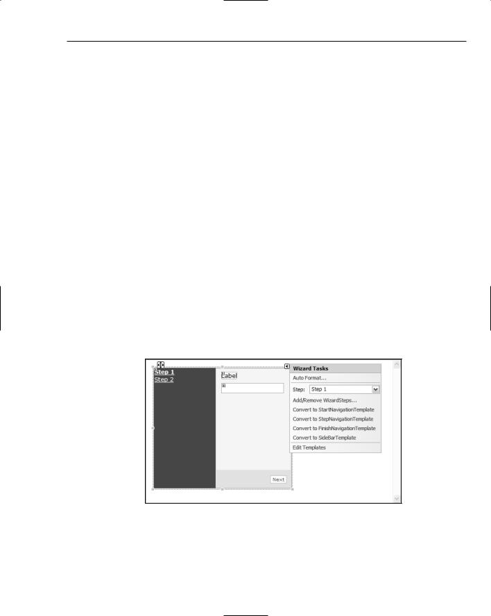
The ASP.NET Wizard component is a complex object that encapsulates an entire step-by-step wizard process. In a Windows wizard, a single dialog window is used to contain the contents of each step, with the necessary text and input fields being displayed as the user navigates through the stages of the wizard. The web-based component replicates this behavior with a user interface comprised of two areas.
The left-hand side contains the list of steps in the wizard, formatted as hyperlinks, while the main righthand pane contains the objects for each step. The smart tag Tasks list (displayed in Figure 41-10) enables you to switch the design-time view between the available steps, pick a preset formatting set, and manage the number of steps you have in the wizard.
Each step can be defined as a starting, finishing, or intermediate stage of the wizard, which affects how ASP.NET renders the navigation buttons.
Figure 41-10
This component also illustrates the introduction of templatized component design. This style of component development enables you to design one single layout (as complex as you require) and set it as a template to be used in other parts of your design. Template design is derived from the master-detail page concept discussed later in this chapter.
561
Chapter 41
Simple Navigation Components
The Toolbox has a separate section for navigation controls, appropriately named Navigation. This group contains three components by default: Sitemap, Menu, and TreeView. The Sitemap control is discussed in the next chapter, which deals with advanced web techniques, but the other two are both useful enough to be covered here.
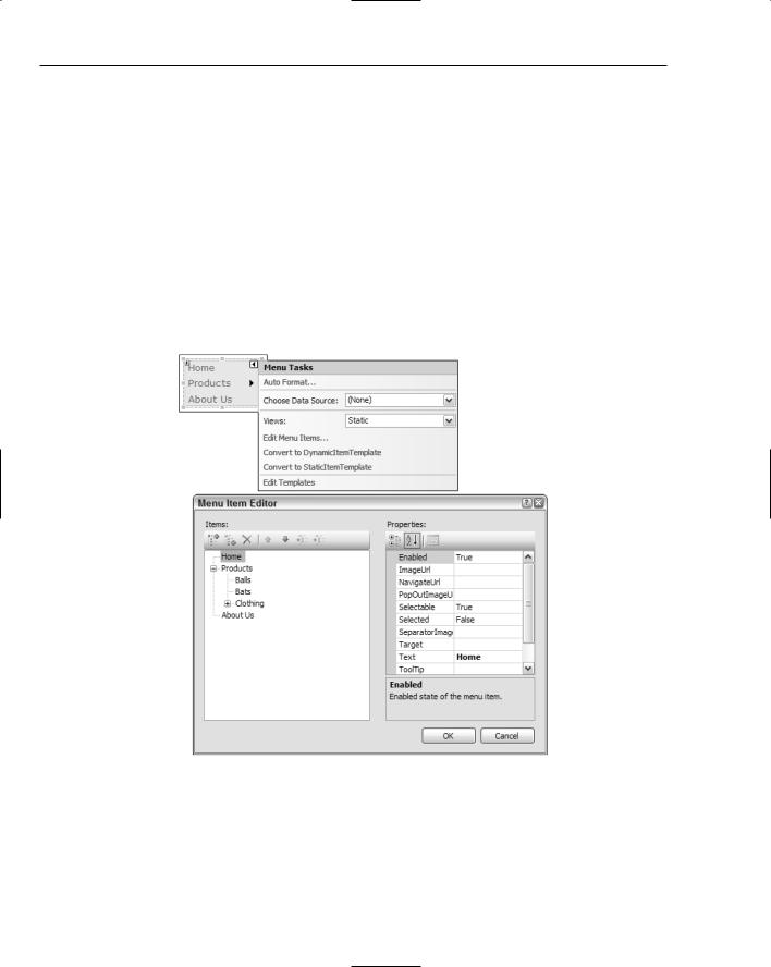
The Menu component enables you to create complex nested menus for your web page that do not require server-based processing for the user to navigate. As Figure 41-11 demonstrates, the default view state for a menu is Static, which means ASP.NET expects the menu to be a fixed set of options such as those shown in the figure. Each menu item can contain a set of submenu items to create as much depth as you require. As users hover their mouse pointers over a menu item, the appropriate submenu is displayed without having to go back to the server for more information.
Alternatively, you can have the menu build its contents dynamically as it receives the request, or even from a Data Source such as a sitemap or XML file.
Figure 41-11
Menus can be displayed vertically as shown in Figure 41-11, or horizontally for the top or bottom of a web page; this is set through the Orientation property of the Menu object itself.
The TreeView component enables you to replicate the TreeView control on many Windows applications. It works in much the same way, with a root node that contains a series of child nodes, which in turn have their own children, and so on.
562
Creating Web Applications
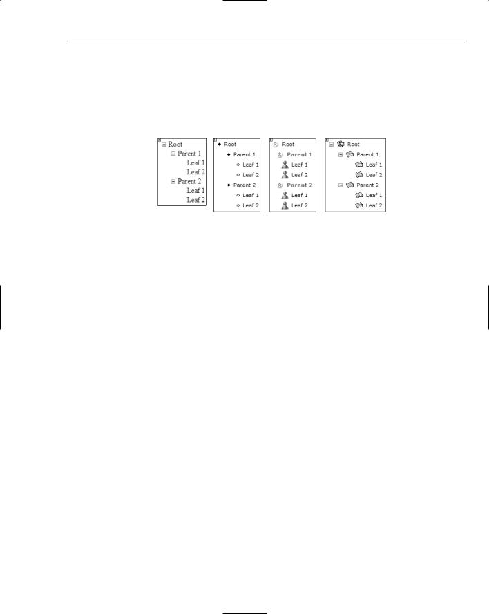
TreeView components can be collapsed or expanded as the user requires, and Visual Studio 2005 comes bundled with a series of preset formats that emulate common Windows applications such as Messenger and Outlook, as shown in Figure 41-12.
Besides formatting the TreeView to look like various Windows applications, you can bind the control to a Data Source in the same way you can with Menu components, even right down to the detail of formatting the lines that join the nodes with color, thickness, and style.
Figure 41-12
User Authentication Components
Perhaps the most significant additions to the web components in terms of functionality are the seven user authentication and login components. With these you can quickly and easily create the user-based parts of your web application without having to worry about how to format them and what controls are necessary.
By default, every web application you create has an automatic Data Source added to its ASP.NET configuration (see the section entitled “Site Administration” later in this chapter). The Data Source is a SQL Server Express database with a default name pointing to a local file system location. This Data Source is used as the default location for your user authentication processing, storing information about users and their current settings.
The benefit of having this automated data store generated for each web site is that Visual Studio can have an array of user-bound web components that can automatically save user information without requiring you to write any code.
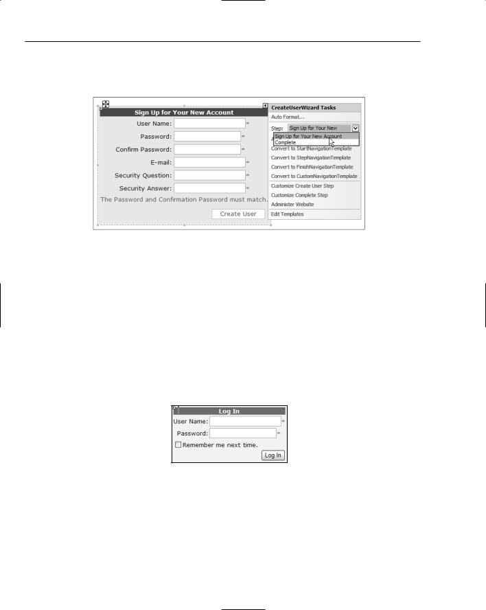
Before you can sign in as a user on a particular site, you first need to create one. Initially, you can do that in the administration and configuration of ASP.NET, but you will also want to allow visitors of the site to create their own user accounts. The CreateUserWizard component does just that, containing two wizard pages with information about creating an account, and indicating when the account is successful.
The default behavior for this control is shown in Figure 41-13 with a simple formatting scheme applied to it for greater legibility. You can see that the initial step allows the site visitor to enter a username, a password (and confirmation of the password), an e-mail address, and some security information for retrieving forgotten passwords. The text below these input fields is a custom control inherited from an ErrorProvider component that is displayed when the password fields don’t match.
Other messages can be customized as well, dealing with situations such as passwords not being long enough or duplicate usernames being detected. Although the component is obviously made up of subcomponents such as Label, TextBox, and Button controls, all the complexity is hidden away behind individual settings that control only the properties of each child control you need to change.
563
Chapter 41
Alternatively, you can select the Customize Create User Step or Customize Complete Step commands from the smart tag Tasks list, also shown in Figure 41-13, and gain direct access to the individual child controls.
Figure 41-13
The major advantage of using this CreateUserWizard component over building your own is that it does everything for you, including the database access to verify that the user can be added, and the actual saving of user information. You don’t have to do a single thing to have this work. As a test, create a new ASP.NET web application and drag an instance of the CreateUserWizard component from the Login group on the Toolbox onto the page and start the application with the Ctrl+F5 keyboard shortcut (to bypass debugging). After Visual Studio saves the files, a virtual server is created and the new page is loaded. You can then test the various error-checking features of the component (such as validation of the password fields) and even create multiple users for the site.
Of course, once users have created their account, they need to be able to log in to the site, and the Login control fills this need. Adding the Login component to your page creates a small form containing User Name and Password fields, along with the option to remember the login credentials, and a Log In button (see Figure 41-14).
Figure 41-14
You can customize the appearance of the component to include a link (including icon and text) to create a user account in the event that the visitor hasn’t previously registered, or even turn off the “Remember me next time” checkbox, forcing users of your web site to log in each time they visit.
The one trick to getting this to work straight away is to edit your Web.config file and change authentication to Forms. This is because the default authentication type is Windows, and the web site authenticates
564
Creating Web Applications
you as per the Windows user you are currently logged in as. Obviously, some web applications require Windows authentication, but for a simple web site that you plan to deploy on the Internet, this is the only change you need to make in order for the Login control to work properly.
The LoginStatus control is a simple bi-state component that displays one set of content when the site detects that a user is currently logged in, and a different set of content when there is no logged in user. Conveniently, the default configuration of this control generates hyperlinks to log in or log out of the site depending on the current status. For example, if the user is logged in, then the hyperlink enables the user to log out; and if the user is not currently logged in, then the hyperlink tries to log the user in using saved login information, or redirects the user to the defined login page in the Web.config file.
The LoginName component is also simple. It just returns the name of the logged in user. If your site is using Windows authentication mode, this is the fully qualified username, including server/machine details; otherwise, it will be the registered username.
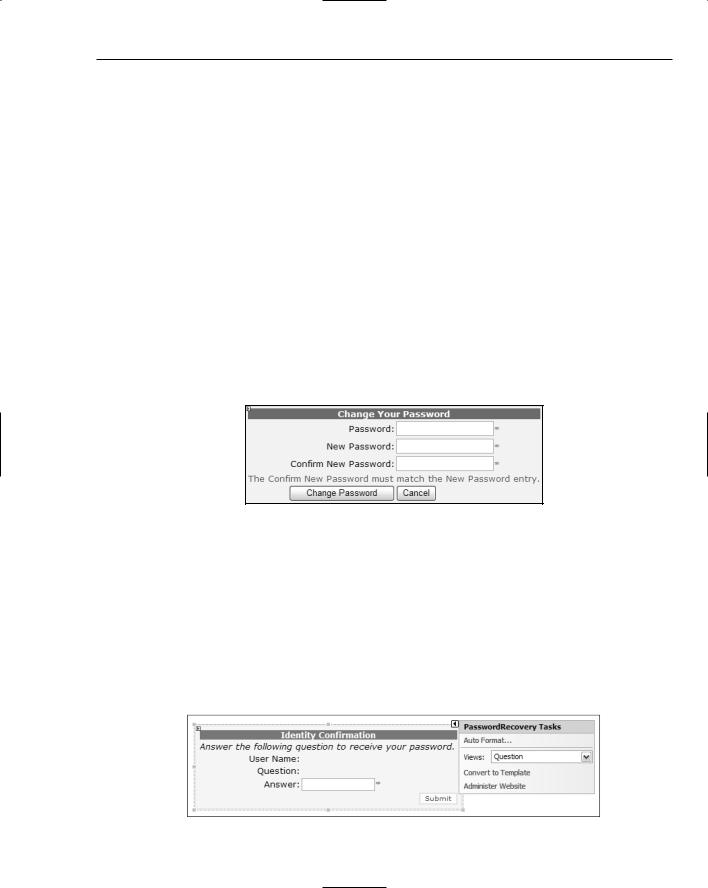
You may want to implement a policy that forces your site’s registered users to change their password regularly, or you might want to simply allow them to change it when they want to. Either way, the ChangePassword component works in conjunction with the other automatic user-based components to enable users to change their password. The default view of the control asks users for their current password as well as the new password (entered twice), and provides Change Password and Cancel buttons (see Figure 41-15).
Figure 41-15
This component does the same password validation as the CreateUserWizard object, enforcing the minimum length and special character requirements. The component also has a second view to indicate success, or you can optionally specify a SuccessPageUrl property value that tells ASP.NET to redirect to a new page when the password has been changed successfully.
Sometimes users forget their password, and that’s where the PasswordRecovery control comes into play. This component, shown in Figure 41-16, has three views: UserName, Question, and Success. The idea is that users first enter their username so the application can determine and display the security question, and then wait for an answer. If the answer is correct, then the component moves to the Success page and sends an e-mail to the registered e-mail address.
Figure 41-16
565
