

Brereton Chemometrics
.pdf C
C
EVOLUTIONARY SIGNALS |
373 |
|
|
where xi is the mean measurement at time i and si the corresponding standard deviation, will have the following characteristics:
1.it will be close to 1 in regions of composition 1;
2.it will be close to 0 in noise regions;
3.it will be below 1 in regions of composition 2.
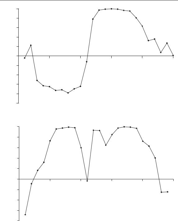
Table 6.5 gives of the correlation coefficients between successive points in time for the data in Table 6.1. The data are plotted in Figure 6.24, and suggest that
•points 7–9 are composition 1;
•points 10–13 are composition 2;
•points 14–18 are composition 1.
Note that because the correlation coefficient is between two successive points, the three point dip in Figure 6.24 actually suggests four composition 2 points.
The principles can be further extended to finding the points in time corresponding to the purest regions of the data. This is sometimes useful, for example to obtain the spectrum of each compound that has a composition 1 region. The highest correlation is between points 15 and 16, so one of these is the purest point in the chromatogram. The correlation between points 14 and 15 is higher than that between points 16 and 17, so point 15 is chosen as the elution time best representative of slowest eluting compound.
Table 6.5 Correlation coefficients for the data in Table 6.1.
Time |
ri,i−1 |
ri,15 |
1 |
−0.480 |
−0.045 |
2 |
0.227 |
|
3 |
−0.084 |
−0.515 |
4 |
0.579 |
−0.632 |
5 |
0.372 |
−0.651 |
6 |
0.802 |
−0.728 |
7 |
0.927 |
−0.714 |
8 |
0.939 |
−0.780 |
9 |
0.973 |
−0.696 |
10 |
0.968 |
−0.643 |
11 |
0.817 |
−0.123 |
12 |
0.489 |
0.783 |
13 |
0.858 |
0.974 |
14 |
0.976 |
0.990 |
15 |
0.990 |
1.000 |
16 |
0.991 |
0.991 |
17 |
0.968 |
0.967 |
18 |
0.942 |
0.950 |
19 |
0.708 |
0.809 |
20 |
0.472 |
0.633 |
21 |
0.332 |
0.326 |
22 |
−0.123 |
0.360 |
23 |
−0.170 |
0.072 |
24 |
−0.070 |
0.276 |
25 |
0.380 |
0.015 |

374 |
|
|
|
|
|
CHEMOMETRICS |
|
1.0 |
|
|
|
|
|
|
0.8 |
|
|
|
|
|
|
0.6 |
|
|
|
|
|
coefficient |
0.4 |
|
|
|
|
|
0.2 |
|
|
|
|
|
|
Correlation |
|
|
|
|
|
|
0.0 |
|
|
|
|
|
|
0 |
5 |
10 |
15 |
20 |
25 |
|
|
−0.2 |
|
|
Datapoint |
|
|
|
|
|
|
|
|
|
|
−0.4 |
|
|
|
|
|
|
−0.6 |
|
|
|
|
|
Figure 6.24
Graph of correlation between successive points in the data in Table 6.1
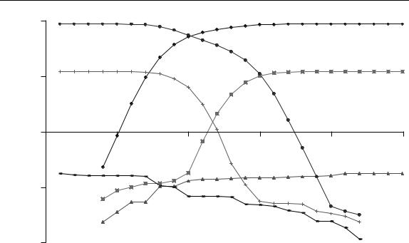
The next step is to calculate the correlation coefficient r15,i between this selected point in time and all other points. The lowest correlation is likely to belong to the second component. The data are presented in Table 6.5 and Figure 6.25. The trends are very clear. The most negative correlation occurs at point 8, being the purity maximum for the fastest eluting peak. The composition 2 region is somewhat smaller than estimated in the previous section, but probably more accurate. One reason why these graphs are an improvement over the univariate ones is that they take all the data into account rather than single measurements. Where there are 100 or more spectral frequencies these approaches can have significant advantages, but it is important to ensure that most of the variables are meaningful. In the case of NMR or MS, 95 % or more of the measurements may simply arise from noise, so a careful choice of variables using the methods in Section 6.2.4 is a prior necessity.
This method can be extended to fairly complex peak clusters, as presented in Figure 6.26 for the data in Table 6.2. Ignoring the noise at the beginning, it is fairly clear that there are three components in the data. Note that the central component eluting approximately between times 10 and 15 does not have a true composition 1 region because the correlation coefficient only reaches approximately 0.9, whereas the other two compounds have well established selective areas. It is possible to determine the purest point for each component in the mixture successively by extending the approach illustrated above.
Another related aspect involves using these graphs to select pure variables. This is often useful in spectroscopy, where certain masses or frequencies are most diagnostic of different components in a mixture, and finding these helps in the later stages of the analysis.

EVOLUTIONARY SIGNALS |
377 |
|
|
Table 6.6 Results of forward and backward EFA for the data in Table 6.1.
Time |
|
Forward |
|
|
Backward |
|
||
|
|
|
|
|
|
|
|
|
1 |
n/a |
n/a |
n/a |
n/a |
86.886 |
12.168 |
0.178 |
0.154 |
2 |
n/a |
n/a |
n/a |
n/a |
86.885 |
12.168 |
0.167 |
0.147 |
3 |
n/a |
n/a |
n/a |
n/a |
86.879 |
12.166 |
0.165 |
0.128 |
4 |
0.231 |
0.062 |
0.024 |
0.006 |
86.873 |
12.160 |
0.164 |
0.128 |
5 |
0.843 |
0.088 |
0.036 |
0.012 |
86.729 |
12.139 |
0.161 |
0.111 |
6 |
3.240 |
0.101 |
0.054 |
0.015 |
86.174 |
12.057 |
0.161 |
0.100 |
7 |
9.708 |
0.118 |
0.055 |
0.026 |
84.045 |
11.802 |
0.156 |
0.067 |
8 |
22.078 |
0.118 |
0.104 |
0.047 |
78.347 |
11.064 |
0.107 |
0.057 |
9 |
37.444 |
0.132 |
0.106 |
0.057 |
67.895 |
9.094 |
0.101 |
0.056 |
10 |
51.219 |
0.182 |
0.131 |
0.105 |
55.350 |
6.278 |
0.069 |
0.056 |
11 |
61.501 |
0.678 |
0.141 |
0.105 |
44.609 |
3.113 |
0.069 |
0.051 |
12 |
69.141 |
2.129 |
0.141 |
0.109 |
35.796 |
1.123 |
0.069 |
0.046 |
13 |
75.034 |
4.700 |
0.146 |
0.119 |
27.559 |
0.272 |
0.067 |
0.044 |
14 |
80.223 |
7.734 |
0.148 |
0.119 |
19.260 |
0.112 |
0.050 |
0.042 |
15 |
83.989 |
10.184 |
0.148 |
0.119 |
11.080 |
0.057 |
0.049 |
0.038 |
16 |
85.974 |
11.453 |
0.148 |
0.123 |
4.878 |
0.051 |
0.045 |
0.038 |
17 |
86.611 |
11.924 |
0.155 |
0.127 |
1.634 |
0.051 |
0.039 |
0.032 |
18 |
86.855 |
12.067 |
0.156 |
0.127 |
0.514 |
0.050 |
0.035 |
0.025 |
19 |
86.879 |
12.150 |
0.160 |
0.134 |
0.155 |
0.037 |
0.025 |
0.025 |
20 |
86.881 |
12.162 |
0.163 |
0.139 |
0.046 |
0.034 |
0.025 |
0.018 |
21 |
86.881 |
12.164 |
0.176 |
0.139 |
0.037 |
0.030 |
0.019 |
0.010 |
22 |
86.882 |
12.166 |
0.177 |
0.139 |
0.032 |
0.024 |
0.012 |
0.009 |
23 |
86.882 |
12.166 |
0.178 |
0.139 |
n/a |
n/a |
n/a |
n/a |
24 |
86.886 |
12.167 |
0.178 |
0.154 |
n/a |
n/a |
n/a |
n/a |
25 |
86.886 |
12.168 |
0.178 |
0.154 |
n/a |
n/a |
n/a |
n/a |
|
|
|
|
|
|
|
|
|
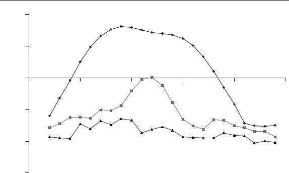
results for the first three eigenvalues (the last is omitted in order not to complicate the graph) are illustrated in Figure 6.27. What can we tell from this?
1.Although the third eigenvalue increases slightly, this is largely due to the data matrix increasing in size and does not indicate a third component.
2.In the forward plot, it is clear that the fastest eluting component has started to become significant in the matrix by time 4, so the elution window starts at time 4.
3.In the forward plot, the slowest component starts to become significant by time 10.
4.In the backward plot, the slowest eluting component starts to become significant at time 19.
5.In the backward plot, the fastest eluting component starts to become significant at time 13.
Hence,
•there are two significant components in the mixture;
•the elution region of the fastest is between times 4 and 13;
•the elution region of the slowest between times 10 and 19;
•so between times 10 and 13 the chromatogram is composition 2, consisting of overlapping elution.
378 |
|
|
|
|
|
CHEMOMETRICS |
|
100.00 |
|
|
|
|
|
|
10.00 |
|
|
|
|
|
Eigenvalue |
|
|
|
|
|
Datapoint |
1.00 |
|
|
|
|
|
|
0 |
5 |
10 |
15 |
20 |
25 |
|
|
|
|
|
|
|
|
|
0.10 |
|
|
|
|
|
|
0.01 |
|
|
|
|
|
Figure 6.27
Forward and backward EFA plots of the first three eigenvalues from the data in Table 6.1
We have interpreted the graphs visually but, of course, some people like to use statistical methods, which can be useful for automation but rely on noise behaving in a specific manner, and it is normally better to produce a graph to see that the conclusions are sensible.
The second approach, which we will call WFA, involves using a fixed sized window as follows.
1.Choose a window size, usually a small odd number such as 3 or 5. This window should be at least the maximum composition expected in the chromatogram, preferably one point wider. It does not need to be as large as the number of components expected in the system, only the maximum overlap anticipated. We will use a window size of 3.
2.Perform uncentred PCA on the first points of the chromatogram corresponding to
the window size, in this case points 1–3, resulting in a matrix of size 3 × 12.
3.Record the first few eigenvalues of this matrix, which should be no more than the highest composition expected in the mixture and cannot be more than the smallest dimension of the starting matrix. We will keep three eigenvalues.
4.Move the window successively along the chromatogram, so that the next window will consist of points 2–4, and the final one of points 23–25. In most implementations, the window is not changed in size.
5.Produce a table of the eigenvalues against matrix centre. In this example, there will be 23 rows and three columns.

380 |
|
|
|
|
|
CHEMOMETRICS |
|
100 |
|
|
|
|
|
|
10 |
|
|
|
|
|
Eigenvalue |
1 |
|
|
|
|
|
|
|
|
|
|
|
|
|
0 |
5 |
10 |
15 |
20 |
25 |
|
|
|
|
|
|
Datapoint |
|
0.1 |
|
|
|
|
|
|
0.01 |
|
|
|
|
|
|
0.001 |
|
|
|
|
|
Figure 6.28
Three-point FSW graph for the data in Table 6.1
dramatically when using different forms of data scaling. However, this is a fairly simple visual technique that is popular. The region where the second eigenvalue is significant in Figure 6.28 can be compared with the dip in Figure 6.24, the ascent in Figure 6.25, the peak in Figure 6.22(c) and various features of the scores plots. In most cases similar regions are predicted within a datapoint.
Eigenvalue based methods are effective in many cases but may break down for unusual peakshapes. They normally depend on peakshapes being symmetrical with roughly equal peak widths for each compound in a mixture. The interpretation of eigenvalue plots for tailing peakshapes (Chapter 3, Section 3.2.1.3) is difficult. They also depend on a suitable selection of variables. If, as in the case of raw mass spectral data, the majority of variables are noise or consist mainly of baseline, they will not always give clear answers; however, reducing these will improve the appearance of the eigenvalue plots significantly.
6.3.5 Derivatives
Finally, there are a number of approaches based on calculating derivatives. The principle is that a spectrum will not change significantly in nature during a selective or composition 1 region. Derivatives measure change, hence we can exploit this.
There are a large number of approaches to incorporating information about derivatives into methods for determining composition. However the method below, illustrated by reference to the dataset in Table 6.1 is effective.

EVOLUTIONARY SIGNALS |
381 |
|
|
1.Scale the spectra at each point in time as described in Section 6.2.3.1. For pure regions, the spectra should not change in appearance.
2.Calculate the first derivative at each wavelength and each point in time. Normally the Savitsky–Golay method, described in Chapter 3, Section 3.3.2, can be employed. The simplest case is a five point quadratic first derivative (see Table 3.6), so that
ij = |
dxij |
≈ −2x(i−2)j − x(i−1)j + x(i+1)j + 2x(i+2)j /10 |
di |
Note that it is not always appropriate to choose a five point window – this depends very much on the nature of the raw data.
3.The closer the magnitude of this is to zero, the more likely the point represents a pure region, hence it is easier to convert to the absolute value of the derivative. If there are not too many variables and these variables are on a similar scale it is possible to superimpose the graphs from either step 2 or 3 to have a preliminary look at the data. Sometimes there are points at the end of a region that represent noise and will dominate the overall average derivative calculation; these points may be discarded, and often this can simply be done by removing points whose average intensity is below a given threshold.
4.To obtain an overall consensus, average the absolute value of the derivatives at each variable in time. If the variables are of fairly different is size, it is first useful to scale each variable to a similar magnitude, but setting the sum of each column (or variable) to a constant total:
I −w+1
= |
|
const ij = | ij | |
| ij | |
i |
w−1 |
where | indicates an absolute value and the window size for the derivatives equals
w. This step is optional.
5.The final step involves averaging the values obtained in step 3 or 4 above as follows:
J |
|
J |
di = |
const ij J or di = | ij | J |
j =1 |
j =1 |
The calculation is illustrated for the data in Table 6.1. Table 6.8(a) shows the data where each row is summed to a constant total. Note that the first and last rows contain some large numbers: this is because the absolute intensity is low, with several negative as well as positive numbers that are similar in magnitude. Table 6.8(b) gives the absolute value of the first derivatives. Note the very large, and not very meaningful, numbers at times 3 and 23, a consequence of the five point window encompassing rows 1 and 25. Row 22 also contains a fairly large number, and so is not very diagnostic. In Table 6.8(c), points 3, 22 and 23 have been rejected, and the columns have now been set to a constant total of 1. Finally, the consensus absolute value of the derivative is presented in Table 6.8(d).
The resultant value of di is best presented on a logarithmic scale as in Figure 6.29. The regions of highest purity can be pinpointed fairly well as minima at times 7 and 15. These graphs are most useful for determining the purest points in time rather than