

Магистратура / Задания на зачёт / Задание 2 - описание диаграмм / Описание диаграмм
.docx

On the first graph, which is line chart, we can see on horizontal axis year and on vertical axis billion passenger kilometers. So, this graph represents how many passengers use different kinds of transport by years.
As an overall trend, it can be seen that the number of car passengers is constantly increase every year. On the other point, the number of rail passengers does not change much, but amount of bus passengers decreases very slowly.
The data are available for the period from 1952 to 2002. And billion passenger kilometers ranges from 0 to 700.
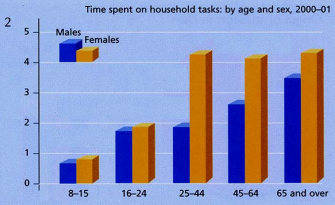
On the second graph, which is bar chart, we can see on horizontal axis male and female age periods and on vertical axis time in hours. So, this graph represents how much time people spend on household tasks, depending on age and gender.
As an overall point, it can be seen that before the age of 25, men and women spend the same amount of time for cleaning. However, after 25 years women spend much more time for household tasks than men do.
The data are available for the period from 2000 to 2001.
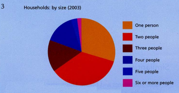
The graph number 3 is pie chart. So, all graph shows us the ratio of families with different numbers of people. And pie parts, depending on the color, the number of people in family.
The graph shows that most households have one or two people in the family, families with three or four people are less common and the rarest are families with five or more people.
The period is not mentioned on this chart.
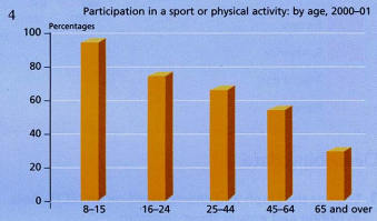
The graph number four is bar chart too.
It shows us the percentage of people of a certain age who take part in sports or physical activity.
We can observe pattern that with increasing age, the percentage of people in sports or physical activity becomes less.
The data are available for the period from 2000 to 2001