

It is your turn now. Prepare bullet charts based on your own data (or take any information)
Find an effective headline for each bullet chart and present them to a partner.
CHECKLIST FOR VISUALS
1. Prepare each visual carefully and separately.
2. Check whether the visual really shows what you are saying.
3. Make sure your audience can read the visual (font size and colours).
4. Find effective headlines.
5. Keep design and content simple.
6. Use bullet charts for text.
7. Reduce text to a minimum.
8 Always prepare audience for visuals.
9 Present information clearly and logically.
10. Remember the rule of six.
Task 15
What is important when presenting visuals? Which opinion(s) do you agree with?
Karen Hamilton, Marketing Manager
I think to be effective a good visual must focus on only a few points.
It is important not to have too much information on one slide or transparency. Slide overload is bad because people will then spend time reading the slide rather than listening to the presenter. I normally use bullet points to structure information -1 never write complete sentences. Headlines are important too.
Keith Sallis, Real Estate Manager
In my opinion, the presenter is the focus of the presentation - not the visuals. The key purpose for using a visual aid is to help the audience understand the topic better. So the visuals should only be used to support the presenter’s message. A process-flowchart slide, for example, helps people understand visually what you are describing verbally. If a visual distracts the audience's attention from what you’re saying, it’s useless.
Susan Liu. Export Manager
Above all. a slide or an overhead must be readable. If the audience can’t read the slide, they will soon give up. That’s why font size is very important. It should be as large as possible. I’d say at least 24. And sometimes it’s also a good idea to use different colours to highlight some points. Using many different colours can be confusing though
(4)
Barbara tames. Market Researcher
What you say and what you show should always go together 100%. So when you’re not talking about the slide, it shouldn’t be visible. I always switch off the display when I’m talking about something that has nothing to do with the slide. If people are busy looking at the slide, they aren't listening to what you’re saying. It’s better to use the В-key to return to a black screen or replace the slide with some form of ‘wallpaper’ such as a company logo.
(5)
Javier Sanchez, Financial Analyst
For me it’s very important that the presenter speaks to the audience and doesn’t read to them! The speaker must make eye- contact and not watch the monitor or screen while he or she is talking. I think it’s extremely boring when someone just reads slides word for word as if it were an essay or something.
(6)
Tony Benetti, Media Consultant
It’s called ’Death by PowerPoint’ when people use so many sound effects and animations that the audience's attention is completely taken away from the delivery of the message. I think PowerPoint is a fantastic tool, but just because it has so many effects, you don’t have to use them all. Overuse is overkill here.
What kinds of tools and visuals do you normally use in your presentations? What tips can you think of for using visuals effectively?
Task 16
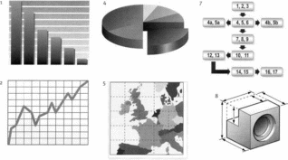
What are these visuals called in English? Match the numbers to the descriptions.
bar chart table
technical drawing
flow chart map
(line) graph
pie chart
organizational chart/organogram
Which of these visuals would you use to describe:
a) your company’s market share?
b) the steps to be followed from order placement to delivery of a product?
c) your company’s new organizational structure?
Task 17
Which box is :
 in
the center?
in
the center?in the bottom left-hand corner?
across the top?
down the left side of the slide?
on the left?
in the upper right-hand corner?
across the bottom?
on the right?
Task 18
Match the two parts to make sentences used to talk about visuals.
1. Let's now have a look
2. The black line gives us
3. Each line on the graph indicates
4. In the upper right-hand corner
5. The graph on the following slide
6. Now I'd like you to take
7. The names of the new models are listed
8. You can see the test results in the
9. This aspect of the problem is illustrated in
10. I'd Ike to draw your
shows our revenues sinces 2004.
the next pie chart.
at how the new division will be structured
attention to the figures in the left-hand column,
you can see the specifications for the TP model
the sales figures for the VW Fox.
table on the right
a look at the next slide
the production output of a different product
across the top.
Task 19
A head of department from a private medical insurance company is telling colleagues from the Italian parent company about last year’s health spending. Look at how he describes this pie chart and complete the gaps with words from the box.
account • amount • attention • divided • see • shown • surprised • total
This pie chart shows our total health spending for the last year and how it is ___1___ among the various health sector areas. Let us begin with the biggest area, which is___2___ in green. We can ___3___ that 31% of our total health spending
went into hospital care last year. The second biggest area with a ___4___of 23% is
‘other spending’ - that’s the red segment here. It includes dental services and home health care. I think you will be ___5___ to see that nearly the same ___6___ - that is 22% - was spent on doctors and clinical services. This was mainly because of the increase in medical technology costs. I would now like to draw your___7___ to the prescription drugs which___8___ for 10% of our total costs.
Task 20
These verbs are used to describe movement or trends. Put them in the correct category: upward, downward or other form of movement.
climb • decline • decrease • double • drop • expand • fall • fluctuate • go down • go up • grow • hit a low • increase • pick up • plunge • reach a high • recover • remain stable • rise • stabilize • stay the same
Downward
|
Upward |
Other
|
|
|
|
Task 21
Sometimes it is necessary to interpret the visual, for example by explaining the reason behind a fact (the cause) or its consequence (the effect). Use words from each column to make sentences.
1 There are several 2 We chose this method 3 The 4 Our new policy 5 The slump was 6 Downsizing 7 We increased our prices 8 Our output has doubled |
caused has led resulted reasons thanks to and because result
|
for the decrease in productivity. a new overtime policy. by the collapse of one of our partner firms. of this move was a drastic increase in our costs. to a significant rise in sales. in a drastic fall in staff numbers. our sales went up! we needed reliable figures. |
Task 22
Complete the presentation extract with the correct prepositions from the box.
around • at • between • by • from • in • of • to • until
|
“The graph shows our online sales figures for the EU market ___1___2006. In the first quarter, online sales averaged ___2___50,000 and 52,000 euros. In April, sales increased ___3___61,0 euros and remained steady ___4___the end of the second quarter. In the third quarter we notice a sharp rise ___5___ 61,000 to 87,000 euros, an increase ___6___almost 50 per cent. In October and November, sales fluctuated ___7___the 85,000 euro mark. This was followed by a slight decline in December, with online sales falling ___8___ 10 per cent, reaching 73,000 euros ___9___the end of the year. “
Task 23
Put the words in the right order to make sentences with expressions from this unit.
1. chart percentage our of pie share the the market shows
2. travel 2006 according costs since risen the have sharply to study
3. rates 0.5% beginning year the the interest were of raised by at
4 june rise in dramatic 15% in was there costs transport a of
5 low December our in hit a productivity
6. decline by poor situation the economic the was caused
Task 24