

Research
There are a number of different styles in which an animated character can be designed. When designing there is a number of key elements that need to be considered such as, what target audience you are trying to make this animation for and how will you make it appeal to them, or what is the overall look of the animation you’re going for, for example do you want a cartoony feel like Mario or a more realistic look such as final fantasy etcetera.
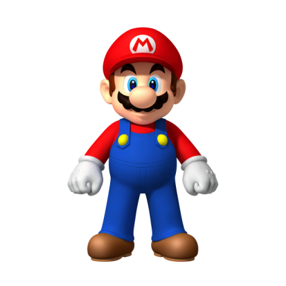
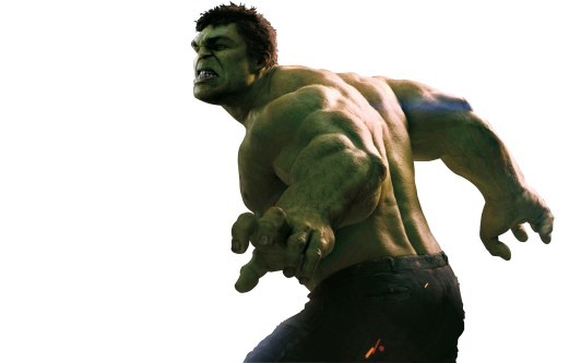
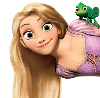
Each character above has distinctive features that make them stand out and appeal and not only that but the way they’ve been textured says a lot about what sort of audience they are trying to reach out to. For example Mario is known and recognised by his large round nose and moustache, he can easily be told apart from Luigi because he is short and because of his round features. Not a lot of work has gone into Mario’s colours either; you can see that they are very flat and not a lot of detail is in it, giving it that cartoony look making it suitable for a large audience. Hulk in the other hand is completely different; you can zoom into the picture and see every bit of detail on the skin, from the scars to the fine hairs, they’ve gone for a more realistic look as opposed to Mario. Also the level of detail on facial expression, which was only made possible by motion capturing, this is not something that I will be able to implement into my animation. The final picture of Rapunzel, I would say is in between the styles of Mario and the hulk. She’s been given very unique features such as the long hair, big eyes and tiny nose, something that’s very typical of a Disney character. Though her features are very cartoony, there is a fine level of detail in how she has been textured, like in the hair and eyes.
Looking at these three characters, I feel that Rapunzel is most relevant to me as it is in a similar bracket to Alice in wonderland and I would like my animation to appeal to the same audience as it. I will try and apply as many features from Rapunzel into Alice such as the big eyes and small nose.
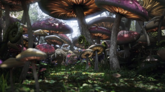
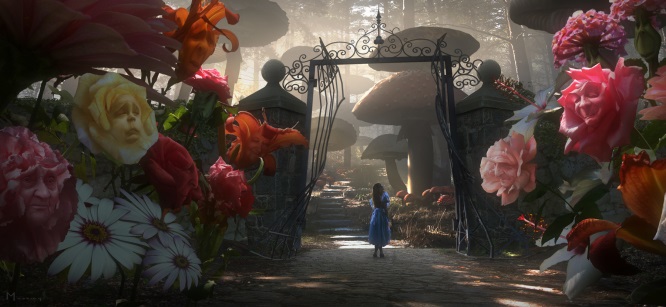
For the set I will try as much as possible to implement as many of the surroundings from Wonderland. There are two main features about Wonderland that come to my mind when I first think about it and they are the mushrooms and the all the flowers. The colours are also very vibrant and warm, which makes the flowers and other plants stand out more.
T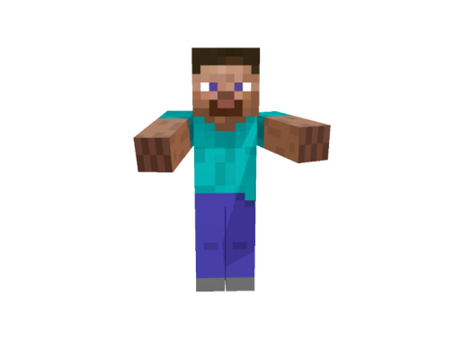
 here’s
a certain style that stands out to me and that is this pixelated
look. It’s become popular in recent times due to titles such as
“Minecraft” and “Flappy Bird”. Though these graphics are very
minimalistic it still managed to attract a lot of attention in many
countries and it’s something that’s not yet been applied to a
movie animation. It is something I feel will be interesting to try
out.
here’s
a certain style that stands out to me and that is this pixelated
look. It’s become popular in recent times due to titles such as
“Minecraft” and “Flappy Bird”. Though these graphics are very
minimalistic it still managed to attract a lot of attention in many
countries and it’s something that’s not yet been applied to a
movie animation. It is something I feel will be interesting to try
out.
Report
For coursework 2 of 3D Animation I was asked to model a character and environment, using any method of my choice and animate it to tell a short story that had to last around 60 seconds. This report will cover the steps I took to complete this work. The stages I will be covering are, planning, modelling, animating and editing, as well as everything new I learnt and he issues I came across.
Planning
I started planning for coursework 2 the day after it was set. I was still a little unsure exactly what we had to do and which of the three passages I wanted to base my animation of. The three options I had were Dracula, Beowulf and Alice in wonderland. I had heard of these books before and know that movies were made of them but didn’t have a real idea of what actually happens in the movies or how the movies had interpreted the characters. In the end I went along with Alice in wonderland. The first thing I did once I had settled with an idea was make myself a schedule that would keep me up to date and on track. I gave myself the first 4 weeks to get the pre-production paperwork done to a good standard that I was happy with, which would leave 6/7 weeks to make my models, animate and render, which at the time I thought was reasonable.
There are many techniques which I could have used to model my characters. I done some research on some of the different techniques and found that box modelling the character would be most suitable for what I wanted to achieve.
Modelling
Problems
with the hair and eyes can be seen here
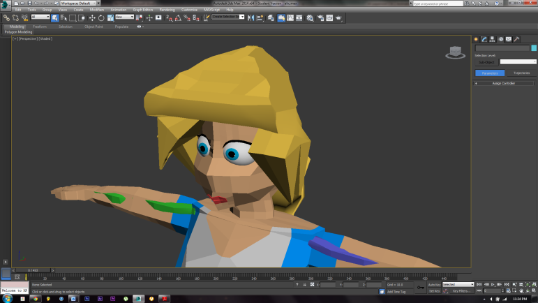 he
process of modelling and refining my character took about a whole
week to do. Following the tutorial step by step on how to box model
characters made the whole process easier. The only issue I had when
modelling was when it came to making the hair. I tried using the hair
and fur modifier, however I found that a bit difficult to use the
tools it provided. It would have also meant that my render times
would increase dramatically. Another reason I went against using hair
and fur is because, I realised that it would not suit the whole
pixelated look I was going for, and it seemed too realistic in a
sense. I spent a while going through a range of websites and video
tutorials for other methods on hair but there was nothing useful. In
the end the hair was just boxed modelled and shaped around the head.
I feel the head is the only aspect of my character model that has let
me down and it’s something that I will have to improve on for
future projects. Another thing which didn’t bother me too much, but
was still and issue was the eyes and how to make it not look like
it’s just two circles sticking out of the skin. To help get around
this issue, I made two sockets for the eyes to go in and then used
the vertices around to shape and mould the skin around the eye.
However even then it never looked right without the eyelids, which I
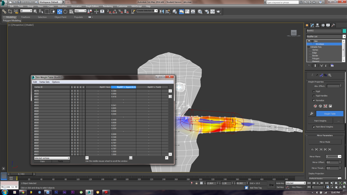
had trouble figuring out how to do. When it came to adding in the
biped and editing the weight I had a couple problems as some of the
vertices, so after reading up a tutorial I found a very helpful
technique by using the weights table in which you simply had to
enter either 0 or 1 to control how effected the vertices are.
he
process of modelling and refining my character took about a whole
week to do. Following the tutorial step by step on how to box model
characters made the whole process easier. The only issue I had when
modelling was when it came to making the hair. I tried using the hair
and fur modifier, however I found that a bit difficult to use the
tools it provided. It would have also meant that my render times
would increase dramatically. Another reason I went against using hair
and fur is because, I realised that it would not suit the whole
pixelated look I was going for, and it seemed too realistic in a
sense. I spent a while going through a range of websites and video
tutorials for other methods on hair but there was nothing useful. In
the end the hair was just boxed modelled and shaped around the head.
I feel the head is the only aspect of my character model that has let
me down and it’s something that I will have to improve on for
future projects. Another thing which didn’t bother me too much, but
was still and issue was the eyes and how to make it not look like
it’s just two circles sticking out of the skin. To help get around
this issue, I made two sockets for the eyes to go in and then used
the vertices around to shape and mould the skin around the eye.
However even then it never looked right without the eyelids, which I
had trouble figuring out how to do. When it came to adding in the
biped and editing the weight I had a couple problems as some of the
vertices, so after reading up a tutorial I found a very helpful
technique by using the weights table in which you simply had to
enter either 0 or 1 to control how effected the vertices are.
Editing
weights table
 hen
I designed my set, I made sure that I didn’t over complicate things
for myself. I wanted something that would look good once modelled and
had enough space for me to move my Alice model around in. the set
only took me around 30 minutes in total in to make and was made using
the box modelling technique. The mountains however I modelled
separately to the main set.
hen
I designed my set, I made sure that I didn’t over complicate things
for myself. I wanted something that would look good once modelled and
had enough space for me to move my Alice model around in. the set
only took me around 30 minutes in total in to make and was made using
the box modelling technique. The mountains however I modelled
separately to the main set.
Animation
The animation, although it was kept very simplistic, it could have been done a whole lot better as when it came to using the motion mixer, the bips were not blended in well together, so you can see it skip after every few loops, something that I will have to take into more consideration in my next project. A major issue for me was when after I applied the bips, the arm of Alice would go through her skirt, to fix this, I keyframed each bit where this issue occurred. This has taught me a lesson in that; I need to consider future problems like this when I am designing my characters in the first place. This issue would not have come across if I had simply made the dress a little longer. One last minor issue for me was editing the footsteps, as I found it difficult to place them directly above my surface, so sometimes her feet would go through and sometimes it’d be as she’s floating.
Editing
The editing is very simple. I rendered out a lot of different angles so when it came to editing the clips together in adobe premiere, it gave me a lot to work with and editing all the different angles in gave it nice look. The official track for Alice was used too; it’s a nice piece of music that added a bit of tension to the scene as she was walking up the path.
Conclusion
Overall I think the project was done to a decent standard, the character design was good, and so was the set. The whole idea of going for the pixelated “Minecraft” is what makes It stand and out and unique. Obviously there are parts that good be improved vastly to make it more visually appealing to the audience I was hoping to target but at the same time there are part of the animation that work well too. All the mistakes and issues I’ve had during this project, I’d like to take as a positive as it has taught me a lot, such as learning all the new functions of the “motion” tab, the whole use of reference planes and how to box model from that and i also learnt new techniques for adding materials. There are a number of changes that i would make if I was to ever do this project again, for instance the eyes and the hair and also the lighting, as it seemed a little flat to me. Another thing I would add would be more camera movements, as pretty much all the shots were steady. I’m happy with the way the colours came out as I was going for a flat look and that’s what I feel I have achieved. I feel that in this project I worked well with the schedule I had set myself at the start, and although I had a few delays mid-way through modelling I managed to finish and render out my project before schedule.
I have shown my project to my housemates and a few friend and this is some of the feedback I received:
“I like how you’ve tried to make it different and unique with the pixelated idea, it makes it stand out. However some areas are seem jumpy and some sound effects could be added” - Dias
“It is nicely modelled and the idea you went for is original. The music used gives it a nice build up as she walks to the door. Maybe work on lighting and shadows to give it more depth” – Ryan
“It’s a nice idea but some cuts seem long. Maybe try shortening some of the cuts so it doesn’t get boring. The music works well with the video, but you should add in some sound effects too. Lastly a little more detail could have been put into the character but overall its very nice” - Afzal
It is only after you received feedback from others that you truly understand how well or bad you done. Having heard some of the feedback I received, I can say I am happy with the outcome and if I was to do this project again, the feedback I received would be applied to my project to make it better.
Bibliography