Practice
Task 1. Given the graph at right, below, answer the following questions.
-
Which course has the most students enrolled in it?
Order the courses by enrollment from lowest to highest.
The enrollment in Econ is approximately how many times bigger than the enrollment in Chem?
Approximately how many students were enrolled in the course with the most students?
Approximately how many more students are in Econ than in Physics?
Enrollment in Introductory Courses at Union University

Task 2. Who Uses the Internet?
The chart shows the percentage of Internet users by age between 1998 and 2000.

a) Complete the sentences
In 1998, less than one Internet user in twenty was ___________
The majority of users in 1998 were ___________
Children _______________ for only 2% of users in 1998.
Between 1998 and 1999, the proportion of children using the Internet ___________.
The percentage of older adults using the internet _________________ between 1998 and 1999.
Overall, there was a steady _________________ in the percentage of 16- 30 year olds using the Internet.
By 2000, older users __________________ ten percent of the total number.
Together, children and older users comprised almost ________________ of the total number of Internet users.
b) Write a short description of the graph.
Task 3.Televisions and Computers
Describe the graph that shows the number of televisions and computers per 1000 people in selected countries.

Task 4. Money spent per week on Holidays, by age.

a) Answer the following questions:
Which group spends least on holidays in the UK?
Which group spends most on holidays in the UK?
Which group spends most on holidays abroad?
Which group spends least on holidays abroad?
b) Describe the chart that shows spending in pounds per week by age on holidays in the UK and holidays abroad (in other countries).
Task 5. Mobile Phones and Landlines
The chart shows the number of mobile phones and landlines per 100 people in selected countries.

Fill in the gaps in the description of the graph:
conclusion |
contrast |
Denmark |
fewer |
higher |
hundred |
pattern |
seems |
selected |
slightly |
than |
twice |
unusual |
USA |
use |
users |
The graph shows the number of mobile phones and landlines per 100 users, for __________countries. The biggest __________of mobile phones are the Italians, with 88 mobile phones per 100 people. Overall, most of the countries included in the graph have more mobile phones ___________landlines. For example, Italy has _____________as many mobile phones as landlines, with 90 mobiles per ______________ people compared to 45 for landlines. However, in some countries, the number of landlines is_________________. One example is the_________________ , where the number of mobiles, at 50 per 100 people, is much lower than the number of landlines, at almost 70 per hundred. A similar ______________ can be seen in Canada. Mobile phone ___________ is low in Canada, with _______________than 40 phones per 100 people. The highest number of landlines in the graph is in_________________ , with about 90 per 100 people. In_______________, the lowest figures for landlines are in Italy and the UK. Denmark is also ________________ because it has _______________ more landlines than mobile phones. In_______________, it __________that mobile phone use is higher in Europe than in North America.
b) Describe the chart displaying the number of mobile phones and landlines per 100 people in selected countries.
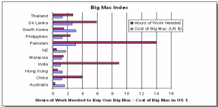
Task 6. Big Mac Price and Salary Comparison
If you are a cleaner in McDonalds in the countries below, how long do you have to work before you can afford to buy a Big Mac?