Microsoft ASP .NET Professional Projects - Premier Press
.pdf<asp:RadioButton runat="server" Text="RadioButton2" GroupName="Group1"></asp:RadioButton>
<hr>
<B>CheckBoxLists</B><br> <asp:CheckBoxList runat="server">
<asp:ListItem Text="Choice1" Value="1" selected="true"/> <asp:ListItem Text="Choice2" Value="2" selected="true"/>
</asp:CheckBoxList > <B>RadioButtonList</B>
<asp:RadioButtonList runat="server" RepeatDirection= "horizontal"> <asp:ListItem Text="Choice1" Value="1" selected="true"/> <asp:ListItem Text="Choice2" Value="2"/>
</asp:RadioButtonList > <hr> <B>DropDownList</B>
<asp:DropDownList runat="server">
<asp:ListItem Text="Choice1" Value="1" selected="true"/> <asp:ListItem Text="Choice2" Value="2"/>
</asp:DropDownList>
<B>ListBox</B>
<asp:ListBox runat="server" SelectionMode="Multiple"> <asp:ListItem Text="Choice1" Value="1" selected="true"/> <asp:ListItem Text="Choice2" Value="2"/>
</asp:ListBox>
<hr>
Button :<asp:Button runat="server" Text="Click Me"></asp:Button><br><br>
LinkButton :<asp:LinkButton runat="server" Text="Click
Me"></asp:linkButton><br><br>
ImageButton: <asp:ImageButton runat="server"
ImageUrl="gifcon.gif"></asp:ImageButton><br><br>
Hyperlink : <asp:HyperLink runat="server" Text="HyperLink"

NavigateUrl="web_intrensic.aspx"></asp:HyperLink><br><br>
Image :<asp:Image runat="server" ImageUrl="gifcon.gif"></asp:Image>
<br>
<asp:Panel runat="server"></asp:Panel>
<hr>
<B>Table</B>
<asp:Table runat="server" GridLines="Both" BorderWidth="1px">
<asp:TableRow>
<asp:TableCell>Column1</asp:TableCell>
<asp:TableCell>Column2</asp:TableCell>
</asp:TableRow>
<asp:TableRow>
<asp:TableCell>Column3</asp:TableCell>
<asp:TableCell>Column4</asp:TableCell>
</asp:TableRow>
</asp:Table>
</form>
</body>
</html>
I now discuss the various controls covered under this category.
§Text Boxes
Textboxes accept input from users. They can be bound to data. A text box's appearance can be controlled by its TextMode property. The TextMode property can either be single-line, multi-line, or password. When it is set to multi-line, the row's property controls how many lines of input can be accepted from the user. Here are a few examples:
Text Box: <asp:TextBox id="Text1" runat="server"/>
Password: <asp:TextBox id="Text2" TextMode="Password" runat="server"/>
MultiLine: <asp:TextBox id="Text3" TextMode="Multiline" rows="4" runat="server"/>
§CheckBox
A check box has the following properties:
o Checked: can be either true or false. When true, it is in the checked state.
oText: This is the text that gets displayed beside the check box.
oAutoPostBack: If this property is true, it causes an immediate postback to the server when the check box's
checked property is changed.
oTextAlign: Sets the alignment of the check box. Can be left or right.
Example:
<asp:CheckBox runat="server" Text="CheckBox1" Checked = "True">
</asp:CheckBox>
§Radio Button
A radio button is similar to a check box. However, you can display a number of radio buttons, relating them to the same group. The user will then only be able to select one radio button from the group.
Example:
<B>Radio Button</B><br>
<asp:RadioButton runat="server" Text="RadioButton1" GroupName = "Group1" Checked="true">
</asp:RadioButton>
<asp:RadioButton runat="server" Text="RadioButton2" GroupName="Group1">
</asp:RadioButton>
§CheckBoxList
This control provides a multi-selection checked list. It has the following properties:
o Selected Property: This property can be checked to determine the selected item.
oRepeatDirection: Can be horizontal or vertical. Specifies direction of control rendering.
oRepeatLayout: Can be Table or Flow. Table means the list will be rendered within a table. Flow renders it without a table structure.
Example:
<asp:CheckBoxList runat="server">
<asp:ListItem Text="Choice1" Value="1" selected="true"/> <asp:ListItem Text="Choice2" Value="2" selected="true"/> </asp:CheckBoxList >
§RadioButtonList
This control provides a group of radio buttons, which allows only one selected value. It has the following properties:
o Selected Property: This property can be checked to determine the selected item.
oRepeatDirection: Can be horizontal or vertical. Specifies direction of control rendering.
oRepeatLayout: Can be Table or Flow. Table means that list will be rendered within a table. Flow renders it without a table structure.
Example:
<asp:RadioButtonList runat="server" RepeatDirection= "horizontal"> <asp:ListItem Text="Choice1" Value="1" selected="true"/> <asp:ListItem Text="Choice2" Value="2"/>
</asp:RadioButtonList >
§DropDownList
The DropDownList displays only one item in a list at a time. It can be bound to a data source.
Examples:
o Adding to the list using ListItem
<asp:DropDownList id= "dropdown" runat="server">
<asp:ListItem Text="Choice1" Value="1" selected="true"/>
<asp:ListItem Text="Choice2" Value="2"/>
</asp:DropDownList>
o Adding to the list using code
o |
Sub AddtoList() |
o |
DropDown.Items.Add("choice1") |
o |
DropDown.Items.Add("choice2") |
o |
DropDown.Items.Add("choice3") |
End Sub |
|
o Binding to a DataSource |
|
o Sub Page_Load(sender As Object, e As |
|
|
EventArgs) |
o If Not IsPostBack Then
o Dim values as ArrayList= new ArrayList()
o |
values.Add ("Choice1") |
o |
values.Add ("Choice2") |
o |
values.Add ("Choice3") |
o |
DropDown.DataSource = values |
o |
DropDown.DataBind |
o |
End If |
End Sub
o Extracting the Selected Value
textbox1.text = DropDown.SelectedItem.Text
§List Box
The List Box control renders a scrollable list of values. It allows either a single option or multiple options to be selected. Multiple selection is enabled by setting the SelectionMode property to "Multiple".
Examples:
§Adding to the list using ListItem
§<asp:ListBox id="list1" runat="server" SelectionMode="Multiple">
§<asp:ListItem Text="Choice1" Value="1" selected="true"/>
§<asp:ListItem Text="Choice2" Value="2"/>
</asp:ListBox>
o Adding to the list using code
o |
Sub AddtoList() |
o |
List1.Items.Add("choice1") |
o |
List1.Items.Add("choice2") |
o |
List1.Items.Add("choice3") |
End Sub
o Binding to a DataSource
oSub Page_Load(sender As Object, e As EventArgs)
o If Not IsPostBack Then
o Dim values as ArrayList= new ArrayList()
o values.Add ("Choice1")
o values.Add ("Choice2")
o values.Add ("Choice3")
o List1.DataSource = values
o List1.DataBind
o |
End If |
End Sub
o Extracting the Selected Value
textbox1.text = List1.SelectedItem.Text
oExtracting Multiple values (when multi-selection is enabled)
o Sub GetMultiples()
o Dim item As ListItem
o Dim s As String = ""
o For Each item In List1.Items
o If item.Selected Then
o s += item.Text + "<br/>"
o |
End If |
o Next
o Response.write(s)
End Sub
§Button
Generates a standard 3D Push button used to submit the page back to the server.
Example:
<asp:Button runat="server" Text="Click Me"> </asp:Button>
§LinkButton
The LinkButton has a similar functionality as that of a Button control. It is also used to submit a page back to the server. However, instead of a button, a link is generated.
Example:

<asp:LinkButton runat="server" Text="Click Me">
</asp:linkButton>
§ImageButton
The ImageButton renders a clickable image, which posts back to the server. Use this control when you want to display a picture instead of a button.
Example:
<asp:ImageButton runat="server" ImageUrl="gifcon.gif"> </asp:ImageButton>
§HyperLink
This control displays a hyperlink, which allows the user to navigate to other URLs.
Example:
<asp:HyperLink runat="server" Text="HyperLink" NavigateUrl="web_intrensic.aspx"> </asp:HyperLink>
§Image
The Image control is used to display an image in the page. Example:
<asp:Image runat="server" ImageUrl="gifcon.gif"></asp:Image>
§Table
The Table control, along with TableRow and TableCell controls, programmatically renders tables.
Example:
<B>Table</B>
<asp:Table runat="server" GridLines="Both" BorderWidth="1px"> <asp:TableRow>
<asp:TableCell>Column1</asp:TableCell>
<asp:TableCell>Column2</asp:TableCell>
</asp:TableRow>
<asp:TableRow>
<asp:TableCell>Column3</asp:TableCell>
<asp:TableCell>Column4</asp:TableCell>
</asp:TableRow>
</asp:Table>
§Panel
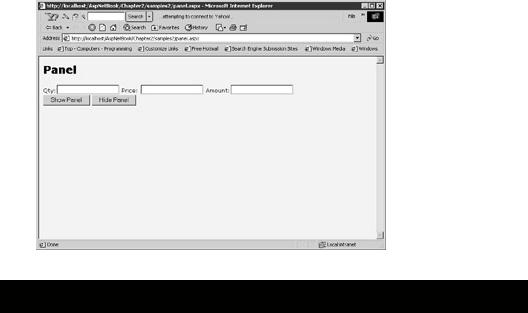
The Panel is used as a container for other controls. A number of controls can be put within a panel tag and made visible or invisible simply by setting the Visible property to true or false. In Figure 2.4 an example of a panel is given.
Figure 2.4: Panel. panel.aspx

<%@ Page Language="vb" %>
<html>
<head>
<script Runat="server">
Sub show(src As Object, e As EventArgs)
detailsPanel.visible = "true"
End sub
Sub Hide(src As Object, e As EventArgs)
detailsPanel.visible = "false"
End sub
</script>
</head>
<body style="background-color='beige'; font-family='verdana'; font-size='10pt'">
<H2> Panel</H2>
<form method="POST" runat="server">
<asp:Panel id="detailsPanel" runat="server" Visible="false">
Qty:<asp:TextBox id="Qty" Runat="server"/>
Price: <asp:TextBox id="Price" Runat="server"/>
Amount:<asp:TextBox id="Amount" ReadOnly = "true" Runat="server"/>
</asp:panel>
<asp:Button id="btnShow" Text="Show Panel" OnClick="Show" Runat="server"/>
<asp:Button id="btnhide" Text="Hide Panel" OnClick="Hide" Runat="server"/><br>
<br>
</form>
</body>
</html>
In this example, the textboxes on the form are put within a Panel tag. The "Show" function set the visible property of the panel to true. This has the effect of showing all
the textboxes on the form. Likewise the "Hide" function sets the visible property of the panel to false and hides all the textboxes.
Rich Controls
There are two controls known as "Rich Controls" supplied with ASP.NET. It is expected that more controls will soon be forthcoming. The AdRotator displays a sequence of advertisements. The Calendar Control makes it easy to provide date and date navigation functionality.
§AdRotator
The AdRotator is a control that produces banner advertisements. Clicking on the control navigates the browser to a specified URL. A different advertisement is loaded each time the page is loaded in the browser.
You need to set up an XML file like the following: Ads.XML
<Advertisements>
<Ad>
<ImageUrl>sos.gif</ImageUrl>
<TargetUrl>www.someurl.com</TargetUrl>
<AlternateText>Sos</AlternateText>
<Keyword>sos</Keyword>
<Impressions>80</Impressions>
</Ad>
<Ad>
<ImageUrl>crylogo.gif</ImageUrl>
<TargetUrl>www.someurl.com</TargetUrl>
<AlternateText>crylogo</AlternateText>
<Keyword>crylogo</Keyword>
<Impressions>80</Impressions>
</Ad>
</Advertisements>
The following properties are set in the XML file. Only the ImageUrl attribute is required; others are optional.
ImageUrl: The url pointing to the advertisement to be displayed.
TargetUrl: The url to navigate to (when the advertisement is clicked).
AlternateText: The "ALT" attribute.
Impressions: The weight relative to the image to be displayed. The greater the weight, the more times the ad will be displayed.
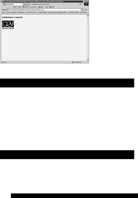
In Figure 2.5, you can see what the adRotator looks like.

Figure 2.5: AdRotator.
You initiate the adRotator component as follows: adrotator.aspx
<html>
<body style="background-color='beige'; font-family='verdana'; font -size='10pt'">
<h3><font face="Verdana">AdRotator Control</font></h3>
<form runat=server>
<asp:AdRotator id="ar1" AdvertisementFile="Ads.xml" BorderWidth="1" runat=server />
</form>
</body>
</html>
§Calendar Control
The Calendar control allows the user to select a certain date, all days in a week or month. It is very easy to set up; as simple as saying:
<asp:Calendar runat = "server"/>
This gives a no frills basic calendar. However, as in other controls, much of its functionality can be customized. Here is an example.
Calendar.aspx
<%@ Page Language="VB" %> <html>
<head>
<script runat="server">
Sub myCal_OnSelectionChanged(Source As Object, E As EventArgs) Dim sel As Integer
Dim i as integer Dim s as string
sel = Mycal.SelectedDates.Count
s = ""
For i = 0 to sel-1
'Beta 2 Code lowercase "d" gives shortdate 'Uppercase "D" will give long date
s = s + Mycal.SelectedDates.Item(i).ToString("d") next
selDate.Text = s End Sub
Sub mycal_OnVisibleMonthChanged(Source As Object, E As MonthChangedEventArgs)
selDate.Text = "Current Month " + " " + E.NewDate.ToString() _ + " Previous Month : " + E.PreviousDate.ToString()
End Sub </script>
</head>
<body style="background-color='beige'; font-family='verdana'; font - size='10pt'">
<form id="myForm" runat="server"> <p>
<asp:Label id="selDate" runat="server" /> </p>
<ASP:Calendar id="myCal" runat="server"
BackColor="#666699" ForeColor="black"
BorderWidth="2"
BorderStyle="Solid" BorderColor="Black"
CellSpacing=2 CellPadding=2
ShowGridLines=true
TitleStyle-BorderColor="#666699"
TitleStyle-BorderWidth="3"
TitleStyle-BackColor="DarkGray"
TitleStyle-Height="50px"
DayHeaderStyle-BorderColor="teal"
DayHeaderStyle-BorderWidth="3"
DayHeaderStyle-BackColor="teal"
DayHeaderStyle-ForeColor="black"
DayHeaderStyle-Height="20px"
DayStyle-Width="50px"
DayStyle-Height="50px"
TodayDayStyle-BorderWidth="3"
WeekEndDayStyle-BackColor="teal"
WeekEndDayStyle-Width="50px"
WeekEndDayStyle-Height="50px"
SelectedDayStyle-BorderColor="firebrick"
SelectedDayStyle-BorderWidth="3"
OtherMonthDayStyle-Width="50px"
OtherMonthDayStyle-Height="50px"
OnSelectionChanged="myCal_OnSelectionChanged" OnVisibleMonthChanged="mycal_OnVisibleMonthChanged" runat="server"
SelectionMode = "DayWeekMonth"/> </form>
