Microsoft ASP .NET Professional Projects - Premier Press
.pdf§Equal
§NotEqual
§GreaterThan
§GreaterThanEqual
§LessThan
§LessThanEqual
§DataTypeCheck
4.The Display property can be of the following:
§None. Indicates that no inline error message should be displayed. However, the control will still get evaluated and the validation control will display the error as a summary.
§Dynamic. Indicates that the control will take page space
when the error text is displayed resulting in page layout change. This is useful when multiple validation controls are attached to a single control.
§ Static. Indicates that space will be reserved for the full error message. In this case the page layout will not change when the error message is displayed.
5.A CompareValidator is valid if blank.
Range Validator
You use the RangeValidator control to check if the user input falls within a specified range. In the example that follows, the RangeValidator checks if the input IQ falls within 180–265.
Range Validator <br><br>
IQ (180 - 265):<asp:TextBox id="iq" RunAt="server"/>
<asp:RangeValidator
id="rvIQ"
ControlToValidate="iq"
Display="dynamic"
ErrorMessage="IQ must be between 180 and 265 to run this example"
MinimumValue=180
MaximumValue=265
Type="Integer"
RunAt="server">
</asp:RangeValidator>
The RangeValidator has the ControlToValidate, Display, and Type properties, which have already been discussed. In addition it has a MinimumValue and a MaximumValue property. These are the upper and lower bounds of the range within which a user input must fall. The RangeValidator is valid if blank.
Regular Expression
The RegularExpressionValidator is the most powerful of all the controls. It checks for user input against a pattern of characters specified by the developer. Regular Expressions have syntax of their own. For example, to ensure that a telephone number is entered in the format "xxx xxx-xxxx," you could enter this regular expression "[0- 9]{3}\s[0-9]{3}-[0-9]{4}". This means that the first three characters should fall within 0 to 9, followed by a blank space (\s), followed by three characters which also fall between 0 to 9, followed by a dash, and then four characters which fall within 0 to 9. You can use this control to check valid e-mail identifications, ZIP codes, and in fact any user-defined pattern. I shall be looking at the Regular Expression syntax later in this chapter. The following is an example of the RegularExpressionValidator, which checks that a telephone number is of the pattern "xxx xxx-xxxx."
Phone: <asp:TextBox id="txtPhone" runat="server" /> <asp:RegularExpressionValidator
id="revPassword"
ControlToValidate="txtPhone"
Display="dynamic"
ValidationExpression="[0-9]{3}\s[0-9]{3}-[0-9]{4}" ErrorMessage="Phone number must be xxx xxx-xxxx" runat="server">
</asp:RegularExpressionValidator>
You will note that the RegularExpressionValidator has the ControlToValidate, Display, and ErrorMessage properties. These properties have the same connotation as the other validation controls. The Validation property is where you set the regular expression pattern. The RegularExpressionValidator is valid if blank.
A Regular Expression Pattern Primer
A regular expression is a sequence of characters that provides a pattern (or template) against which to match a value input by the user.
Pattern Matching
The pattern "Hersh" matches string combinations of characters "Hersh" appearing together and in that order. "Her.h" would match "Herjh," "Hersh," and "Herdh." The decimal point matches any character except the newline character.
Now suppose you wanted to precede "Hersh" with a digit falling within the range 0–9, you would say "[0-9]Hersh." The "[xyz]" brackets represent a character set and any of the enclosed characters are matched. The pattern "[a-z]" represents lower case alphabets whereas "[a-zA-Z]" includes all uppercase and lowercase alphabets. To search for digits in a string, use "[0-9]."
Repetition Matching
Suppose you wanted to find all occurrences of "book" and "books." You would use the pattern "book?." The question mark matches the preceding character 0 or 1 times (i.e. it will only look at one more character after "book" and concatenate it to "book"). Now suppose we wanted to go beyond the one character limit imposed by the question mark and search for "book" followed by anything. We would use the "*", and our pattern will look like "book*." This will return words like "booked," "bookiee," "bookworm," etc.
The expression "{n}" matches against the target string exactly n times. For example, "p{2}" will match "happy" but not "hop."
Position Matching
Suppose you wanted to find words which started with "Gr," you would use the caret symbol and your pattern would be "^Gr." This would match words like "Great," "Grate," "Grr," etc. The caret symbol matches the start of the line.
The dollar symbol ($), on the other hand, matches the end of the line. Thus if you wanted to find words ending with "d" your pattern would be "d$" and this would fetch words like "had," "bad," "lad," etc.
Custom Validation
The CustomValidator can be used to extend the functionality of the validation controls by performing validation using custom functions and routines. This is particularly useful in cases when you need to access database information as part of the validation routines. You can define a server function and optionally a client side function that gets called by the CustomValidator. The functions on both client and server side would be similar. There is no need of having elaborate client side routines, as the client side checks can easily be side-stepped by a malicious user. You should only use client side routines to give immediate feedback to users when an illegal entry is made. The real validation functionality should be maintained server side.
The following is an example:
Custom Validation: <br><br>
Must be the number 10
<asp:TextBox id=Text11 runat="server" />
  
<asp:CustomValidator id="CustomValidator1" runat="server"
ControlToValidate="Text11"
OnServerValidate="ServerValidate"
Display="Static"
Font-Name="verdana" Font-Size="10pt">
This field must be the number 10!
</asp:CustomValidator>
In this example the user is supposed to enter the number 10. Input of any other number causes an error state and the client side custom error function gets fired. When the submit button is pressed, the server side error function gets fired.
Server Side Functionality
The server side function is specified by the OnServerValidate property. This has been set to fire the function ServerValidate, which is as follows:
Sub ServerValidate (sender As Object, value As ServerValidateEventArgs)
Dim num As Int32 = Int32.Parse(value.Value)
response.write(num)
if num= "10" then
value.IsValid = True
else
value.IsValid = False
end if
End Sub
This simply checks if the number entered is 10. If not, it returns false.
Client Side Functionality
The client side functionality is maintained by the property ClientValidationFunction. This has been set to fire the custom function ClientValidate. This can be a function written in JScript or VBScript. I show a skeleton function in the following code:
<script language = javascript >
<!--
function ClientValidate(source,value) {
// Put some client side code here
}
//-->
</script>
The code in this function gets fired each time the user enters something in the field and tabs out. It will return true or false, which will in turn toggle the error state on or off. For older browsers or when the client validation has been turned off, this function will not get called. The CustomValidation control automatically checks the browser capabilities and renders HTML accordingly. However, you should always enclose the client side script in HTML comments so that older browsers ignore it. Two parameters are passed into the client function (which correspond to parameters passed to the server function). These are the client validator element and the value of the control specified by the ControlToValidate. In the client side function you can choose to ignore these parameter definitions in your function call. Finally, the CustomValidator is valid if blank.
The ValidationSummary Control
The final control is the ValidationSummary control. This control accumulates values from the errormessage property of all the validation controls on the page and displays them together. You can place the validation control anywhere on the page. You can also control how the errors are displayed (bulleted, plain list, etc). The following is an example:
<asp:ValidationSummary runat=server
displaymode ="bulletlist"
showsummary = "true"
headertext="There were errors on the page:" />
The validation control has the following properties:
§HeaderText. This is the caption of the errors list.
§DisplayMode. This can be List (separated by <br>), BulletList (default-
separated by<li>), and SingleParagraph (un-delimited, all in one para).
§ShowSummary. True (default) or False. If set to false, only HeaderText is displayed.
§ShowMessageBox. True or False (default). When set to true, shows a pop-up message box instead of the summary.
The IsValid Property
The IsValid property is a page property, which evaluates to true if no errors were encountered or false if errors were found. It is important to check this property before making updates, etc., to the database. The following is how a submit handler might look:
Public sub OnSubmit(source as object, e as eventargs)
If Page.IsValid then
'proceed to update database
End if
End Sub

Disabling Client Side Validation
At times you may want to disable client side validation. You might have code that needs to be executed server side only and client side validation might be unnecessary, or you might have too few input fields to justify client side validation. To disable client side validation you use a Page Directive "clienttarget = downlevel". It looks like the following:
<%@ Page Language = "vb" clienttarget = "downlevel" %>
The default value for this directive is "auto" meaning that you get client side validation for Internet Explorer 4.0 and above only.
Summary
The validation controls take out the drudgery of writing validation code. They are intelligent beasts and can render HTML based on the browser type. They are a welcome addition to our toolbox and I will be making extensive use of them in later chapters.
Chapter 6: User Controls
"Code Behind" techniques involved separating the visual portion and the scripting portion into separate forms. The web form basically inherited the code classes into the page. A user control, however, can be a self-contained entity, comprised of both the graphical interface and scripting code. A user control has the functionality (and simplicity) of legacy ASP Server Side Includes. However, include files are static files whereas user controls provide an object model support, which allows you to program against properties and use methods. They work much like the ASP.NET intrinsic controls, and like intrinsic controls they can expose properties and methods. You need to choose a single language when writing ASP.NET web forms. User controls circumvent this restriction as you can have controls written in different languages on the same Web page. They can also be used more than once on the same page without having any naming conflicts. This is because each control resides on its own namespace.
A user control file is a simple text file, saved with the extension ascx. It should not contain the <html> and <body> and the <form> tags. The page that calls the user object will apply these tags. Any existing web form can be converted to a user control with slight modifications.
Creating a Simple User Control
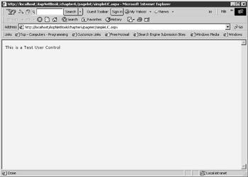
I will now create a user control, which displays the single line of text, "This is a Test Control," when invoked. See Figure 6.1 for an example.
Figure 6.1: Simple user control.

1.Create a file and save it with the name simpleUC1.ascx.
2.Add a single line of text in this file "This is a Test Control."
3.Create a web form simpleUC1.aspx and add the following tags: simpleUC1.aspx
<%@ Register TagPrefix="Hersh" TagName="test" Src="SimpleUC1.ascx" %>
<html>
<body style="background-color='beige'; font-family='verdana'; fontsize='10pt'">
<Hersh:test runat = server />
</body>
</html>
4.Run the web form in your browser.
The register directive registers the control with the Web page. I have given the user control a TagPrefix of "Hersh". This can be any name. The TagName is the alias to the user control. We use this to refer to the control. You can see in this simplified example that the user control behaves much like an include file.
Exposing Properties
Visual Basic.NET and C# provide a useful way of assigning and retrieving values through accessor and mutator functions. Instead of the Let, Set, and Get statements in VB 6.0 (which are now unsupported), you just need a single Property block that would contain a Set and Get block. In this example I have a "message" property block as follows:
Public Property message As String
Get
Return Txt.Value
End Get
Set
Txt.Value = Value
End Set
End Property
The accessor functions (the Get functions) get called when values are requested from the message property. Similarly, the mutator function (the Set function) gets called when values are assigned to the message property.
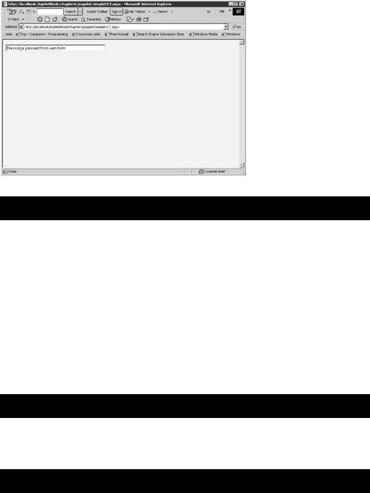
A user control can expose properties, which can then be set by the user. The contents of the user control can thus be encapsulated so that the user is not exposed to the inner working of the component. In the following example, my user control is comprised of a single textbox to which I pass a string "Message passed from web form." Figure 6.2 shows what the output of the web form looks like.

Figure 6.2: Exposing properties in user controls. simpleUC2.aspx
<%@ Register TagPrefix="Hersh" TagName="test" Src="SimpleUC2.ascx" %> <html>
<body style="background-color='beige'; font-family='verdana'; font-size='10pt'"> <form runat="server">
<Hersh:test runat = server message="Message passed from web form" /> </form>
</body>
</html>
The user control form contains the following code: simpleUC2.ascx
<script language="VB" runat="server"> Public Property message As String
Get
Return Txt.Value
End Get
Set
Txt.Value = Value

End Set
End Property
</script>
<input id="Txt" size="50" type="text" runat="server">
User controls reside on their own namespace. This means that the variable names specified for a user control will not clash with another user control, intrinsic control, or even the page variables.
It is recommended that you expose properties instead of Public variables. Properties allow data hiding, can be versioned, and are supported by visual designers such as Visual Studio.NET. I have defined a property called message, which assigns the passed message text to the textbox.
Designing a Navigation System for Your Web Site with a User Control
Each time a new Web page is added to your site, you need to update all the web forms in the site to update the navigation structure. Site navigation should be kept separate from your web forms. When I build a site, I keep all my links in an XML file. I then merge my "navigation" XML file with my "main" XML file and render them by applying stylesheets. I used to do this using a combination of MSXML and XSL stylesheets and was pleasantly surprised to find that implementing the same functionality in ASP.NET was a breeze.
I maintain my site links in an XML file with the following structure: nav.XML
<Siteinfo>
<site>
<sitename>Home</sitename>
<siteurl>default.aspx </siteurl>
</site>
<site>
<sitename>Masters</sitename>
<siteurl>masters.aspx</siteurl>
</site>
</Siteinfo>

The user control that I developed can be placed on any web form with an invocation like the following:
Navigation.aspx
<%@ Register TagPrefix="Hersh" TagName="nav" Src="nav.ascx" %> <html>
<head>
<style>
a { color:black; text-decoration:none;}
a:hover { color:red; text-decoration:underline;}
</style>
</head>
<body style="background-color='white'; font-family='verdana'; font-size='10pt'"> <form runat=server>
<Hersh:nav id="menu" runat = server vGridlines = Both
vBorderColor = "Black" vCellPadding = 7
/>
</form>
</body>
</html>
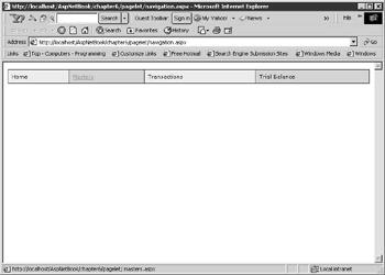
This displays a navigation menu, which looks like Figure 6.3.

Figure 6.3: Navigation Menu.
The user control is contained in the file nav.ascx. A Web page that calls the control will register it with a directive like the following:
<%@ Register TagPrefix="Hersh" TagName="nav" Src="nav.ascx" %>
The control is then instantiated with the following tags:
<form runat=server>
<Hersh:nav id="menu" runat = server
vGridlines = Both
vBorderColor = "Black"
vCellPadding = 7
/>
</form>
Note that the component resides within the form tags on the calling page. Also note that it sets three properties, which are vGridLines, vBorderColor, and vCellPadding.
The following list discusses the user control:
1.Passing parameters from the Web Page to the Component: The User Component declares three Public variables to receive the three passed variables as follows:
2.PUBLIC vGridLines As GridLines
3.PUBLIC vBorderColor as String
PUBLIC vCellPadding As Integer
4.Reading the XML File into a DataSet: In the page_load event, the XML file is read and stored in a DataSet. A DataGrid is bound to the DataSet and its GridLines, BorderColor, and CellPadding attributes are set with the passed variables.
5.Sub Page_Load(Source As Object, E As EventArgs)
6.Dim ds As New DataSet
7.Dim fs As filestream
8.Dim xmLStream As StreamReader
9.fs = New filestream(Server.MapPath("nav.xml"), FileMode.Open, FileAccess.Read)
10.xmlStream = new StreamReader(fs)
11.ds.ReadXML(XmlStream)
12.fs.Close()
