

Laboratory work № 5 Quantitative Risk Analysis
Using the option add trendline There are two types of stocks.
For each of them is known Adjusted close price. It is required to choose the variant of investments to provide the best combination of expected yield and degree of risk.
For doing the laboratory work we need to:

1. For each of the types of stocks calculate net return over month Rt and gross return over month (1+Rt)
2. Calculate unbiased point estimators of the net return over month Rt:
the expected value(mean);
Variance;
Standard deviation;
Coefficient of variation.
3. Calculate semi-characteristics:
Semi-Variance;
Semi-Standard Deviation;
Semi-Coefficient of Variation.
4. By comparing the calculated indicators for two types of stocks, choose which of them provide the best combination of expected profit and degree of risk.
Sequentially get the original data (Historical Prices) about two stocks from the site Finance.yahoo.com. For this:
specify the first letters of any company's ticker and choose some of them (for example, try start to enter the first letters of your surname);
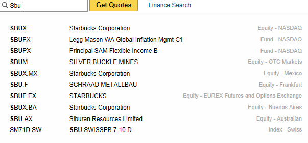
receive the historical data on returns (the section on historical prices in left-hand side of the page);
set Date Range (not less than over 12 years);
specify, that you want to work with monthly data and Get Prices;
Download this data to Spreadsheet (bottom Download to Spreadsheet) and save it as a Microsoft Excel Comma Separated Values File (.csv);
create new blank Workbook;
get external data form file with your historical data (tab Data / group Get external data / icon From text);
in the first step of the Text Import Wizard specify the value of the parameter "Start import at row" – 8;
in the second step of the Text Import Wizard specify the value of the parameter "Delimiter" – Comma;
in the third step of the Text Import Wizard specify the value of the parameter "Column data format" for column Date – Date;
delete all columns except Date and Adjusted Close;
sort the data by Date from Oldest to Newest.
Design original data for each stock separately as follows:
Weekly historical prices by "______________________"
Date |
Adjusted close price (at the end of month) |
Net return over month |
Gross return over month |
t |
PAt |
Rt |
(1+Rt) |
|
|
- |
|
|
|
|
|
|
|
|
|
|
|
|
|
|
|
|
|
|
|
|
|
|
|
|
|
|
|
|
|
… |
… |
… |
… |
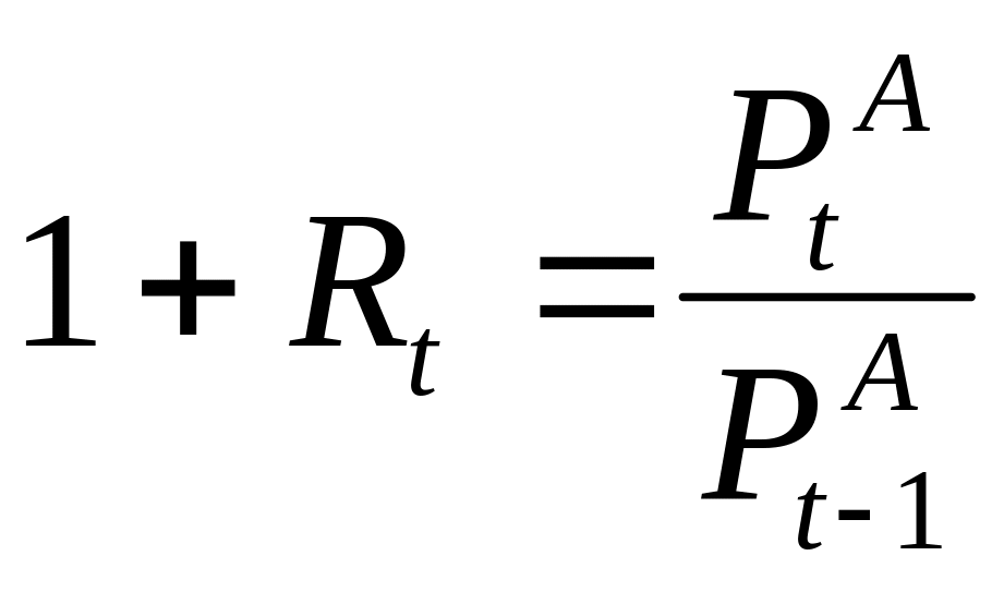
Calculate the simple returns:
net return over month Rt:

gross return over month 1+Rt:
Define the names of this arrays.
Insert the scatterplots "Adjusted close price (at the end of month)", "Monthly simple net return over month" and "Monthly simple gross return over month" by each stock separately.