

Introduction
At the core of good science and engineering is the careful and respectful treatment of data. We calibrate our instruments, scrutinize the algorithms we use to process the data, and study the behavior of the models we use to interpret the data or simulate the phenomena we may be observing. Surprisingly, this careful treatment of data often breaks down when we visualize our data.
Using examples from a wide range of application areas in science and engineering, we will demonstrate how standard uses of color can distort the meaning of the underlying data, and can lead the analyst to incorrect evaluations, conclusions or decisions. We will also establish demonstrate principles we have discovered which can help people avoid these artifacts and build more effective representations of their data. These principles explicitly consider characteristics of the data, how the data are to be used, and how the human visual system processes color information. We will escort you through these concepts and compare their application to what you would obtain with more traditional visualization techniques. We will also briefly discuss tools we have developed which incorporate these ideas into a rule-based visualization system.
Figure 16 shows two views of the same data set. The only difference between these two representations is the choice of colormap. In the view on the left, you see large areas of yellow, with a dark blue region, rimmed with cyan and green moving in from the left, and some dark red regions particularly in the upper right. Based on this distribution of color, you may make some assumptions about the underlying structure in the data. Now, consider the image on the right, which you will recognize as a map of the southeastern United States, with the Florida peninsula clearly illustrated. In this representation, you can easily see the coastline and the surrounding continental shelf in the Gulf of Mexico and Atlantic Ocean. The boundary of the continental shelf and areas of deep ocean are shown in purple, which darkens with depth. The Appalachian Mountains are clearly distinguished in lighter colors from the piedmont and coastal plain regions, primarily in green. Which picture do you think best represents the underlying topography and bathymetry data? Would it surprise you to learn that the two pictures not only show the same data, but are represented by colormaps which are mathematically equivalent? In both cases, each value of the continuous variable, elevation in meters above and below sea level, has been mapped onto a unique value on a continuous pseudo-color scale. In the left-hand picture, elevation at each point has been mapped onto the most commonly-used colormap in visualization, the so-called "rainbow" colormap. In this hue-based colormap, show to the right of the visualization, the lowest value is mapped to blue, the highest value is mapped to red, and the intervening values are mapped continuously onto values interpolated between these two colors in red-green-blue space. In the right-hand picture, elevation has also been mapped onto a pseudo-color map. However, in this case, the colormap has been designed to take into account characteristics of the data and the human visual system. In particular, the colormap has been designed so that equal steps in the data variable will be perceived as equal steps in the representation. Since the data has a threshold value or boundary of interest to the user of the data (i.e., sea level), this characteristic of these interval data is also explicitly incorporated into the colormap.
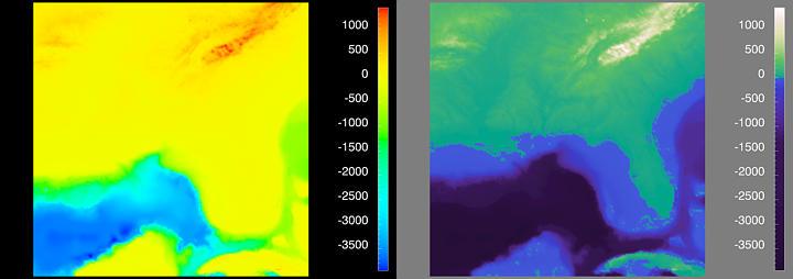
Figure 16. What's Wrong with this Picture?
While comparing these two representations of the same data, the first thing you may notice is the importance of capturing zero-crossings or other thresholds in the data. In this case, preserving the zero-crossing at sea level allows the automatic demarcation of the coastline, which is obscured with the rainbow colormap. Another artifact produced by the rainbow colormap is the false impression created about the structure of the surface topography and the ocean bathymetry. Looking at the color bar, you clearly see that there is a blue region, followed by a cyan region, a green region, a yellow region and a red region. Perceptually, it appears as if there are only five discrete elevations, when in fact, the data set contains a sampling of a continuous function. The perceptual colormap on the right more accurately conveys the continuous nature of the data. The ocean depth decreases gradually over the continental shelf, then decreases steeply. Above sea level, the height of the coastal plain increases gradually in shades of green up into the maize of the low-lying mountains. In addition, artifacts due to the limited resolution and sampling inherent in this data set are visible in the perceptual colormap, but are hidden by the rainbow colormap.
Misleading Use of Color in Your Data
I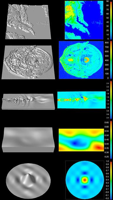 t
is easy to recognize and laugh at the artifacts produced by the
rainbow colormap in well-known data. But what about the
situation when we are working with less familiar data, when we want
to rely on visualization to tell us about the features and
relationships in the data? In these cases, it is
all-to-easy to miss underlying characteristics present in the data
and to misinterpret artifacts of the visualization process as
structures in the data.
t
is easy to recognize and laugh at the artifacts produced by the
rainbow colormap in well-known data. But what about the
situation when we are working with less familiar data, when we want
to rely on visualization to tell us about the features and
relationships in the data? In these cases, it is
all-to-easy to miss underlying characteristics present in the data
and to misinterpret artifacts of the visualization process as
structures in the data.
Figure 17 shows five different data sets spanning a range of scientific and engineering disciplines. Each is represented by two different visualization techniques. Each data set contains a single number at a set of positions in two-dimensional space. The first column shows a representation of the data intended to show you what the data "really" look like. In this depiction, the value at each position is raised by a height proportional to the magnitude of the data value, and the "plane" of values is deformed accordingly. The resultant shape is shown as a gray, Gouraud-shaded surface rendered in a perspective view with a light source at the location of the viewer. Of course, this is not a "perfect" representation of the data, but it does, nonetheless, serve as a basis for comparing the data sets independently of color. The second column shows the same data mapped onto a rainbow colormap, where each data value is mapped to a color value interpolated between blue and red.
The first row shows a digital elevation model of a portion of the Chesapeake Bay basin in Maryland and part of Virginia, including the mouths of the Potomac and Patuxent Rivers. The surface representation in the first column shows that the sea level in the bay and in the rivers is relatively constant, and that the coastline emerges gradually and continuously, leading into a well-defined tributary structure. The rainbow color map representation in the second column masks many of these tributaries. Much of its complexity is lost in the variation from green to cyan. It also introduces a false segmentation of the higher elevations; instead of appearing continuous, these regions appear to be sharply divided into four separate, colored areas.
Figure 17. What Does (or Doesn't) the Rainbow Colormap Tell Us About the Structure in Our Data?
The second row shows T2, one of the three continuous measurements captured in a magnetic resonance scan (MRI), shown for a human head. The rainbow-hue representation in the right-hand column shows the same type of color contouring seen in the first row. Looking at the color map at the right edge of the figure, you can see that nearly the entire range from 150 to 300 looks uniformly cyan. Although the data change by a factor of 2, all the values in this range look identical. Similarly, all the values from 300 to 500 appear to be green. This colormap segments the data range into just a few bands, and incorrectly gives the impression that there are just a few values in the data. Furthermore, these bands are not evenly spaced, and the boundaries between them are fuzzy and indistinct. This colormap produces a contoured impression, masking the subtle, continuous variations in T2 intensity.
The third row shows a two-dimensional simulation of noise from a jet aircraft engine. The representation at the left shows that this is a complex, turbulent scene. The depiction in the right hand column, however, is dominated by the segmentation inherent in the rainbow colormap. It fails to show the multiple peaks in the high frequency region in the left-half of the domain, and the undulating low-spatial frequency structure on the right.
The fourth row shows a representation of a model of the Earth's surface magnetic field on a Cartesian (Cylindrical Equidistant) projection. The north pole is stretched across along the top and the south pole along the bottom, while the equator runs horizontally bisecting the rectangle. The deformed surface shows how magnetic field varies very gradually, increasing slightly at the magnetic poles. The rainbow colormap makes it appear as if there are large and sharp changes in magnetic field, with a particularly clear discontinuity in the near polar field. This representation gives the impression that structures exist which are not present in the data, while at the same time, failing to show gradual changes in the data (e.g., the smooth, continuous increase in the range from 0.35 to 0.55 Gauss).
The fifth row shows a smooth, continuous, two-dimensional sinc function (z=sin(x) sin(y)/xy over the domain of -2p < x,y < 2p). This expression yields a large central peak surrounded by four small, equally spaced troughs. The steep gradient for the peak and the shallow gradient for the troughs vary continuously. The peak for this function, when represented with the rainbow colormap, however, looks like a set of banded colors, giving the impression that there are four distinct regions, surrounded by four falsely-segmented trough regions.
Perceptually-Based Colormaps
To eliminate the artifacts produced by the rainbow colormap, we have been studying how to create better visual representations of your data. One result of this work has been a set of colormaps which take into account the data type, the spatial frequency of the data, and properties of the human perceptual system. These colormaps are all designed to create more faithful impressions of the structure in the data.
Data Types
Measurement theory distinguishes between four types of data. Nominal data are those for which no mathematical operations are allowed, since the values assigned to particular measurements represent a name. For example, even if you categorized different types of tumors with numerical labels 1, 2, 3, and 4, no mathematical operation on these data are meaningful (e.g., tumor 4 should not be interpreted as having twice the severity of tumor 2). The numbers are simply names. Ordinal data have values which represent the ordering of the values, but no assumption is made about the spacing of the values. They may be numbered 1, 2, 3, and 4, but the distance between 1 and 2 should not be assumed to be the same as the distance between 3 and 4. Ordinal data are inherently discrete. For interval data, the numerically equal distances between values are assumed to be actually equal. Interval data are very commonly measured experimentally, and include temperature, rainfall, proton density, radiation dosage, etc. For ratio data, ratios between values are assumed to be equal, and a zero value of the scale is assumed. Absolute temperature in kelvins, for example, is a ratio scale.
Our focus has been on interval and ratio data since they are the most commonly represented in scientific visualization, and are so prone to misrepresentation by standard techniques. (We are also working on effective representations of two types of categorical data — nominal and ordinal). Interval and ratio data are stored and used discretely in computing, and are really quantized samplings of continuous functions over some domain. Hence, there is a requirement to preserve that continuum in visualization. For interval data, the goal is to create a colormap where equal steps in the data corresponds to equal perceptual steps. For ratio data, this same goal is shared, and, in addition, it is important to represent the zero of the scale, since this is the point from which data values increase and decrease. There is also a special case of interval data, which may occur when one or more threshold values in the scale have a significant meaning. We use the same approach as with ratio data for appropriate representations.
Color Types
To create colormaps where equal steps in the data corresponded to equal perceptual steps, we turned to the psychophysical experiments by S. S. Stevens, formerly of Harvard University. Stevens examined different dimensions of the color stimulus, and tested separately their ability to communicate information about the magnitude of a signal. Although color is thought of as a uniform entity, it really has three dimensions. A highly simplified view of the three dimensions of human color perception is shown in Figure 18.

Figure 18. Color Has Three Perceptual Dimensions.
One dimension of the color stimulus is related to its intensity, or how bright it appears. This is the luminance dimension. In the central portion of the figure there are two cones sharing a common base and a straight line connecting each respective apex. Here, the luminance of the stimulus goes from dark, at the bottom (apex of the lower cone) to light at the top (apex of the upper cone). Another dimension is the intensity of a color. This is the saturation dimension. Red, for example, often appears as a very strong color, but can also be more subtle like pink. Saturation is shown as a vector starting at zero along the central dark/light axis, and moving outward, increasing in equal steps of perceived saturation. The third dimension is the most familiar, and is related to the name associated with a color. This is the hue dimension, which makes a ring around the central axis in this figure. The disk illustrating saturation and hue is also shown on the left rendered with the implied variation in color that corresponds to that central ring. This corresponds to a slice through the three-dimensional hue-luminance-saturation space where the luminance is at some intermediate value between low and high. On the right is another slice through that space, which illustrates the relationship between luminance and saturation for a specific choice of hue.
Stevens found that hue was not a good dimension for encoding magnitude information. Thus, we have followed Stevens, and have used luminance-based and saturation-based colormaps for representing continuous variations in data magnitude. In the case of ratio data or interval data with a threshold, we have used colormaps which capture the transition explicitly via a perceived discontinuity.
The second body of research which has influenced our work is the study of human spatial vision. In particular, the human visual system is very good at processing high-resolution images, or data which vary rapidly over an area if that spatial variation is represented as a variation in luminance. In other words, the mechanisms in human vision responsible for high spatial frequency information processing are luminance channels. Reinterpreting this result, if the data to be represented have high spatial frequency, we recommend using a colormap which has a strong luminance variation across the data range. Conversely, the saturation mechanisms in human vision are very sensitive to, and by extension, can be used to carry information about, spatial variations of color. This phenomenon is illustrated in Figure 4.
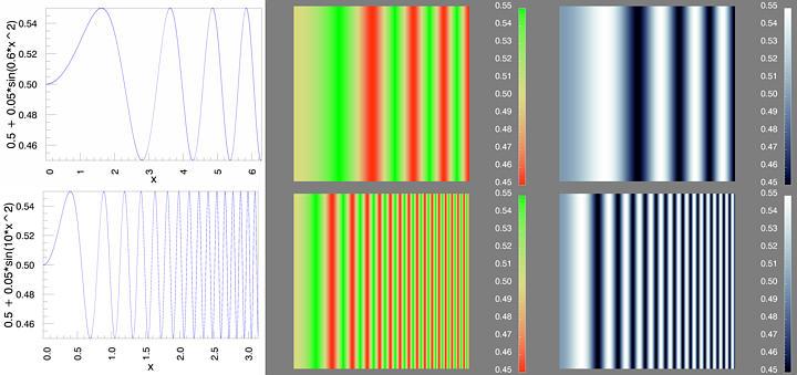 Figure
19. Saturation-Varying Colormaps for Low Spatial Frequency;
Luminance-Varying Colormaps for High Spatial Frequency.
Figure
19. Saturation-Varying Colormaps for Low Spatial Frequency;
Luminance-Varying Colormaps for High Spatial Frequency.
In the top row of Figure 19, we have a frequency-modulated grating which begins at one cycle per image, and then increases in spatial frequency going from left to right. This variation in data value is represented using a saturation-varying colormap, in the center column, and by a luminance-varying colormap at the right. The waveform is depicted in the left-hand column. At the low frequency end of the spectrum, the saturation-varying colormap makes the sinusoidal variation more visible than with the luminance-varying colormap. The opposite effect is shown when we switch to a high spatial frequency modulated grating in the bottom row. With the saturation-varying colormap, you can only see the first few cycles of the frequency-modulated grating, whereas you can see more than twice as many with the luminance-varying colormap.
For interval and ratio data, both luminance- and saturation-varying colormaps should produce the effect of having equal steps in data value correspond to equal perceptual steps, but the first will be most effective for high spatial frequency data variations and the second will be most effective for low spatial frequency variations.
Figure 20 illustrates how these colormaps work with a representation of the atmosphere above the southern hemisphere of the Earth during austral spring. In particular, a deformed surface is shown, where the height of the surface corresponds to the total column density of ozone (in Dobson Units) in the upper troposphere and lower stratosphere, remotely sensed from an orbit above the earth. This surface is redundantly colored using different colormaps in each image within the figure. The rainbow colormap is at the top left. A perceptual colormap designed to show high spatial frequency data is shown at the top right. This is a luminance-varying colormap increasing, with data value, from black to white (i.e., a gray-scale). The image at the bottom left uses a perceptual colormap designed to represent low spatial frequency interval data. This is a colormap, which increases in saturation from an achromatic midpoint, becoming increasingly saturated in red for higher data values and increasingly saturated in green for lower data values. The colormap representing the data in the bottom right combines the luminance variation of the high spatial frequency map and the saturation variation of the low spatial frequency map to effectively capture both the high and low spatial frequency variations in the data. We use the deformed surface so that you can see these effects associated with the regions in questions. In particular, the depressed region corresponding to an area of ozone depletion is delineated with the saturation colormap since it is a low spatial frequency feature. Artifacts of atmospheric circulation, which are of high spatial frequency, are effectively captured by the luminance colormap.

Figure 20. Low (Saturation-Based) and High (Luminance-Based) Spatial Frequency Colormaps.
Applying Perceptually-Based Colormaps to the Data
We now return to the five data sets discussed in Figure 17. We have added a third column containing the data in each row represented with a perceptually-based colormap.
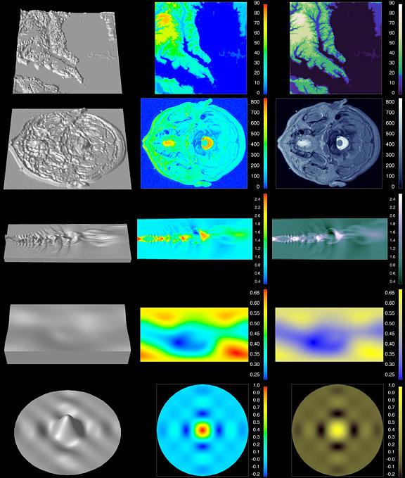
Figure 21. Perceptually-Based Colormaps.
The topography data in the first row are high spatial frequency interval data with a threshold. The perceptual colormap uses luminance variation to carry information about the rapid variation in data value across the domain. This variation increases from the threshold for the coastline and decreases for elevations below a nominal sea level. Hue is used to reinforce the luminance variations. Notice how clearly this colormap shows the tributaries of the Potomac and Patuxent Rivers.
This high spatial frequency interval data set in the second row is well represented with a primarily grayscale colormap. Brightness increases monotonically and hue, which begins as a pure vivid blue, becomes more and more pastel. This colormap produces a monotonic increase in perceived magnitude over the range. Notice how the structures in the image almost leap out in clarity, and how much fine detail is lost with the rainbow colormap. This perceptually isomorphic map, although less dramatic, more accurately reflects the underlying structure in the data. For example, the spatial structure in the midbrain and striate cortex which appear uniform green in the default map are highly detailed in third column. Given the artifacts introduced by the default colormap, it is easy to understand why the medical community has been so cautious about adding color to their visual representations.
The simulated jet engine noise in the third row is an interval data set containing regions of both low and high spatial frequency. This image clearly captures the structure of these complex, turbulent data. Since there is a mix of spatial frequencies, a greater range of hue is utilized compared to the previous row.
In the fourth row, the perceptual colormap used for the earth's magnetic field is a low spatial frequency, interval colormap. The saturation of the colormap increases from achromatic (gray) in the yellow direction for higher magnetic field strength and in the blue direction for lower values. This allows us to see how the magnetic field varies gradually, with increases for the geomagnetic poles.
The large central peak of the sinc function shown in the fifth row ordinarily would be considered a low spatial frequency feature. However, due to the steep gradient from the surrounding minima, a primarily luminance-based colormap is chosen. These features are captured within the continuum of the function as well as the lower minima and maxima near the boundary of the domain.
Different Visualization Tasks
We have shown examples and solutions for selecting color maps which capture properties of the data, and capitalize on the way the human color system processes spatial frequency information. The examples we have described deal with tasks where the interpretation depends on equal steps in the data corresponding to equal perceptual steps. We call these isomorphic tasks. In particular, we have seen that both luminance and saturation can be used to convey the perception of increased magnitude. Luminance variations are better at conveying variations in the magnitude of high spatial frequency data, while saturation variations are better at conveying variations in the magnitude of low spatial frequency data. We have also shown that using these perceptually-based colormaps can help represent features in the data and prevent visual artifacts, which could be erroneously interpreted as structures in the data.
Another aspect of our research focuses on matching the visual representation to the visualization task. We explore two additional visualization tasks: segmentation and highlighting. In both, the user is interested in understanding how a phenomenon behaves within specific ranges of values. In segmentation, the analyst's goal is to look at the whole range of data, but partitioned. If the segments are derived from interval or ratio data, it is important to preserve the perception of order, that is, that the order of the segments matches the order of the data values. In highlighting, the analyst's goal is to focus on a limited range in a variable and study how this range expresses itself in the data set. The analyst, for example, may want to probe the exact ranges where the dose of a radiological treatment affects distant healthy tissue, or the particular magnitude at which the wind changes direction in a meteorological simulation.
Comparing The Rainbow Colormap with Perceptually-Chosen Maps for Different Tasks
The following two figures (22 and 23) show how the same set of data can be explored using four different colormaps, and how these colormaps can answer different questions about the data. In each of these figures, the rainbow colormap is shown in the upper left quadrant so that it can be easily compared with the perceptually-chosen maps for three different visualization tasks. When the goal of the visualization is to produce a faithful representation of the structure in the data, we recommend an isomorphic colormap. The isomorphic map is show in the upper right quadrant, and has been designed so that equal steps in the data correspond to equal perceptual steps. The segmented colormap (lower left) is designed to show how particular ranges of a variable are distributed over the image. The highlighting colormap (lower right) is designed to draw the user's attention to regions in the image which have certain characteristics (lower right). Figure 7 shows data from a low spatial frequency air pollution model. Figure 8 shows high spatial frequency MRI data.
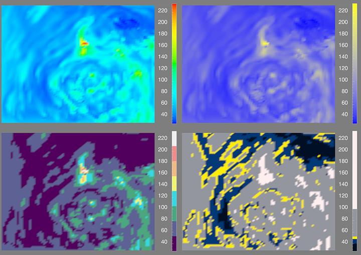
Figure 22. Photochemical Pollution Model with Rainbow, Isomorphic, Segmented and Highlighting Colormaps.
All four visualizations in Figure 22 show the result of a photochemical grid model of transport and deposition of airborne pollutants over the midwestern portion of the United States on June 26, 1987 at 18:00 local time. Ozone pollution concentration is shown in parts per billion by volume (ppbv). The isomorphic colormap used on the left effectively captures the inherent dynamics of this model by showing a snapshot of atmospheric motion. The low spatial frequency circular filaments in yellow correspond to higher ozone concentrations. The segmented colormap used on the right gives the analyst the ability to identify regions of moderate to high pollution in context. In the segmented colormap case, higher pollution levels (e.g., above 160 ppbv) are clearly visible as pale orange, pink and white. It should also be noted that this colormap allows the user to see some artifacts of the limited grid resolution of the model. Using the highlighting colormap, the analyst is able to focus on particular ranges in the data. For example, the range below 50 ppbv relates to the atmospheric circulation apparent in the isomorphic map. On the other hand, regions where the levels are of concern (e.g., above 100 ppbv) are clearly visible. Using all three perceptually-based representations in concert allows the analyst to gain a more sophisticated insight into the data.

Figure 23. MRI Data with Rainbow, Isomorphic, Segmented and Highlighting Colormaps.
In Figure 23, we revisit the MRI data shown in the second row of Figures 17 and 18. Again, the rainbow colormap in the upper left of Figure 8 creates perceived contours which do not reflect discrete transitions in the data. Structures in the data which fall within one of these artificial bands are not represented, and attention is drawn to the yellow areas because they are the brightest, not because they are in any way the most important. The isomorphic colormap (upper right) is designed to produce a faithful representation of the structure in the data. A different isomorphic colormap from the one employed in Figure 6 is used. It has greater variation in hue, although still dominated by variation in luminance, in order to show the structure of lower spatial frequency features (e.g., a tumor near the center of the image). The segmented colormap (lower left) is designed to delineate regions visually. Given the higher spatial frequency of the MRI data compared to the pollution data, fewer segments are employed so that they can be perceptually discerned. The highlighting colormap (lower right) is designed to draw the users' attention to regions in the image which have certain characteristic features, such as a tumor (lower right). This colormap was designed to draw attention to areas which have data values near the median of the range.
More Complex Applications
Some of these ideas can be applied to more complex applications with multiple data sets in three dimensions, as illustrated in Figure 24. These data are from an analysis of various weather observations, which indicate the state of the atmosphere on November 19, 1997 at 01:00 local time in the San Jose area. Four distinct colormaps (two isomorphic and two segmented) are used to visualize four different variables using a variety of geometries registered into a single geographic scene. The choice of colormaps used for each of these variables and their realizations is based upon their spatial characteristics and the task associated with the visualization. For example, relatively noisy data such as wind speed are primarily mapped into luminance, while relatively smoothly varying data such as temperature are primarily mapped into opposing saturation pairs to impart a continuous representation. When contouring is selected as a technique, the data are mapped into a set of bands, to which a segmented colormap with perceived ordinality is applied.
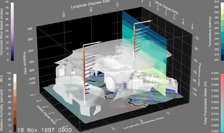
Figure 24. A Three-Dimensional Analysis of Weather Data.
A surface variable (total precipitation) has been selected for display as pseudo-color, which is overlaid on a topographic map. This low-spatial frequency variable is mapped to a variation between cyan and pink. Rivers and coastlines are draped on the surface in contrasting colors, blue and black, respectively, for annotation. An upper air variable (relative humidity) has been selected for display via isosurface extraction. The surface at 90% is requested in translucent white as a representation of a cloud boundary. Another field (temperature) has been selected to show as a vertical slice, which is pseudo-color contoured using a segmented colormap. The upper air wind data can be seen along two vertical profiles. The direction of the analyzed wind field along these "virtual soundings" are shown via vector arrows pseudo-colored by horizontal wind speed. The wind colormap is based primarily on a luminance variation. The length of the arrows also corresponds to the horizontal speed. The profile is realized as a pseudo-colored tube, which is contoured by the variable selected for isosurface realization (i.e., humidity) using a segmented colormap. Since the same colormap is also used for the isosurface, you can easily see the correspondence between the profiles and the extracted surface.