

17.2 Buttons 573
javax.swing.JComponent
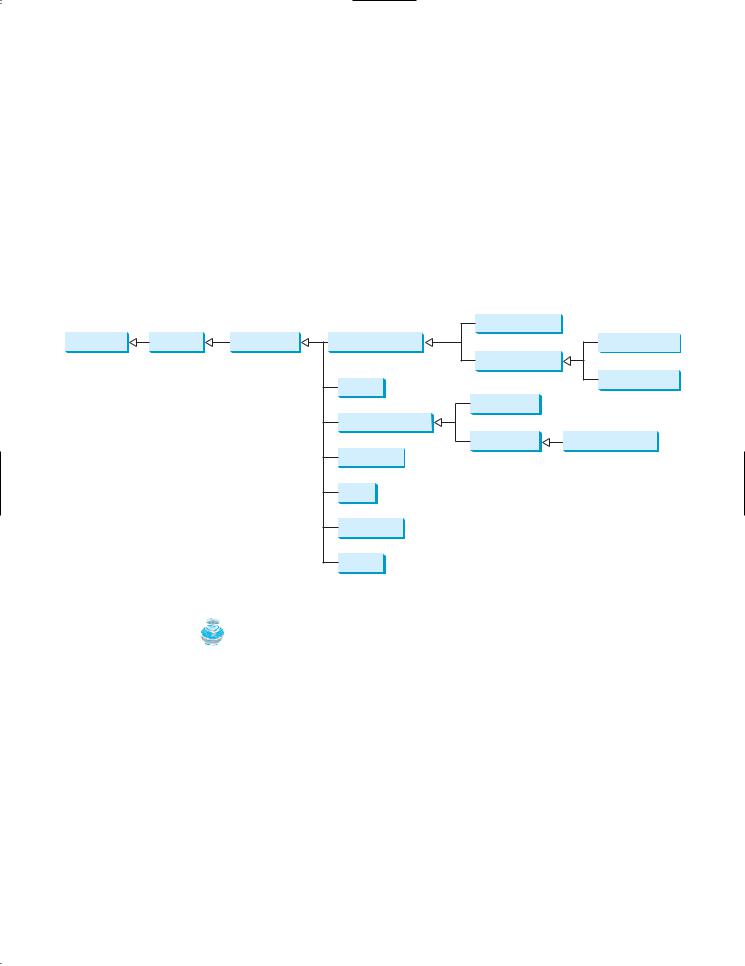
The get and set methods for these data fields are provided in the class, but omitted in the UML diagram for brevity.
javax.swing.AbstractButton
-actionCommand: String -text: String
-icon: javax.swing.Icon
-pressedIcon: javax.swing.Icon -rolloverIcon: javax.swing.Icon -mnemonic: int
-horizontalAlignment: int -horizontalTextPosition: int -verticalAlignment: int -verticalTextPosition: int -borderPainted: boolean
-iconTextGap: int -selected(): boolean
FIGURE 17.2 AbstractButton defines common features of different types of buttons.
javax.swing.AbstractButton
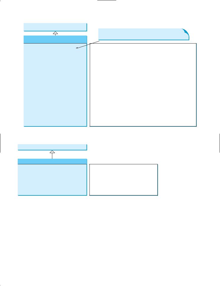
javax.swing.JButton
+JButton()
+JButton(icon: javax.swing.Icon) +JButton(text: String) +JButton(text: String, icon: Icon)
+addActionListener(listener: ActionListener) : void
FIGURE 17.3 JButton defines a regular push button.
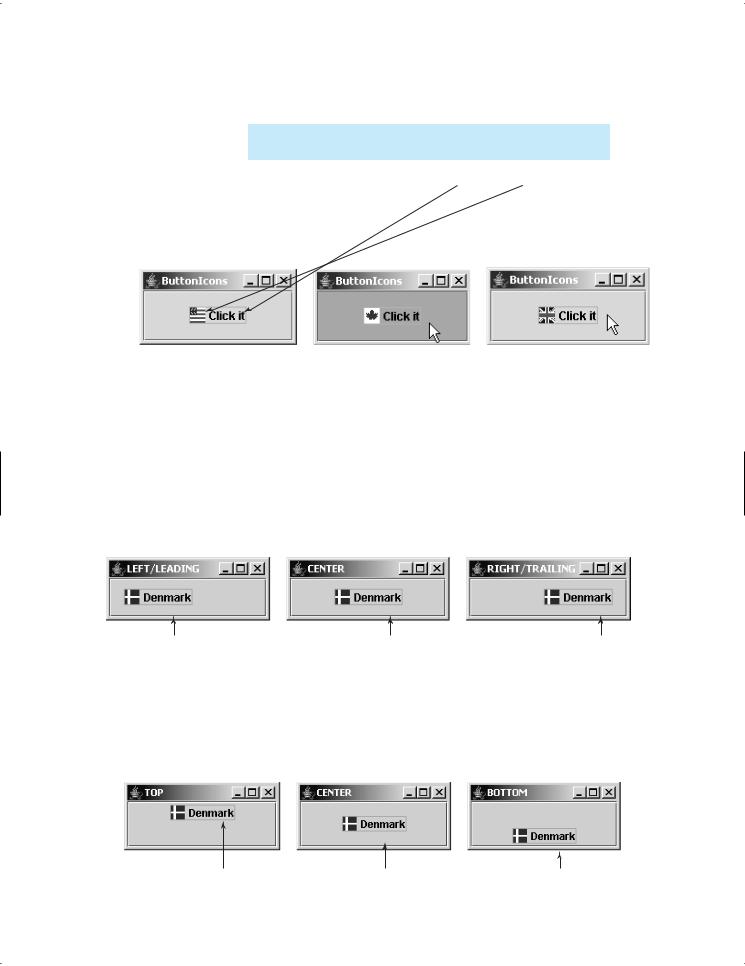
For example, Listing 17.1 displays the American flag as a regular icon, the Canadian flag as a pressed icon, and the British flag as a rollover icon, as shown in Figure 17.4.
LISTING 17.1 TestButtonIcons.java
1 |
import |
javax.swing.*; |
|
2 |
public |
class TestButtonIcons extends JFrame { |
|
3 |
|||
4 |
public static |
void main(String[] args) { |
|
5 |
// |
Create a |
frame and set its properties |
6JFrame frame = new TestButtonIcons();
7 frame.setTitle("ButtonIcons");
8frame.setSize(200, 100);
9 frame.setLocationRelativeTo(null); // Center the frame
10 frame.setDefaultCloseOperation(JFrame.EXIT_ON_CLOSE);
576Chapter 17 Creating Graphical User Interfaces
2.Process the event.
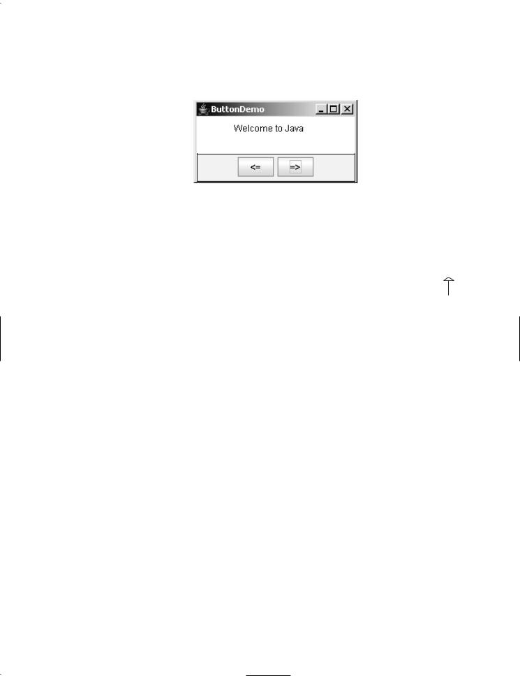
Create and register listeners for processing the action event to move the message left or right according to whether the left or right button was clicked.
 MessagePanel
 JPanel with
FlowLayout
FIGURE 17.9 Clicking the <= and => buttons causes the message on the panel to move to the left and right, respectively.
LISTING 17.2 ButtonDemo.java
|
1 |
import java.awt.*; |
|
||||||||
|
2 |
import java.awt.event.ActionListener; |
|
||||||||
|
3 |
import java.awt.event.ActionEvent; |
|
|
|||||||
|
|
JFrame |
|||||||||
|
4 |
import javax.swing.*; |
|
|
|||||||
|
5 |
|
|
|
|
|
|
|
|
|
|
|
6 |
public class ButtonDemo extends JFrame { |
|
ButtonDemo |
|||||||
|
7 |
|
// Create a panel for displaying message |
|
|
||||||
|
8 |
|
protected MessagePanel messagePanel |
|
|
|
|||||
|
|
|
|
|
|
|
|
|
|
|
|
|
9 |
|
|
= new MessagePanel("Welcome to Java"); |
|
|
|
||||
|
10 |
|
|
|
|
|
|
|
|
|
|
|
11 |
|
// Declare two buttons to move the message left and right |
||||||||
|
12 |
|
private JButton jbtLeft = new JButton("<="); |
|
|
|
|||||
|
13 |
|
private JButton jbtRight = new JButton("=>"); |
|
|
|
|||||
|
14 |
|
|
|
|
|
|
|
|
|
|
|
15 |
|
public static void main(String[] args) { |
|
|||||||
create frame |
16 |
|
|
ButtonDemo frame = new ButtonDemo(); |
|
||||||
|
17 |
|
|
frame.setTitle("ButtonDemo"); |
|
||||||
|
18 |
|
|
frame.setSize(250, 100); |
|
||||||
|
19 |
|
|
frame.setLocationRelativeTo(null); // Center the frame |
|||||||
|
20 |
|
|
frame.setDefaultCloseOperation(JFrame.EXIT_ON_CLOSE); |
|
||||||
|
21 |
|
|
frame.setVisible(true); |
|
||||||
|
22 |
|
} |
|
|
|
|
|
|
|
|
|
23 |
|
|
|
|
|
|
|
|
|
|
|
24 |
|
public ButtonDemo() { |
|
|||||||
create UI |
25 |
|
|
// Set the background color of messagePanel |
|
||||||
|
26 |
|
|
messagePanel.setBackground(Color.white); |
|
||||||
|
27 |
|
|
|
|
|
|
|
|
|
|
|
28 |
|
|
// Create Panel jpButtons to hold two Buttons "<=” and “right =>" |
|||||||
|
29 |
|
|
JPanel jpButtons = new JPanel(); |
|
||||||
|
30 |
|
|
jpButtons.add(jbtLeft); |
|
||||||
|
31 |
|
|
jpButtons.add(jbtRight); |
|
||||||
|
32 |
|
|
|
|
|
|
|
|
|
|
|
33 |
|
|
// Set keyboard mnemonics |
|
||||||
mnemonic |
34 |
|
|
jbtLeft.setMnemonic('L'); |
|
|
|
|
|
|
|
|
35 |
|
|
jbtRight.setMnemonic('R'); |
|
||||||
|
36 |
|
|
|
|
|
|
|
|
|
|
|
37 |
|
|
// Set icons and remove text |
|
||||||
|
38 |
// |
|
jbtLeft.setIcon(new ImageIcon("image/left.gif")); |
|
||||||
|
39 |
// |
|
jbtRight.setIcon(new ImageIcon("image/right.gif")); |
|
||||||
|
40 |
// |
|
jbtLeft.setText(null); |
|
||||||
|
|
|
|
17.2 Buttons 577 |
41 |
// |
jbtRight.setText(null); |
|
|
42 |
|
|
|
|
43 |
|
// Set tool tip text on the buttons |
|
|
44 |
|
jbtLeft.setToolTipText("Move message to left"); |
|
tool tip |
45 |
|
jbtRight.setToolTipText("Move message to right"); |
|
|
46 |
|
|
|
|
47// Place panels in the frame
48setLayout(new BorderLayout());
49add(messagePanel, BorderLayout.CENTER);
50add(jpButtons, BorderLayout.SOUTH);
51 |
|
|
52 |
// Register listeners with the buttons |
|
53 |
jbtLeft.addActionListener(new ActionListener() { |
register listener |
54public void actionPerformed(ActionEvent e) {
55messagePanel.moveLeft();
56}
57});
58 |
jbtRight.addActionListener(new ActionListener() { |
register listener |
59public void actionPerformed(ActionEvent e) {
60messagePanel.moveRight();
61}
62});
63}
64}
messagePanel (line 8) is deliberately declared protected so that it can be referenced by a subclass in future examples.
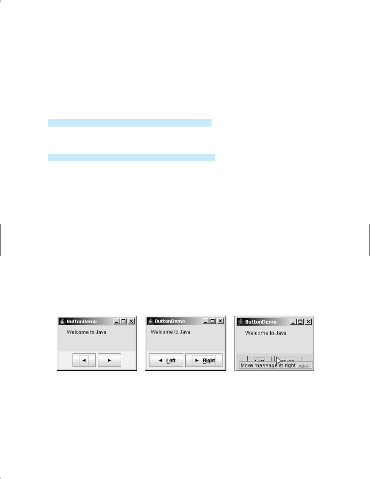
You can set an icon image on the button by using the setIcon method. If you uncomment the following code in lines 38–41:
//jbtLeft.setIcon(new ImageIcon("image/left.gif"));
//jbtRight.setIcon(new ImageIcon("image/right.gif"));
//jbtLeft.setText(null);
//jbtRight.setText(null);
the texts are replaced by the icons, as shown in Figure 17.10(a). "image/left.gif" is located in "c:\book\image\left.gif". Note that the backslash is the Windows file-path notation. In Java, the forward slash should be used.
(a) |
(b) |
(c) |
FIGURE 17.10 You can set an icon on a JButton and access a button using its mnemonic key.
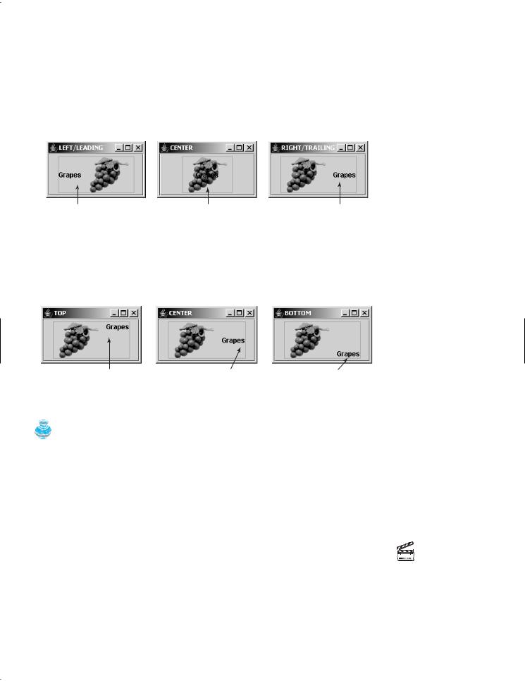
You can set text and an icon on a button at the same time, if you wish, as shown in Figure 17.10(b). By default, the text and icon are centered horizontally and vertically.
The button can also be accessed by using the keyboard mnemonics. Pressing Alt+ L is equivalent to clicking the <= button, since you set the mnemonic property to 'L' in the left button (line 34). If you change the left button text to "Left" and the right button text to "Right", the L and R in the captions of these buttons will be underlined, as shown in Figure 17.10(b).